How to Use Acme: An Expressive Typeface Inspired by Cartoons
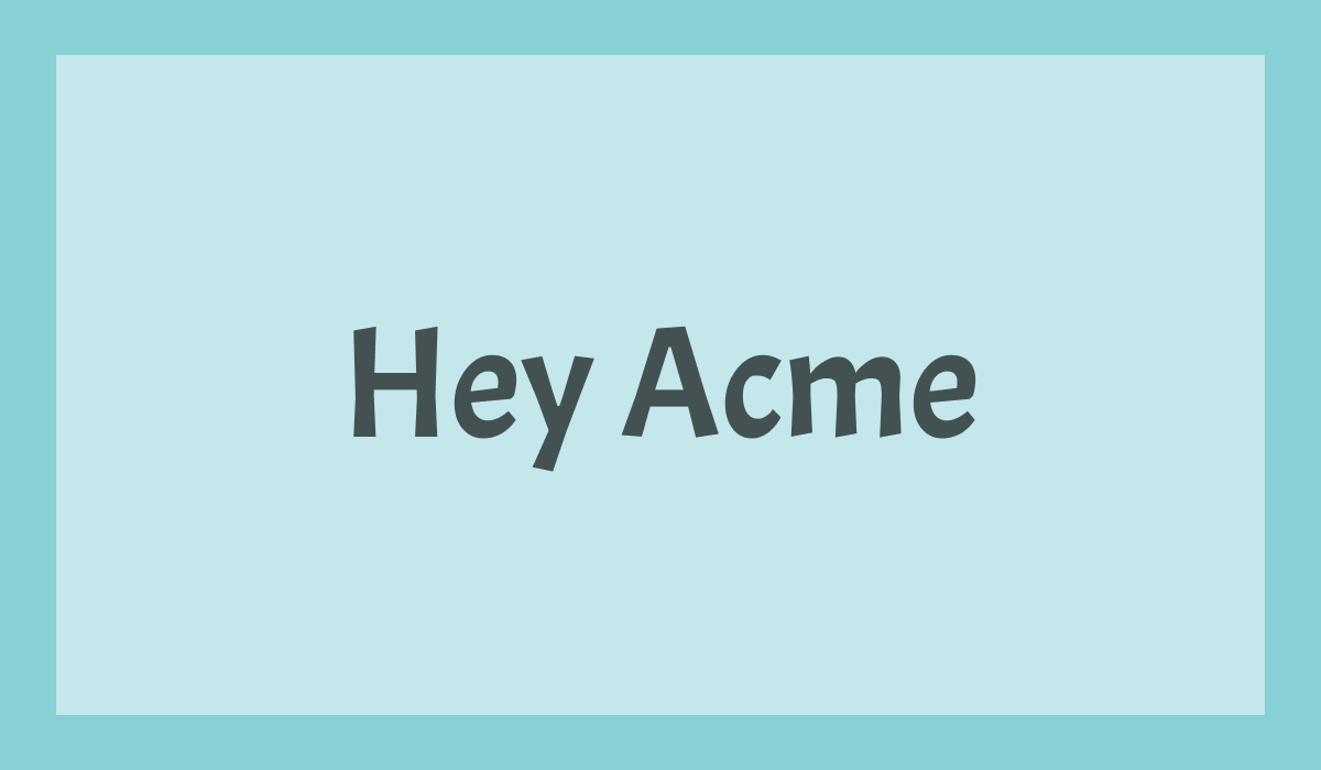
Font of the Week: Acme
About Acme
Acme is a bold display sans-serif designed by Juan Pablo del Peral, drawing inspirations from classic cartoons and comics. It combines a strong, confident presence with a warm and casual personality, making it an excellent choice for headlines, logos, and branding that need to feel approachable but with some quirks.
Its unserious attitude and distinctive character make Acme a versatile typeface for projects that call for typography with both clarity and warmth.
Acme Type Details
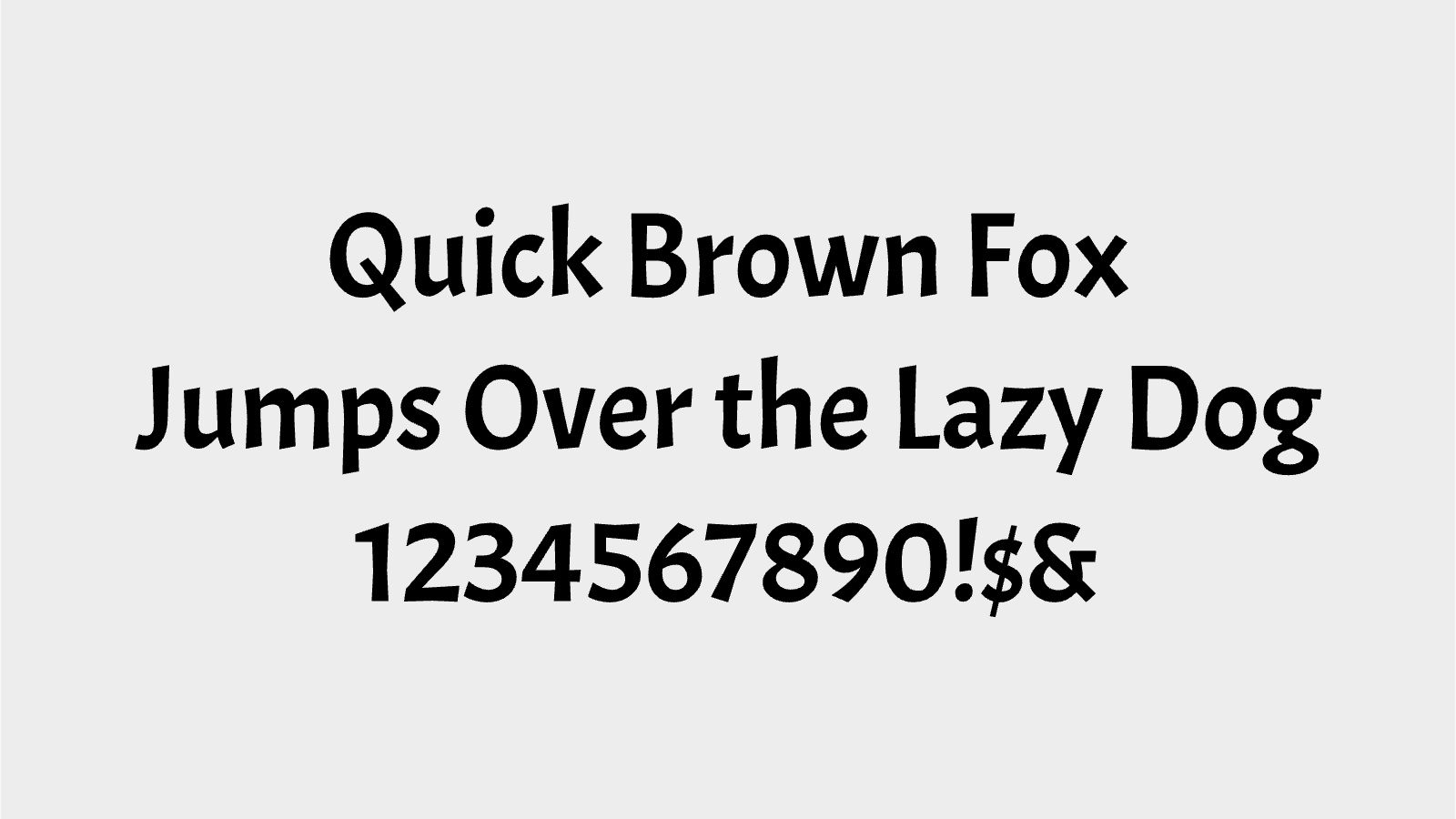
Acme features sturdy, low-contrast strokes, open counters, and slightly condensed proportions that create a compact yet highly legible appearance. Subtle hand-lettered influences give the typeface a lively, distinctive voice while maintaining the simplicity of a sans-serif.
Designed primarily as a display face, Acme performs best in headlines, posters, packaging, logos, and short marketing copy where its personality can take center stage.
How to Use Acme for Logos
Acme is an excellent choice for logos that need to communicate confidence, friendliness, and warmth. Its bold forms create a memorable wordmark while remaining clear across a wide range of sizes.
It works particularly well for brands in food, education, retail, entertainment, and lifestyle, where an approachable but distinctive visual identity is important. Pair it with simple graphic elements to let the typography remain the focal point.
How to Use Acme for Branding & Marketing
Acme shines in branding systems that need eye-catching headlines and a welcoming personality. Use it for campaign headlines, product packaging, promotional graphics, social media assets, and event materials where you want typography to stand out.
Because Acme is a display typeface, pair it with a neutral sans-serif such as Roboto, Open Sans, or Lato for body copy to create a balanced and readable typographic system.
Acme Font Pairings
1. Roboto – A clean, modern sans-serif that complements Acme's expressive display style while providing excellent readability for longer text.
2. Open Sans – An approachable, versatile companion that balances Acme's personality across both digital and print applications.
3. Lato – With its warm, humanist design, Lato pairs naturally with Acme to create branding that feels both friendly and polished.