How to Use IBM Plex: A Excellent Multi-Family Font Perfect for Web Apps and Software Interfaces

The IBM Plex Family
Plex is a system of fonts that has sans, serif, and monospaced versions. Plex is extensive because IBM originally designed it as its brand font. IBM wanted to illustrate the themes of mankind and machine. The font mirrored this brand vision by having neutral, balanced yet approachable normal weights and more friendly italics. This highly versatile system of fonts can work for a variety of projects. When used together, they can complement each other to display complex text information for app user interfaces, spreadsheets, or presentations.


What Are Monospaced Fonts?

So far, the fonts we have covered have been proportional, where each character takes as much width as it needs. Monospaced fonts are fixed width (all of the characters have the same width). Most "typewriter" fonts are monospaced. Also, the fonts you see in code editors, like Courier.
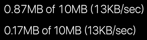
Monospaced fonts are great for displaying numbers, like prices, playback time, and more, because every single character is the same width, which means, the numbers line up perfectly. Monospaced numbers are also called tabular numbers, because... they are born to be used in tables and spreadsheets. If you are creating a project with numbers and data, try a monospaced font -- you will be pleased.
Plex at a Glance
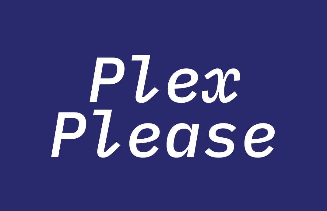
Plex Mono is perfect for numbers, symbols. It is also great for showing code snippets. Plex Mono Italic has the most personality out of the Plex bunch.
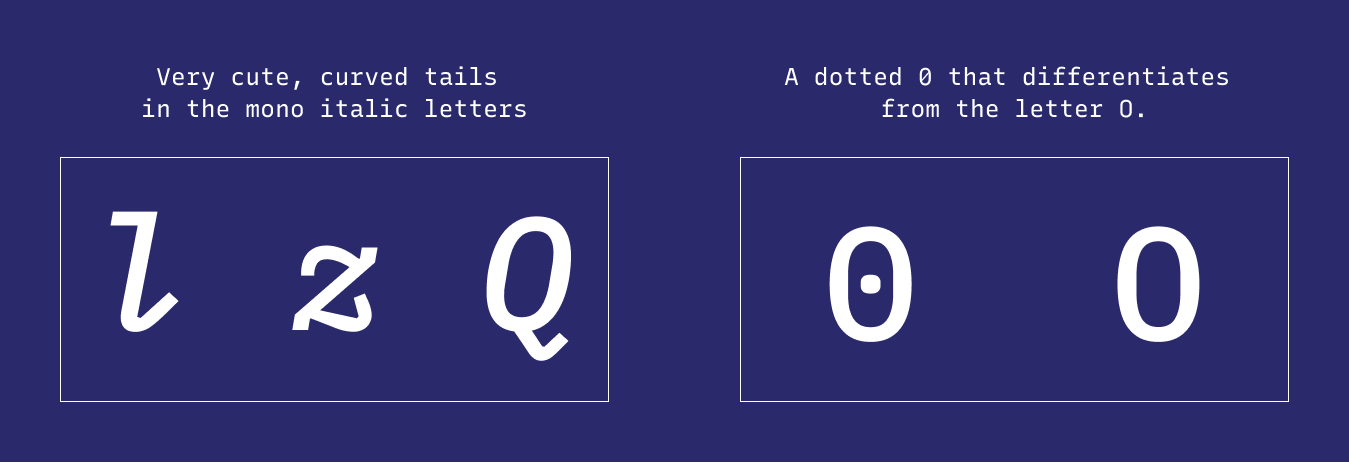
Some excellent features of Plex Mono include:
- A dotted 0 that differentiates from the letter O.
- Curved tails in "l," "z," and "Q" for mono italic.
Plex Sans is perfect for presentation and displaying text. It has excellent legibility. This also goes for the Plex Serif, which is more suited for editorial storytelling.
How Should I Use IBM Plex for Logo and Branding?
As you can already guess: coming from a tech company, Plex has the approachable, accessible tone that many other tech companies enjoy employing in branding. The question is: Can I use it for my own company since it's already associated with another brand? The answer is yes. As you have seen in these examples, Plex has already been open-sourced and free to use. The sans and serif versions are perfect for any company that looks to be open and approachable. The monospace version communicates friendliness. The Monospace Italic is very cutesy. Overall, a highly versatile family of fonts for you to play within your projects.

Logo
Tech companies with open, accessible, or friendly brand personalities. Most of the "friendly" are in the monospace italic of this font.
Typography System & Pairing
(marketing, presentation, and website)
Plex pairs well with each other and has many weights. It can display complex data like pricings. Plex Sans can pair nicely with Playfair Display. Plex Serif can pair nicely with Space Grotesque.

Cautiously Avoid
Here is a tip instead: If you use bold versions of anything at a smaller size, you can increase the letter spacing slightly — it allows people to read better.
Creative Prompt
On my Instagram, I host a Tip Wednesday design challenge, where you gave a tip on a subject you know about on Wednesday and publish it as a post and a story. Can you make a Tip Wednesday post with Plex?
Phew, You Made it
You can find Plex in Canva and Figma. It is available to download on Google Fonts.