Antonio: A Bold Sans Serif for Powerful Branding and Eye-Catching Typography Design
Font of the Week
About Antonio Font
Antonio is a bold sans serif font that has become a favorite among graphic designers for its striking visual impact. Inspired by modernist typography, this font is designed to make a powerful statement through its clean lines and robust weight. Its roots trace back to simplistic, straightforward typefaces that prioritize readability and strength, making it a standout choice for modern branding and design projects.
Antonio Font Details
Characterized by its tall, condensed letterforms, Antonio exudes a sense of authority and sophistication. The design details, such as the tight spacing and straight edges, create a commanding presence on any page or screen. Antonio excels in applications where attention is key, like logo design or marketing materials. Its potent visual weight ensures it captures interest at first glance, making it ideal for powerful branding and eye-catching design.
Antonio Variable Font
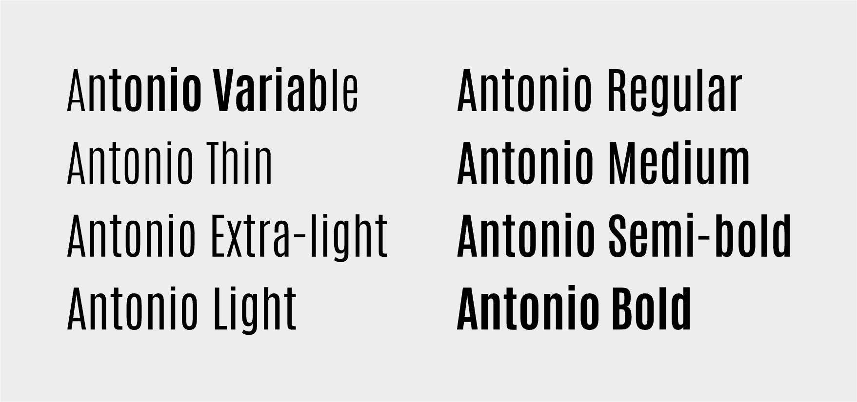
Antonio's variable font version enhances its flexibility in design projects. Primarily featuring the "wght" axis, Antonio allows designers to adjust the weight from regular to bold, giving you the creative ability to customize its appearance for different uses—whether that’s for branding statements or typography design adjustments.
How to Use Antonio Font for Logo
Using Antonio font for logo design can be a game-changer. Its bold sans serif nature offers excellent legibility at various sizes, ensuring logos remain clear and impactful. For logos, utilizing a heavier weight can maximize its robustness and visibility, reinforcing your brand's presence even on small-scale applications.
How to Use Antonio Font for Branding & Marketing
In branding and marketing, Antonio's authoritative design elements lend themselves well to creating memorable materials. Its commanding style is ideal for headlines that need to catch attention quickly. Pairing Antonio with softer sans serif typography can create a balanced and harmonious design that underscores brand messaging with strength and clarity.
Antonio Font Pairings
Pair Antonio with these Google Fonts to create complementary designs that highlight its bold nature:
Lato - Lato offers a softer sans serif option that balances Antonio’s boldness, providing contrast and readability.
Open Sans - With its versatile, minimalist style, Open Sans complements Antonio by adding a sense of modernity and openness.
Roboto - Roboto's geometric shapes work seamlessly with Antonio, creating a cohesive and streamlined design approach.