Reviewing Averia: A Versatile Font Inspired by Computation
In This Issue…
How to Use Averia for Logo, Branding & More
- Font of the Week: Averia
- Marketing Idea of the Week: Open-Source Projects
- Color Inspiration of the Week: The System of Sol LeWitt

Font of the Week
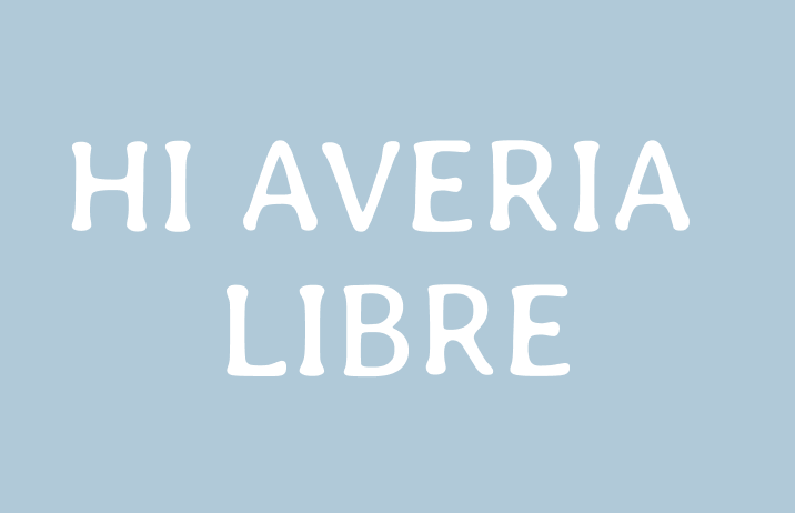
Averia, the Averaging Font
There are many different ways of creating things: One method is to create an idea entirely from scratch based on inspirations and chanced encounters. Another way is to research many references and create a unique blueprint. Which do you use?
Averia’s maker used the second method. He created Averia by averaging all the fonts on his computer. At the start of his process, he overlaid different fonts on top of each other at low opacity, then converted each layer to monochrome images. The blurry shapes from the reference images served as a good preview visualization for letterforms in Averia.
He then improved this process by looking for the average coordinate positions among the points to be more efficient. The averaging resulted in the soft and swelled strokes you see in this Averia Libre.


Font Details
There are several different styles of Averia. Averia Libre is an average of all the fonts; Averia Sans Libre includes is the average of all the sans serif, whereas Averia Serif Libre is the average of all the serifs. Averia Sans Libre feels the most gentle because it looks thinner and softer than other style versions.

How to use it for logo?
- Softness and swelled up strokes gives a brush appearance, hand-crafted feeling
- Communicates warmth, artisanal, gentleness
How to use it for marketing?
- Each Serif, Sans, and Libre version has three weights and is available in regular and italic styles.
- Averia Serif and Sans serif can pair with each other
- Serif is good for editorial; Sans and Libre is excellent for body copy
Marketing Idea of the Week
Open-Source Project
In tech, an open-source project means that it is a community project that everyone can contribute. Many fonts in this newsletter are open-sourced. Their project files are on Github, and anyone can download the source files and create modifications to them. Having a community project like this can foster a sense of community and empowerment through group ownership. Free projects that allow everyone can modify and share can be a great source of marketing. Can you think of a simple project that everyone can modify and share?

Color Inspiration of the Week
The System of Sol LeWitt
Sol LeWitt was a fine artist who worked in a very computational way. He used different components in various combinations and permutations to create many different versions of the drawings.
Beige red: #C7988E | Soft yellow: #EAE381 | Soft blue: #97B2C1
Jargon Buster!
Transitional Serif
First Seen: mid-18th century
Transitional serifs are in-between “Old Style” and “Modern” serifs (we will cover these in the next newsletter). In these serif types, the contrast between thick and thin strokes is more pronounced. Sometimes you will see ball terminals and vertical stress. The capital letter R usually has a curved tail.
- Example: Times New Roman
- Stroke Contrast: ++

Want more Typography Jargon Busters? Check out Typogram's blog!
Creative Prompt
Write a plan for a project you can create to allow everyone to contribute. If you feel like sharing, I would love to see it!
Thank you!
Thanks for being here for another week. Averia is available here.
