Reviewing Six Caps: A Condense Font Perfect for Marketing Graphics

The Narrow Six Caps
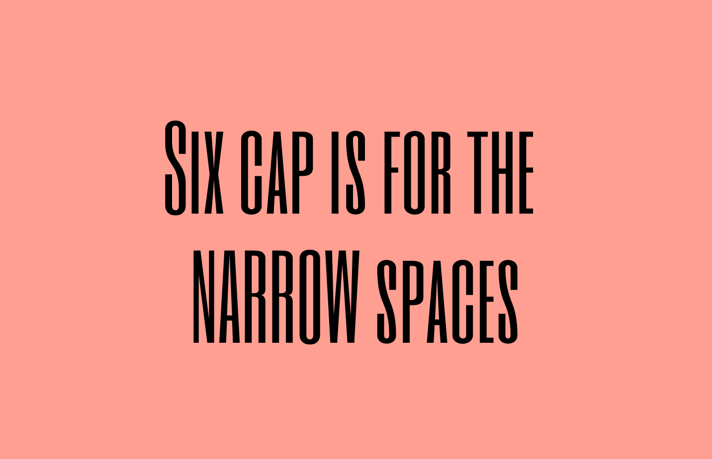
Did you ever need a font that could fit into narrow spaces? Like on the side of a video? If yes, Six Caps is made just for you.

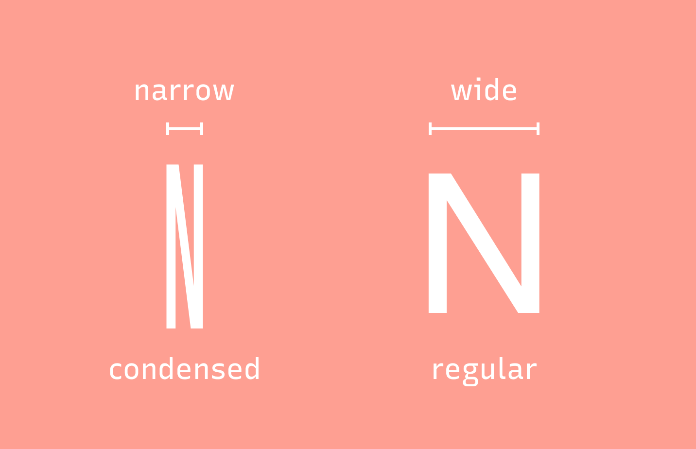
Six Caps is a sans serif. A quick reminder: sans serifs are letterforms without the little serif(feet). As you might have noticed, this sans serif appears visibly narrower than regular fonts. This is called condensed font.
It is very common to find condensed fonts sitting inside classified sections in newspapers or magazines. Due to its width, a condensed font is more visually pleasing sometimes and can best leverage a narrow space. It is like putting a book inside its slip-case — everything fits together proportion-wise. Six Caps is your reliable space-saving friend.
When we talk about the personalities of fonts, the most telling characteristics are in their lowercase. For our case, Six Caps is relatively neutral and doesn't have a traditional lowercase. Instead, it has a small-cap to meet all your spacing needs. If you need to place text in a tight space, like the corners of a photo, use a condensed font like Six Caps can be incredibly useful.
How to Use Six Caps for Logo & Branding Design?
Logo
This font is very neutral. You can use it for logos, but you may need to design your logo a bit more to make it stand out.
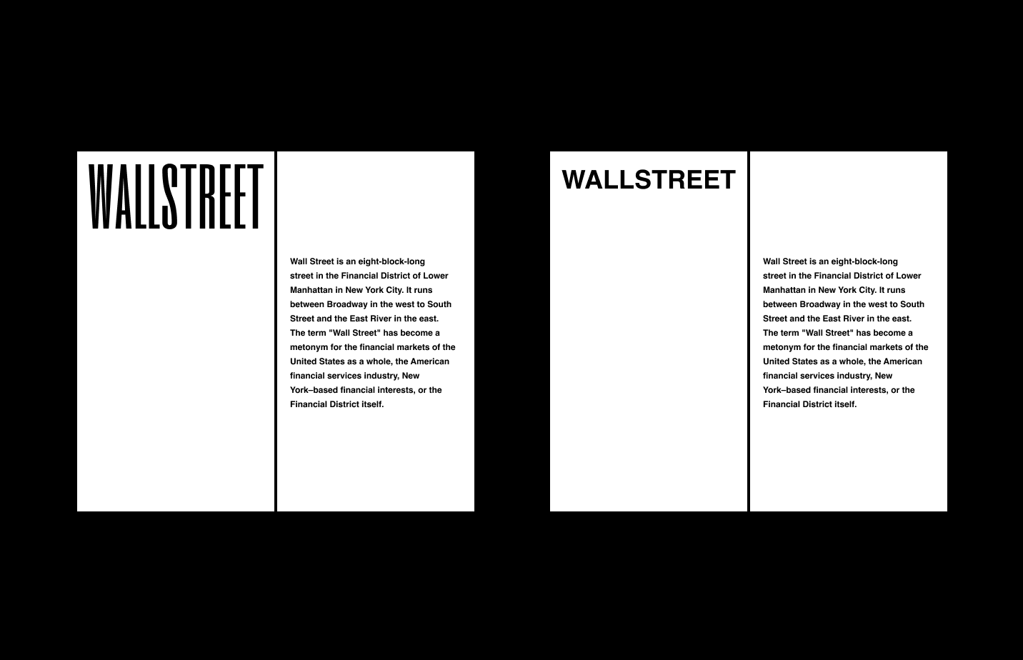
Typography System (Marketing, Branding)
This font is very condensed. Don't use it if you have a lot of space.
Cautiously Avoid
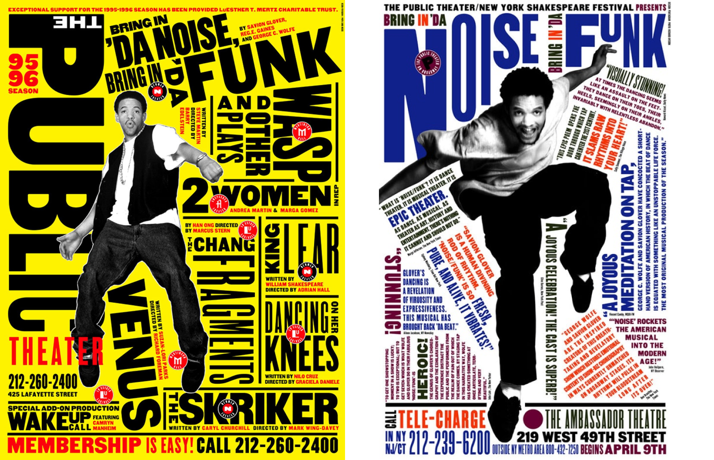
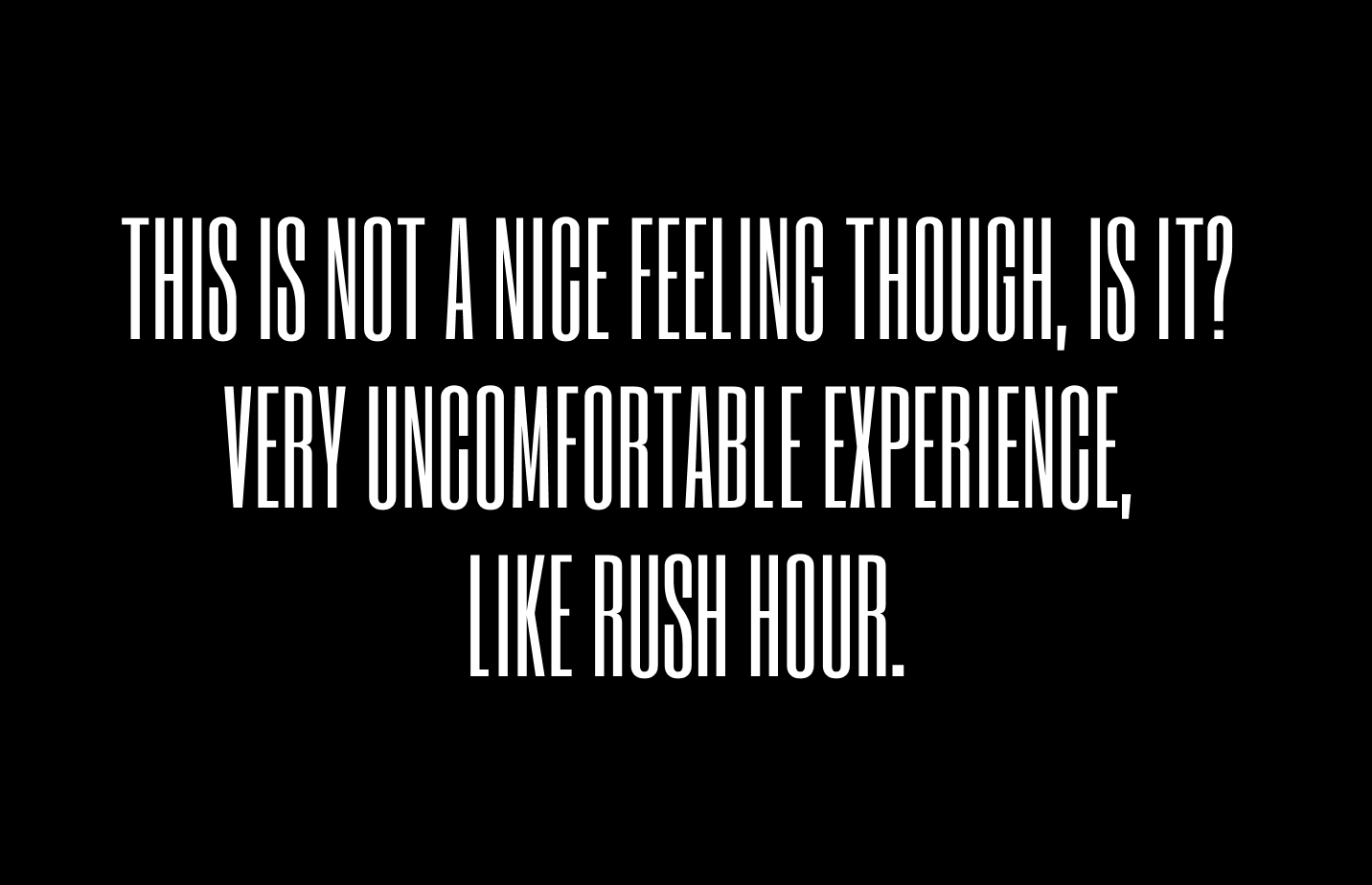
Overusing. A bunch of condensed letters is like being a crowded subway. It makes readers uncomfortable.
Creative Prompt
I challenge you to make a youtube video cover with Six Caps! If you don't do youtube, well, this gives you an excuse to make a youtube video. 😉
You Made it!
You can find the Six Caps here.
