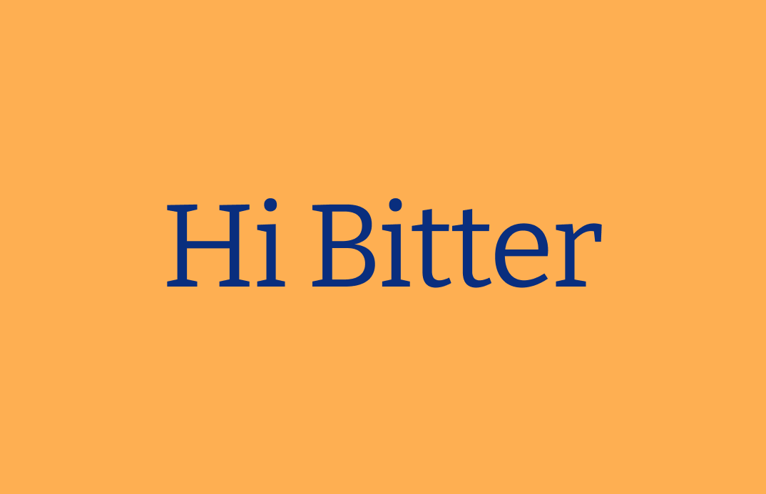
Reviewing Bitter: Excellent Slab Serif Perfect for Reading Online
In This Issue…
How to Use Bitter for Logo, Branding & More
- Font of the Week: Bitter
- Design idea: The Art of Asking Questions
- Color Inspiration: Yellowstone National Park
Font of the Week
About Bitter
Bitter is a highly versatile slab serif designed for optimizing reading experiences online. Bitter is designed with practical principles in mind, and most design choices are made with considerations for digital environments rather than aesthetics.
My favorite design feature about Bitter is the minimal contrast in stroke width. This makes Bitter look contemporary and modern to the eyes while contributing to its overstrength as a screen font for reading.
Font Details
- 9 weights with respective italic versions
- Low stroke contrast
- Great as display or reading font


How to use Bitter for logos?
Bolder versions are perfect for logos. It has a contemporary, objective tone that works for many different projects, especially in the likes of publishing and blogs.
How to use Bitter for marketing and branding?
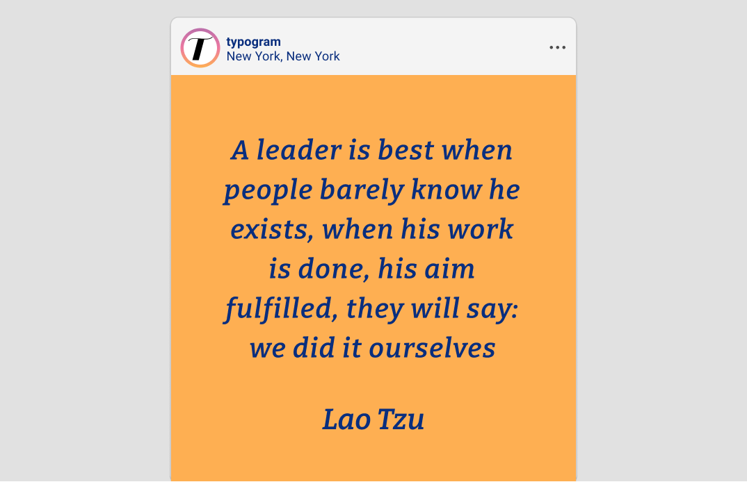
The lighter styles of this font, like Thin, Extralight, and Light are especially pleasing to the eye. They are perfect for quotes or display-size copies and make the typography on your page look clean and easy on the eye. Because Bitter is optimized for the digital reading experience, the regular and bold versions work fantastically as reading fonts.
Design Idea of the Week
Art of Question
Did you know that, as children, we can ask an average of 40,000 questions between the ages of 2 and 5? But as soon as we grow older, we stop asking those questions publicly. This week, check out this helpful guide on the art of asking questions.
Color Inspiration
Yellowstone National Park
This week, enjoy colors from Yellowstone, USA.
Bronze #C86D04 | Sherbert #FEAF52 | Teal #02A790 | Egyptian #045396
Typography Jargon Buster!
Font Style
Font style is a particular style of the font within a font family. For example, usually, there is the italic style within a font family - a group of letters with a degree of slant. Font style can come in normal, italic, and oblique. The Normal style is when the text is upright. The italic style is usually calligraphic, cursive-influenced, and slanted. The Oblique style is a slanted version of the Normal style.

Creative Prompt
Create something with Bitter.
Thank you
…for reading and hanging out here this week! Bitter is available here.
