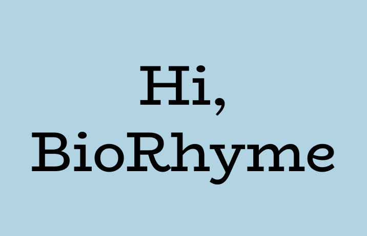
Reviewing BioRhyme: An Quirky Wide Font For Headlines
In This Issue…
How to Use BioRyhme for Logo and Branding
- Font of the Week: BioRhyme
- Design idea: Typogram Launch!
- Color Inspiration: Oslo, Norway
Font of the Week
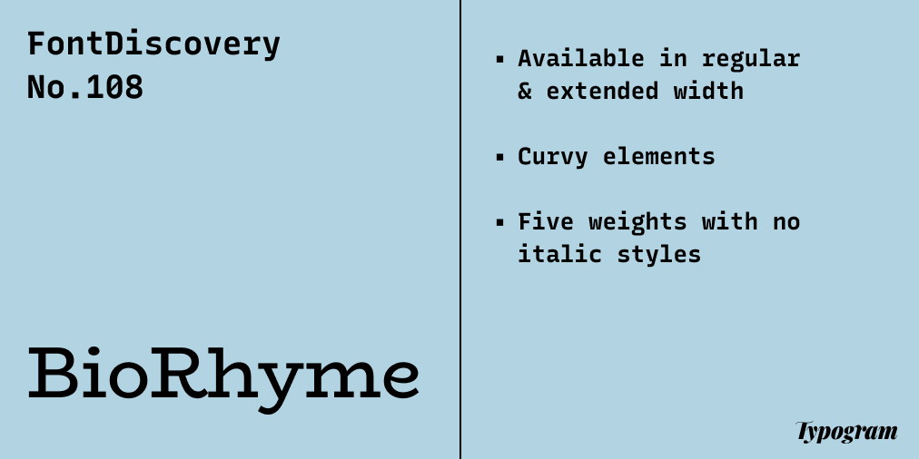
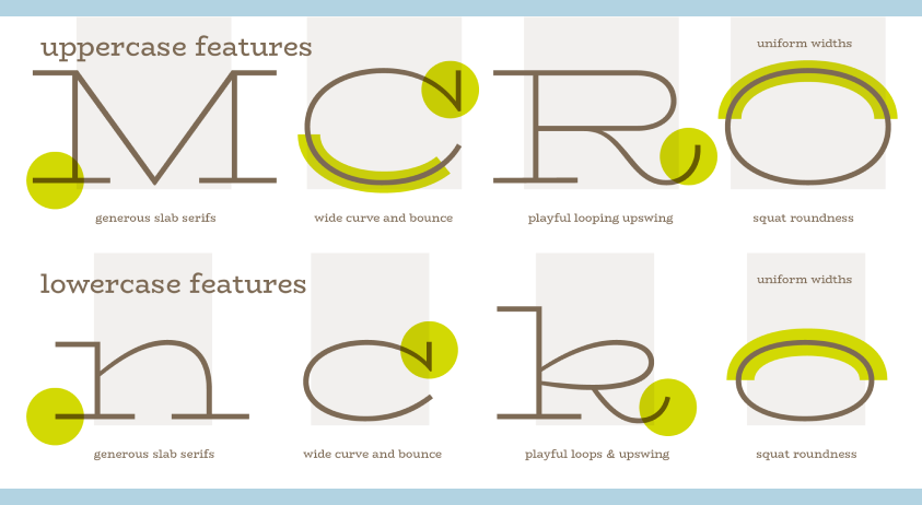
About BioRhyme
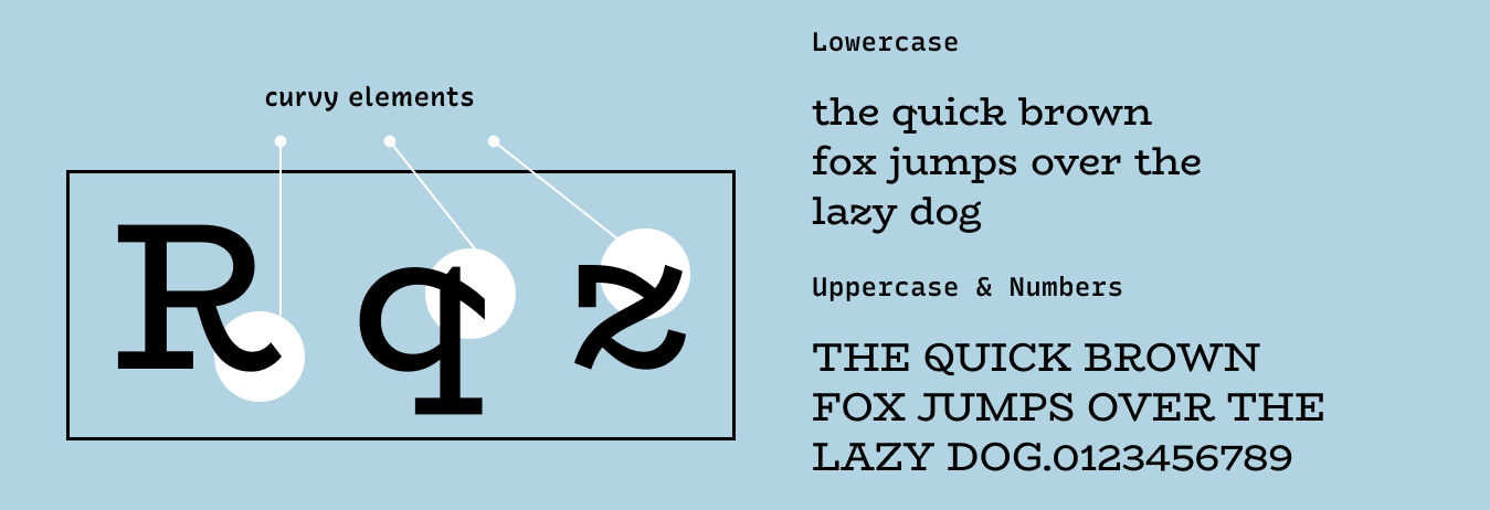
If you are looking for a font with a beautiful organic shape, look no further than BioRhyme. BioRhyme is a slab serif with graceful curvy details that are rare in a slab serif font. These curvy elements, like the curves in the tails of the uppercase “R” and the strokes in the lowercase “z,” make BioRhyme looks extra elegant and inviting to the audience.
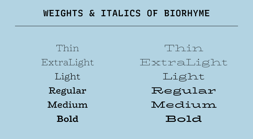
Font Details
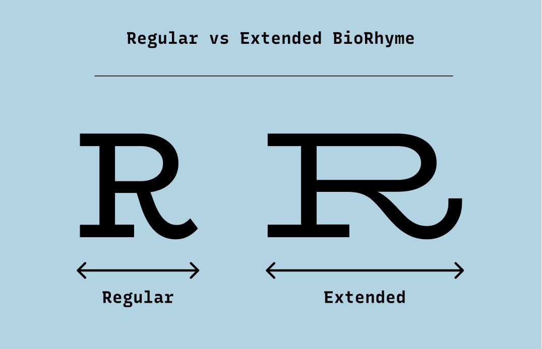
Available in regular and extended width
Curvy elements
Each width has five weights with no italic styles
How to use BioRhyme for logo?
Both widths of BioRhyme, at heavier weights, like bold and semibold, are great for logos. My favorite is BioRhyme extended because it is extra attention-catching and elegant.
How to use BioRhyme for marketing and branding?
BioRhyme comes in two font widths: regular and extended. Regular is the more standard letter width, which is great for headers, whereas extended width is much wider and perfect for making attention-grabbing bold copy statements.
Design Idea of the Week
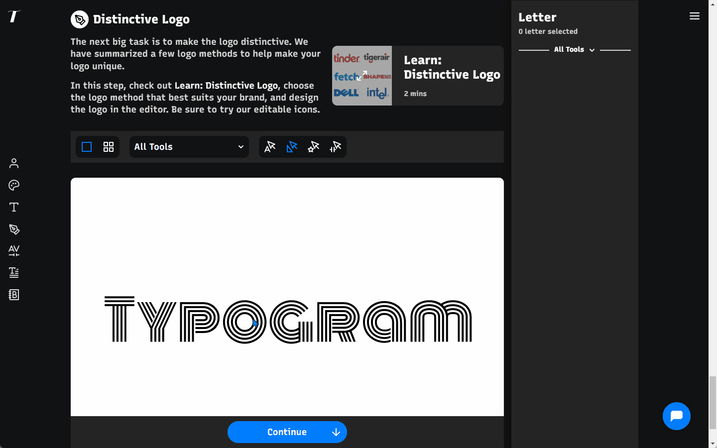
Typogram Launch!
We finally launched our little logo design tool. You can now create a free account to try out our features! One of our proudest features is the icon swap. Choose a letter or a partial shape within a letter, and then click on “Swap with Icon” to experience the magic. And we currently support three types of icons:
Editable icons: A Typogram specialty, designed and developed in-house and exclusive to our app.
Regular icons: Large and searchable sets of traditional icons
Bring your own icon: We support bringing your own icon via SVG code, adding flexibility. (Note: the icon should have filled path)
Color Inspiration of the Week
Oslo, Norway
This week, Enjoy colors from Oslo, Norway.
Baby Blue #B2D3E2 | Alloy Orange #C68B3D | Basil #A5BB67 | Wood #846B5F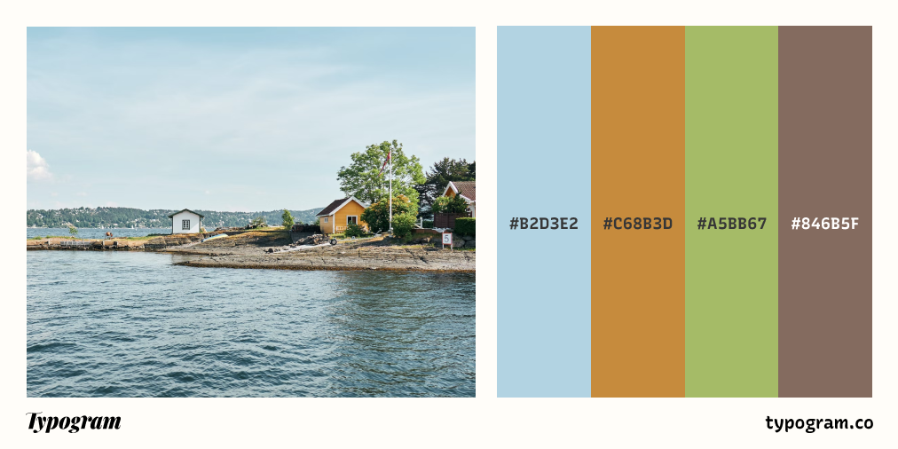
Typography Jargon Buster!
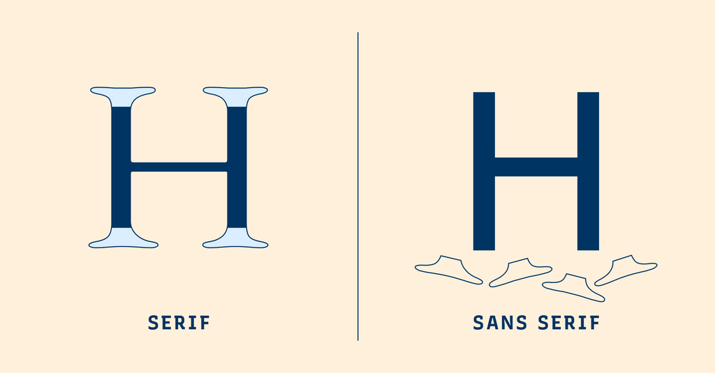
Serif Typeface
Serif typefaces are letterforms with small lines or strokes, or “serifs,” attached at the end of larger strokes. Serif typefaces originated from inscriptional lettering: Words were first painted with a brush, then carved into stones in Roman antiquity. Serifs are classified into several smaller categories: Old Style, Transitional, Modern, and Slab Serif.
Creative Prompt
Create something with BioRhyme.
Thank you
…for reading and hanging out here this week! Check out BioRhyme.