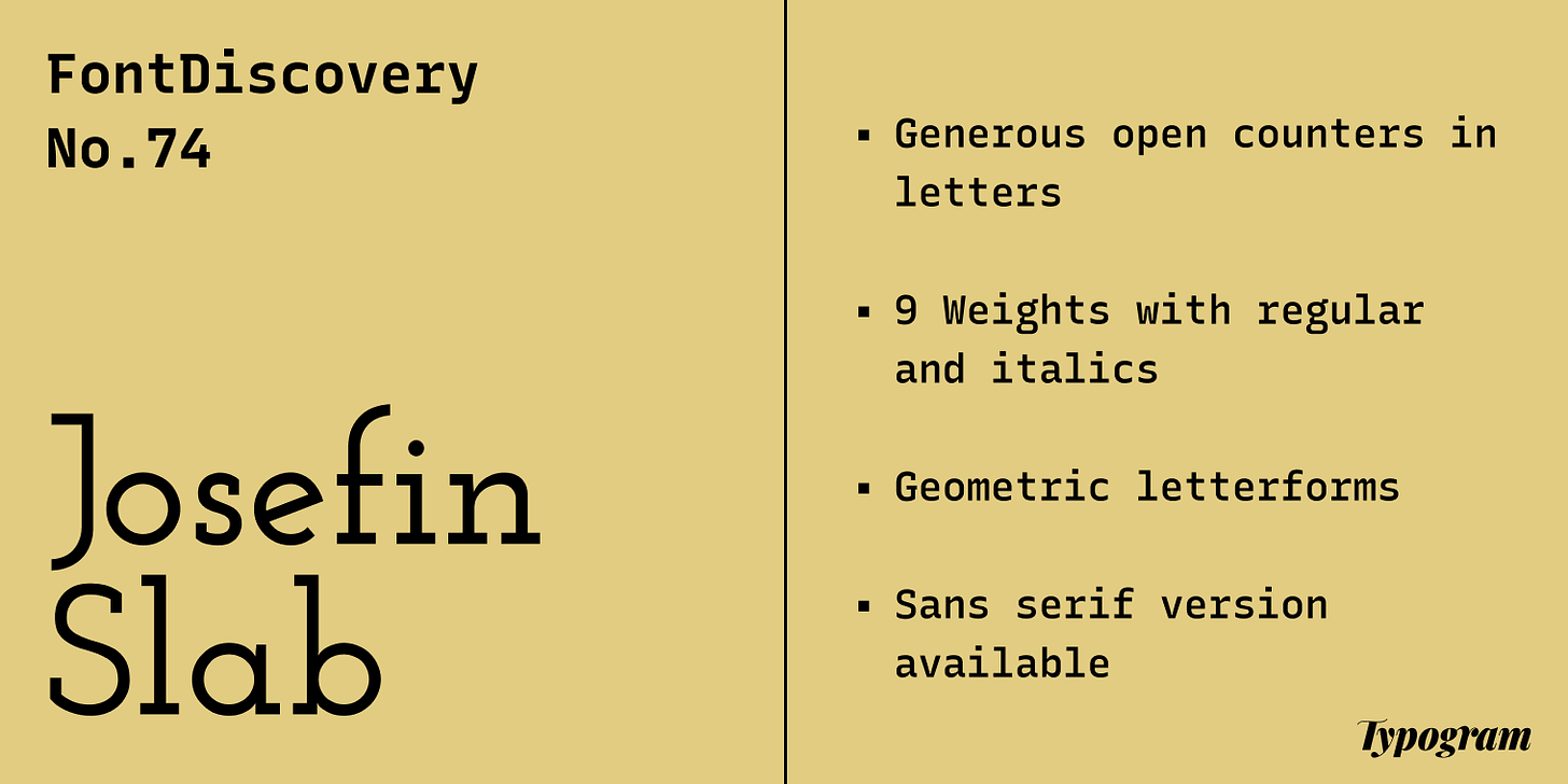
Josefin Slab is a delicate, elegant slab serif perfect for speaking in an elegant tone. A slab serif is a serif font with large, block-like serifs.
Compared to Zilla Slab, a slab serif we have featured in the past, Josefin Slab is more dainty and graceful. Visually, its letter shapes are geometric rather than calligraphic. They are representations of beauty ideals like the perfect circle, giving Josefin Slab an extra vibe of classicalness. In addition, large open counters in lowercase letters signify an easiness and grace.
Font Details
Generous open counters in letters, like “f” and “g”
Nine Weights split with regular and italic versions
Josefin Slab is perfect for logos looking to appear elegant. Avoid using lighter weights. Use Bold Weights starting from SemiBold so that the shape of letterforms doesn’t break under small scales.
How to use Josefin Slab for Marketing and Branding?
Josefin Slab is great for header-size text and call-out copies in marketing. It has multiple weights, allowing you to make eye-catching designs. If you want to use Josefin Slab for body text, try its sans serif counterpart in the same font family, Josefin Sans. Josefin Slab and Sans pair perfectly for an elegant look and feel.
Josefin Slab used on exhibition graphics, source: FontsInUse
Josefin Sans as the logo typeface for a Belgium luxury jewelry brand, source: FontsInUse
Design Idea of the Week
Interactive Typography Jargon Buster: Serifs Styles You Must Know
The newest typography jargon buster is out! This time, I created an x-ray-like effect to illustrate these terms. Mouseover the graphic will allow users to uncover and examine parts of the letter. Check it out, and let me know what you think!
x-ray effect to illustrate our serif terms
Color Inspiration of the Week
Baroque Palette
This week, enjoy this fine art palette from the painting The Milkmaid by Johannes Vermeer.