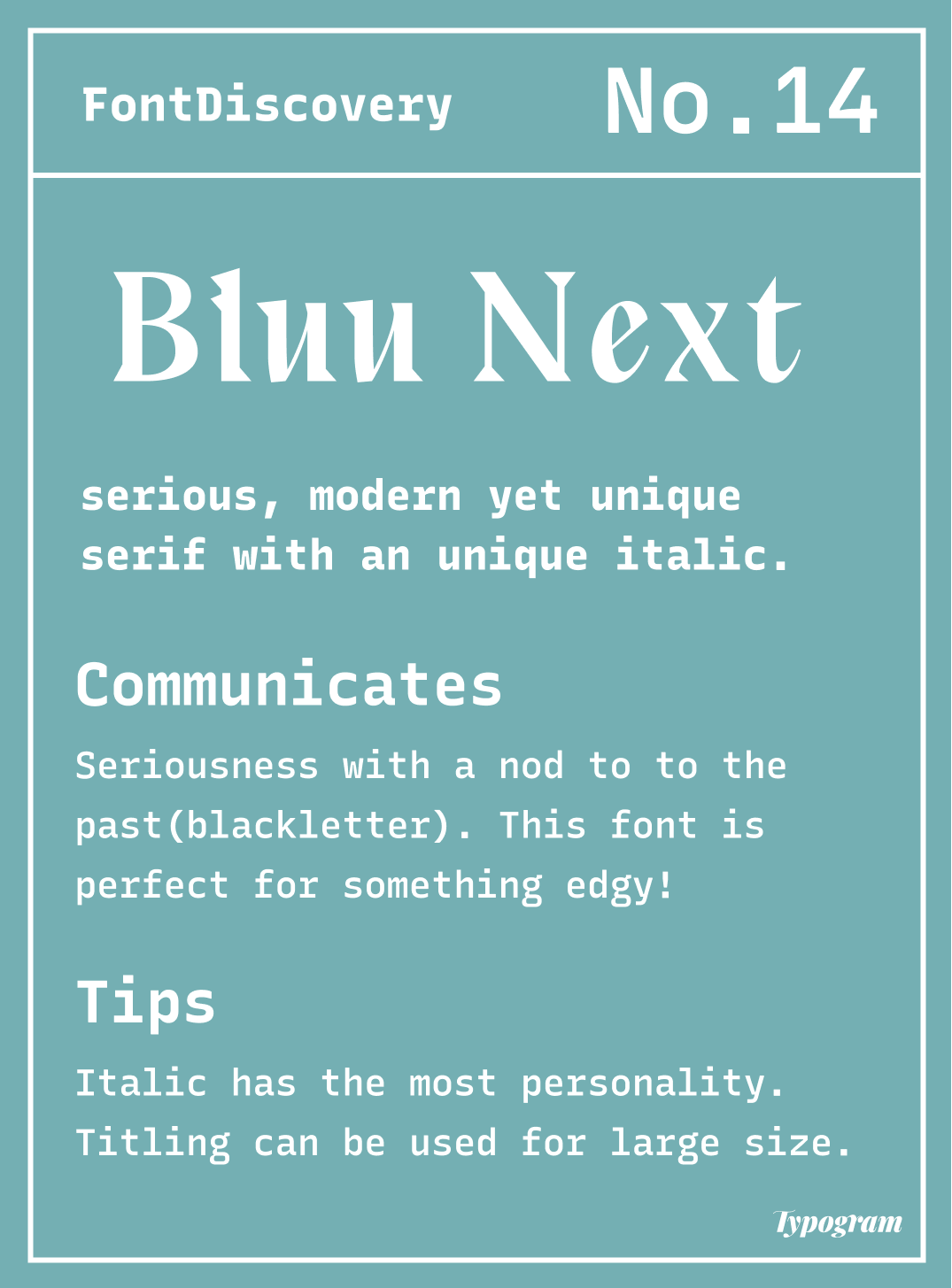
Reviewing Bluu Next: An Edgy Serif for Your Creative Needs
In this issue...
How to Use Bluu Next for Logo and Branding

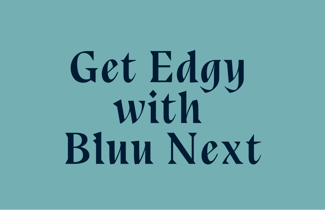
The Edgy Bluu Next
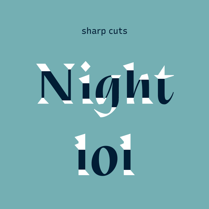
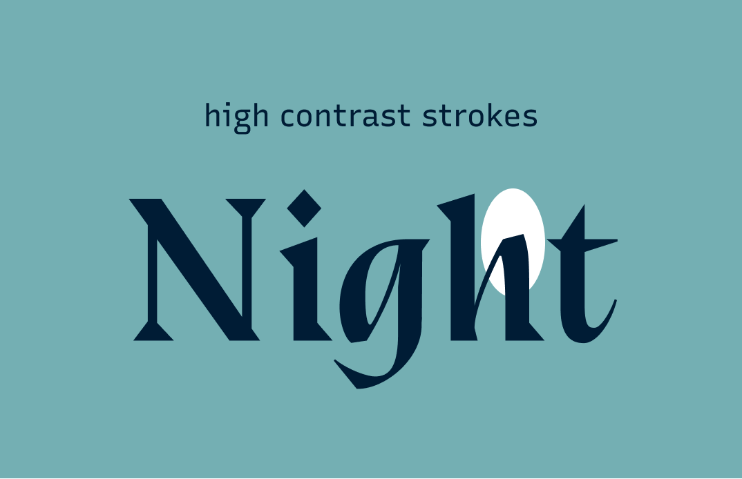
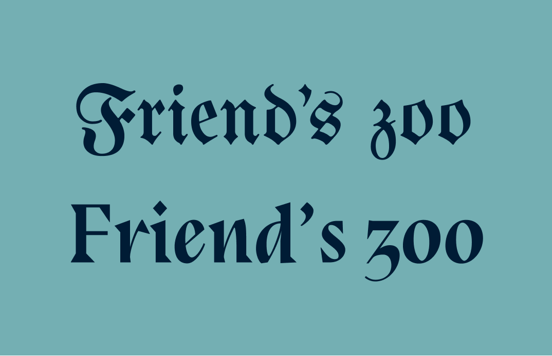
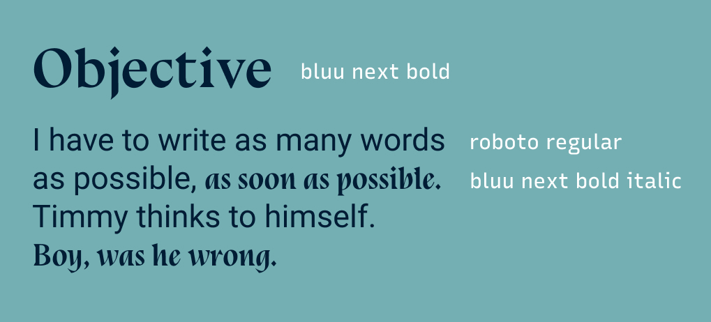
There is an edgy quality about Bluu Next, especially the Bold Italic. It lacks the slant that italics typically have. Each letter also has many sharp and precise cuts. The high contrast ink pen-like quality gives us a subtle hint of Blackletter. You can catch the influence of Blackletter in this font's lowercase letters, like "z" Combining styles of the older style like Blackletter with a newer style like serif gives this font a rhythmic, refreshing voice that is serious, unique, and a little edgy.
How Should I use it for Branding?
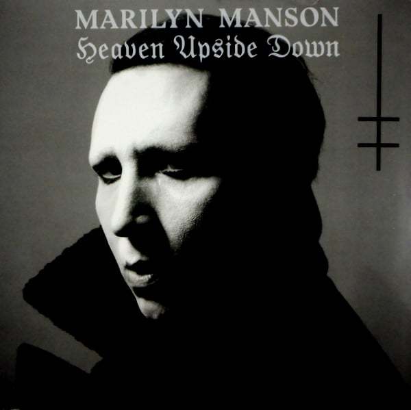
Compare Bluu Next Bold Italic with Playfair Display, and you will see Bluu Next Bold Italic's distinctive voice right away. The sharp cuts on the letter make Bluu Next stand out. This font is perfect for a brand that is edgy and serious.


How Should I Use it for Marketing?
As you can see, its contrasty strokes make it fitter for headers on your landing page or marketing materials. Because it's a little eclectic, It is best paired with a plain sans serif, like Roboto, to balance out its quirks.
We haven't talked about the regular versions.
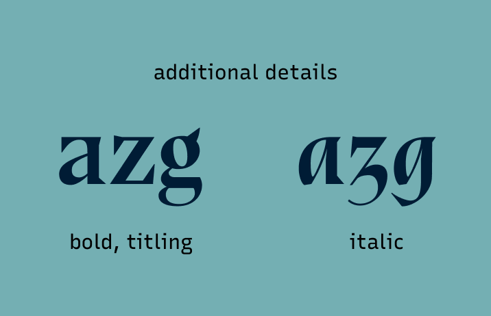
The regular version of Bluu Next comes in Bold and Titling. Both are more serious, slightly less "edgy" than the Bold Italic. Both are suited to editorial storytelling. Tilting has more contrast in stroke width than Bold. Its thinnest and thickest strokes are more exaggerated than Bold, producing an enhanced visual effect that is more suited for displaying bigger font sizes.
If you have a longer and smaller text, use Bold. If you have just a few words in large sizes, use Titling.
How to use Bluu Next for Logo & Branding
- Bold Italic communicates serious, edgy, modern
- Bold style is more serious, modern, and less edgy
Font Details
- Sharp, precise cuts on Bold Italic and regular versions
- Hint of Black letter influence on Bold Italic, like “z”
- Single story “a” and “g” makes this Bold Italic a true italic
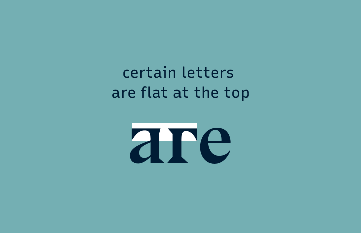
- Flat tops in some letters in Bold weight
Typography System
(marketing, presentation, and website)
- Header or subhead for Bold and Bold Italic
- Extremely large sizes (like the cover of a presentation) can use Tilting
- Pair with a more “plain” sans serif, like Roboto
Cautiously Avoid
Avoid making a whole paragraph in bold. Reading a lot of bold text can get overwhelming. Try just bolding one key sentence or a few keywords, or better yet, recreate the paragraph as bullet points.
Phew. This is the end.
You can download Bluu Next here.