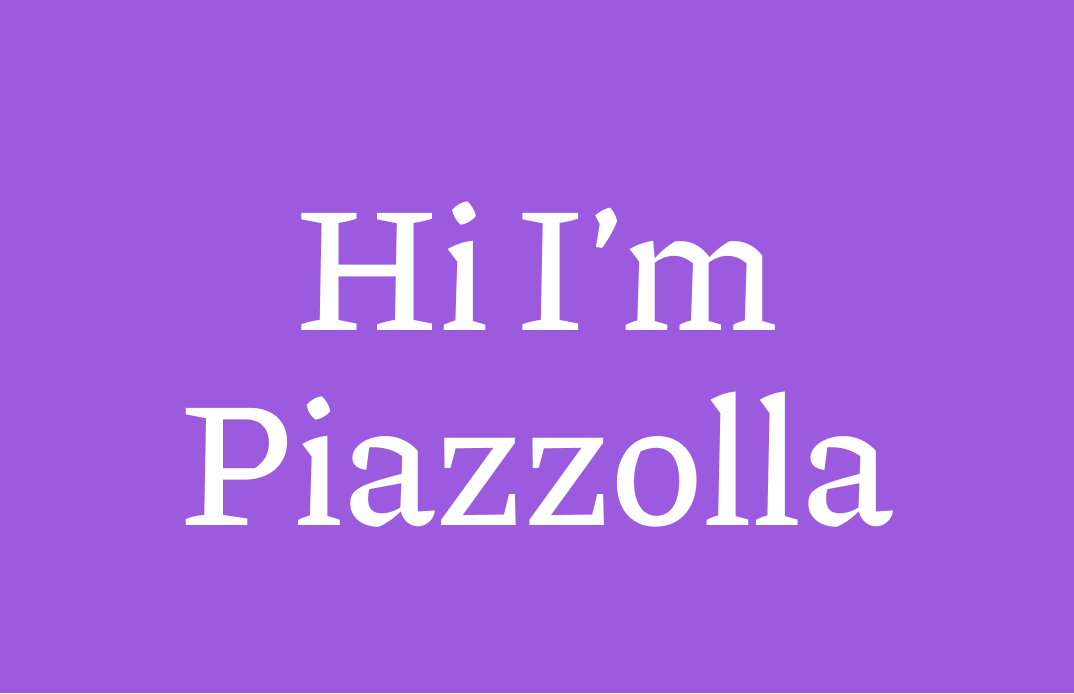
Reviewing Piazzolla: A Serif Font with a Modern Twist, Perfect for Blogs and Publishing
In This Issue…
How to Use Piazzolla for Logo and Branding?
Serif Traditions
Serif lettering originates from inscriptional lettering created by the Romans. The Romans were great at making things with stones -- sculptures, architecture, carving texts into buildings -- you name it, they built it. The letter outlines were first painted onto the stone, and then the stone carver followed the brush marks. The flares carvers made at the end of the stroke and corners became the serifs you see now.


Serifs are usually considered classic, serious, and proper. Piazzolla is all of those things, but with doses of energy. The tension between the straight edges and curves gives this serif trendy and updated vibes. As a serif, Piazzolla is classic, serious, but with a fun, lively touch.

How to Use Piazzolla for Logo and Branding?
Logo
Piazzolla is great for logos. But remember it has a trendy, energetic tone. If your brand is classic but geared towards a younger audience, why not give Piazzolla a try?
Typography System
This typeface has so many weights, which means it can be used in a variety of sizes, as header, subhead, or body.

Cautiously Avoid
Don’t clutter your design with a bunch of bold, capitalized texts. It overwhelms your audience.
Thank you
Piazzolla is available on Google Fonts. Have a nice week and see you in the next issue!
