How to Use Farro: A Modern Sans Serif With a Human Touch

In This Issue…
How to Use Farro: A Modern Sans Serif With a Human Touch
- Font of the Week: Farro
- Color Inspiration of the Week: Wild Lavender
Font of the Week
About Farro
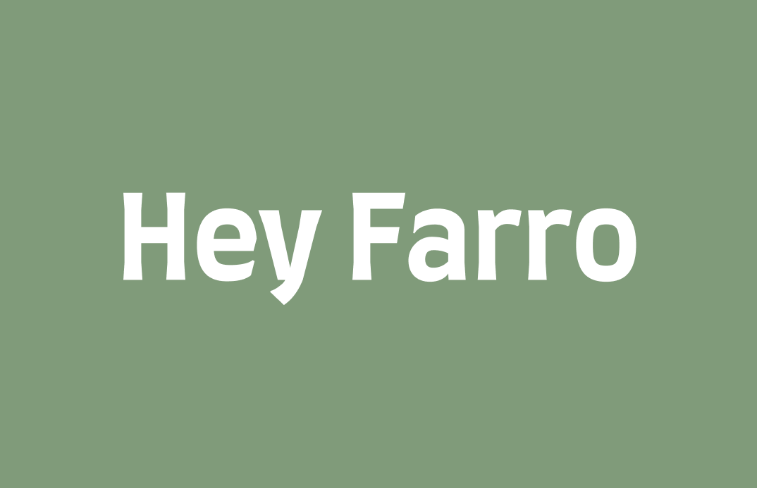
Farro is humanist sans serif mixing calligraphy and modern influences. Its strokes slightly flare out at the end, almost like bellbottom jeans. This characteristic makes the font tone more conversational, casual and welcoming to the eye. It's common to see fonts like Farro used as marketing and signage for events and local businesses.
The letter details in Farro confirm this relaxed tone. Though Farro is Humanist Sans Serif, it has a modern-looking, single-story g to showcase its business-casual attitude.
Font Detail
- Shallow, single-story “g”
- The letter strokes are thicker, giving Farro a bold appearance
- Four weights in regular


Specific Usage Tips
How to use Farro for logo?
Farro is excellent for logos that want to appear formal but with a hint of casualness. It is perfect for projects in traditional topics or spaces, like investing or publishing, with a modern twist or unique angle.
How to use Farro for marketing and branding?
Though Farro has relatively good readability, it works better as a display font because of its visual quirks. Try using Farro at large sizes for call-out copies on your projects.
Color Inspiration
Wild Lavender
Soft Blue #C99697|Pidgeon #D0D5D9|Moss #809B7A|Lavender #ADA1B9
Typography Jargon Buster
Descender
The part of a lowercase letter that goes below the baseline.

Want more? check out the jargon buster glossary page.
Creative Prompt
Create something with Farro!
Thank you
…for reading and hanging out here this week! Farro is available here.


