Reviewing Fredoka One: Round Sans Serif With a Friendly Tone
In This Issue…
How to Use Fredoka One for Logo, Branding & More
- Font of the Week: Fredoka One
- Design Idea of the Week: Unicode
- Color Inspiration of the Week: Holiday Pine

Font of the Week
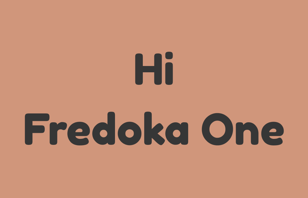
Fredoka One Overview
For letters with rounded caps, we have covered Nunito and Dosis. Today, we’ll meet Fredoka One. Fredoka One is an ultra-bold and round sans serif that speaks to a sense of cheerfulness and bounciness. Compared to these two fonts, Fredoka one is much heavier in font-weight and more cheerful. Its joyful voice reminds you of fonts that you see in children’s books, child products, or sweet and “cheery” food brands like Dunkin Donuts.

Font Details
- Extra bold stroke width and rounded caps
- Only available in one weight


How to use Fredoka One for logo?
Fredoka One is a good logo font. It is bold enough to view in small size without the shapes, especially the counter spaces, like the small spaces inside the“e,” breaking down. It communicates cheerfulness. Its thickness makes this font extra inviting to read. A bonus tip: increase letter spacing to help the letters become more legible and visually pleasing.
How do I use Fredoka One for marketing and branding?
Fredoka One is playful and eye-catching for branding and marketing while inviting to audience. It is best to be used sparsely and for attention-grabbing copies. It is perfect for Social posts, wrapping paper, t-shirts, and showpieces graphics. Since Fredoka One is a display font, it is not suitable for body text. Its boldness comes across as bulky and not reading-friendly in paragraphs at the reading size.


Design Idea of the Week
Emojis Usage Trend
This week I was delighted to discover Jennifer Daniel's newsletter about Emojis and Unicode Consortium, a nonprofit organization responsible for digitizing the world’s languages and maintaining them.
In this post, she talked about which emoji gets the most used and which the least in 2021, and guess what? My favorite, "Tears of Joy" isn't dead! (Apparently, this emoji is what divides Millennials and GenZ according to GenZ Tiktokers).
Another thing that surprised me is the least usage of country flags, which I thought sports fans would totally use like crazy. This article was a fabulous read and really made me think of how people communicate.
Color Inspiration of the Week
Holiday Pine
This week, please enjoy the colors of pine cones!
Tree Truck #693B2C | Plan Beige #D0967B | Seaweed #2D3329 | Soft Mint #93AC96
Typography Jargon Buster!
Cap Height
The height of capital letters from the baseline.

Creative Prompt
Can you create a holiday card with Fredoka One?
Thank you!
Thanks for being here for another week. Fredoka One is available here.
