Reviewing JetBrains Mono: A Beautiful Versatile Coding Font Perfect for Branding
How to Use JetBrains Mono for for Logo, Branding & More
In This Issue…
- Font of the Week: JetBrains Mono
- Design idea of the Week: Psyche
- Color Inspiration: Trondheim, Norway
Font of the Week
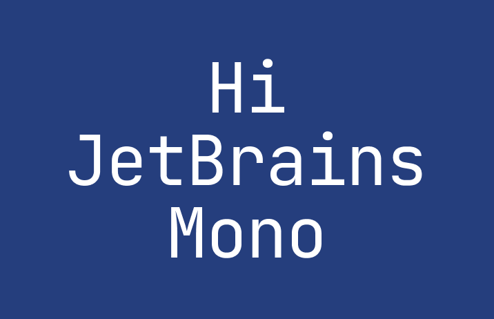
About JetBrains Mono
For the engineers and developers out there, JetBrains Mono is one great coding font with italic and programming ligatures, perfect for any IDE (interactive development environment).
JetBrains Mono is one of my favorite open-sourced fonts for programming. As compared to Victor Mono, JetBrains Mono is much more subtle in terms of styles –– it is devoid of any decorative element and designed strictly to be utilitarian and optimized for reading numbers and letters for code and formulas. One key feature is that the lowercase letters have maximized height. This feature reduces the length of code displayed in the editors, making the code and complex more comfortable to read.
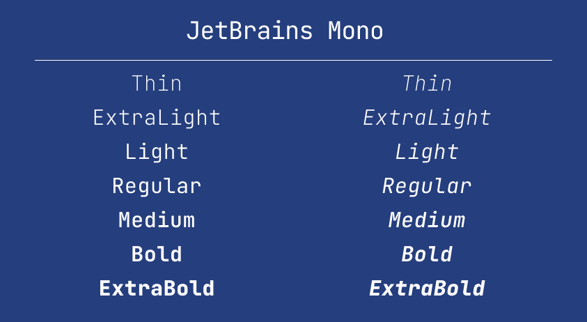
In addition, JetBrains Mono has eight weights, with italic versions, which is perfect to explore for branding, and more advanced information hierarchy systems for blogs, data display, and app interfaces.
Font Details
eight weights with italic versions
maximized height in lowercase letters
How to use Jet Brains Mono for branding?
JetBrains Mono has a neutral tone. Visually it is devoid of decorative, individualistic elements making JetBrains Mono perfect for brands requiring objective and utilitarian voice.
How to use Jet Brains Mono for marketing?
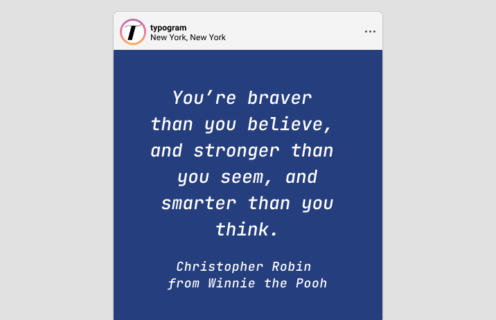
Available in eight weights, and optimized for reading, JetBrain Mono is perfect for typography systems on blogs and labels, UI text for app interfaces. The italic looks muted but distinct enough and make italicized text, like quotes, stand out while not breaking the reading flow.
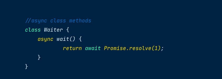
JetBrains Mono as a coding font…
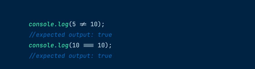
A quiet rebel, JetBrains Mono’s italic is more muted than all the coding fonts we have covered to minimize reading disruptions. JetBrains Mono uses true italic construction for only three of its letters, “a”, “y”, and “f”, and features a small degree of slant. JetBrains Mono features an excellent set of ligatures for programming to reduce the noise of multiple letters in your code.
Design Idea of the Week
Psyche
Yesterday was National Mental Health Day. This week, take some time to support wonderful varieties of humans. I personally enjoyed this article about running, and how it benefits our mental health.
Color Inspiration of the Week
Trondheim, Norway
Royal Blue #253E7D | Lapis Lazuli #315E8E | Spruce #4C6569 | Vancouver #E0EAF4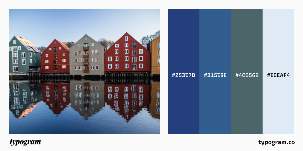
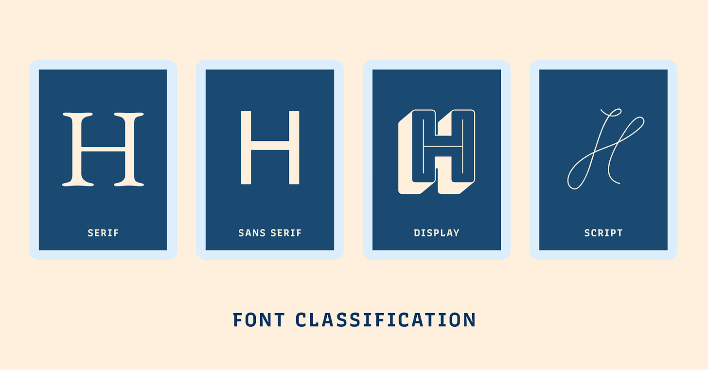
Typography Jargon Buster!
Font Classification
Fonts are commonly classified into four main categories based on their appearance. These categories are –– fonts with serifs (Serif), fonts without serifs (Sans Serif), fonts with highly decorative characteristics (Display), and font that looks like handwriting (Script).
Want more typography jargon buster? Check out this post!
Creative Prompt
Create something with JetBrains Mono.
Thank you
…for reading and hanging out here this week! JetBrains Mono is available here.
