How to Use Italiana: A Elegant Font Perfect for Branding
In This Issue…
How to Use Italiana for Logo and Branding
- Font of the Week: Italiana
- Design idea of the Week: Reddit Go Dark
- Color Inspiration of the Week: California Palms
Font of the Week
About Italiana
In the past issues of our newsletter, we have covered many display fonts, like Playfair Display and Bluu Next.
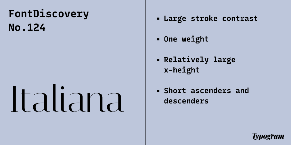
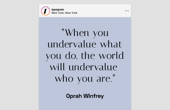
In this issue, we are introducing Italiana, a fantastic font inspired by the calligraphy of Italian masters. Though the designer didn’t name a specific influence, the font reminds me of the works of Italian calligraphers like Giovanni Battista Palatino, who inspired Palatino, a favorite font for many inside Microsoft Office.
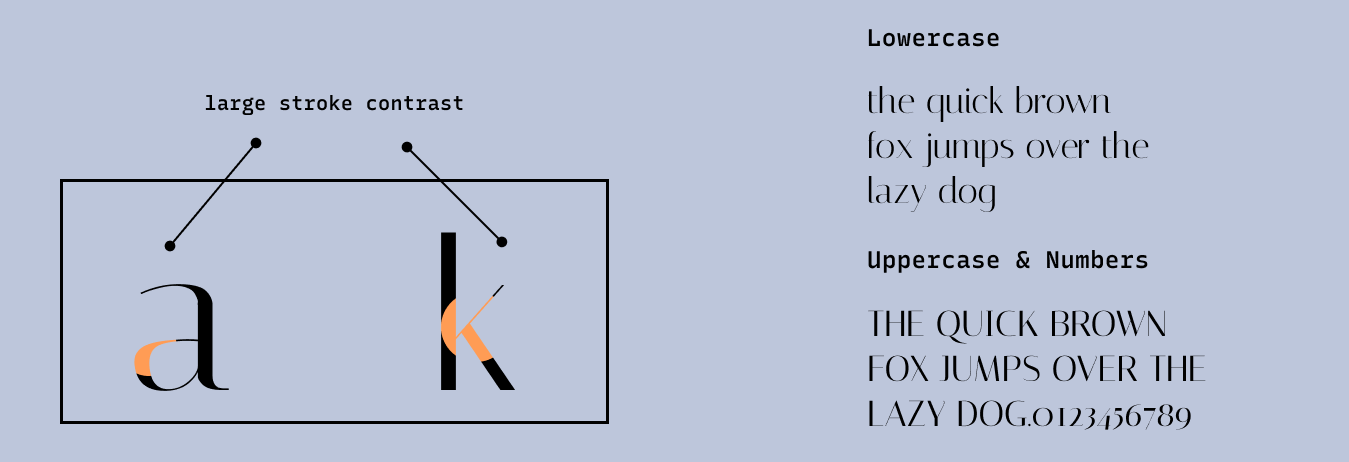
Italiana’s significant stroke contrast, gentle curves, and large x-height create a sleek, elegant vibe so aesthetically pleasing to the eye. It is a fantastic display font with a graceful sophisticated tone.
Font Details
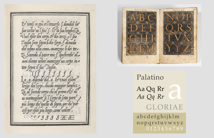
Large stroke contrast
One weight
Relatively large x-height
Short ascenders and descenders
How to use Italiana for logos?
Italiana’s graceful tone is great for a brand targeting elegance and sophistication. The only thing: since there is only one font-weight: watch out for thin parts of the letters disappearing at smaller sizes. It could be helpful to add a stroke outside the letter to help with legibility.
How to use Italiana for branding and marketing?
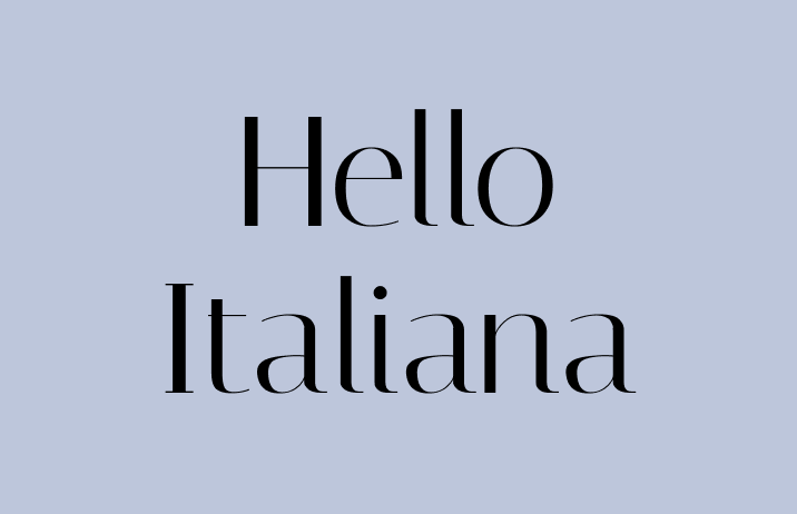
Italiana is a display font perfect for headers for graphics and invitations. The font is readable, and the letters’ elegance shines through in header sizes; just make sure the thin strokes of the fonts are not disappearing.
Design Idea of the Week
Reddit Goes Dark
Reddit is one of my favorite sites to check daily and hosts many of my favorite internet communities. Because of the presence of many popular third-party apps(many are used to browse Reddit and make the experience better on Mobile), recently, Reddit started charging money for the usage of its API (i.e., Reddit’s code third-party are using), which effectively makes many of these popular third-party apps too expensive to run.
To protest this, many communities on Reddit start going “dark,” as in temporarily offline, to protest the developer fee. It’s a fantastic way to show solidarity with indie apps. Check out more here.
Color Inspiration of the Week
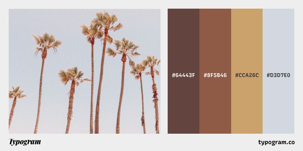
California Palms
This week check out amazing summer colors from California!
Typography Jargon Buster!
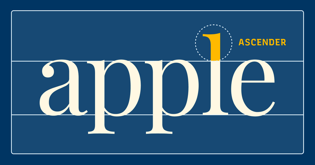
Ascender
An ascender is a vertical stroke of a lowercase letter extending upwards, beyond the x-height, sometimes beyond the cap height. For example, “h” is a lowercase letter with an ascender. In general, typefaces having long ascenders and descenders help with readability. Long ascenders help make a lowercase more distinguishable as long as the other parts of the letters are legible.
Want more typography jargon buster? Check out this post!
Creative Prompt
Create something with Italiana.
Thank you
…for reading and hanging out here this week! Here is Italiana.
