Reviewing Luckiest Guy: A Cheerful Font for Marketing
In This Issue…
How to Use Luckiest Guy for Logo, Branding & More
- Font of the Week: Luckiest Guy
- Design idea: No Code Automation
- Color Inspiration: Summer Fields

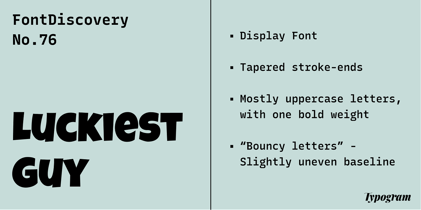
Font of the Week
About Luckiest Guy

Font Details
- Tapered stroke-ends
- Mostly uppercase letters, with one bold weight
- “Bouncy letters” - Slightly uneven baseline


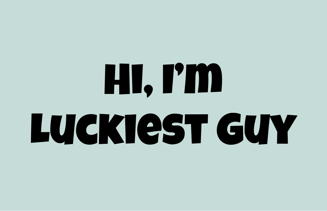
How to use Luckiest Guy for logo?
Luckiest Guy has a cheerful, retro vibe. It only has mostly uppercase letters (it has a few lowercase letters like “e”, and “m” ). If you create logos with Luckiest Guy, make sure the white spaces in letters like “E” are visible on small scales.
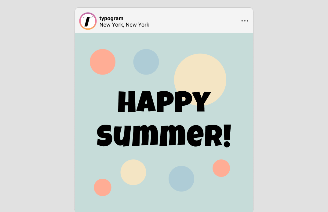
How to use Luckiest Guy for marketing and branding?
Because Luckiest Guy is very bold, It is best on marketing graphics and call-out copies. Its boldness and retro and jovial tone make this font very distinctive; therefore, avoid using it for multiple headers or overusing it on a web page.

Design Idea of the Week
No Code Automation
I know I shouldn’t have, but I started a new writing project 😆 ! I have been itching to share more about my behind-the-scenes process of running this newsletter and Typogram using no-code tools and automation. For example, budget-friendly and organizational things I have learned to make managing this newsletter and other projects easier!
I just published my first blog post about a feedback collecting system and automation I have set up. If you are interested in Notion or no code to improve your workflow, or if you run a newsletter, it may be helpful.
Color Inspiration of the Week
Summer Fields
This week, enjoy this color palette from summer fields!
Coral #FF8461 | Butter #F4D389 | Mint #C6DCD9 |Powder #AECCD6
Creative Prompt
Create something with Luckiest Guy.
Thank you
…for reading and hanging out here this week! Luckiest Guy is available here.