How to Use Alegreya: A Font with Multiple Styles Perfect for Blog and Newsletters
In This Issue…
How to Use Alegreya for Logo, Branding & More
- Font of the Week: Alegreya
- Design idea of the Week: Best and Worst Headshots
- Color Inspiration of the Week: July Fireworks
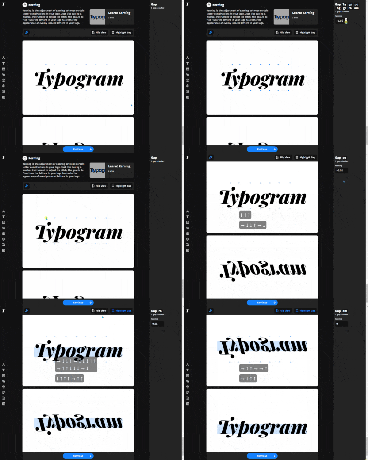
Also, we recently shared a build update for Typogram on the blog! We managed to ship several key features to our app like kerning (letter-spacing) and multiple canvases that make designing easier for beginners!
Font of the Week
About Alegreya
In our newsletter, we featured several “super family” fonts, like IBM Plex, and Cormorant.
Alegreya is one of these large typefaces with several styles for you to use for different projects. I like superfamily fonts a lot because it makes it easy to decide how to pair fonts. Especially when it’s a complex project with a lot of text, if the font family has both the serif and sans serif versions - they can pair with each other.
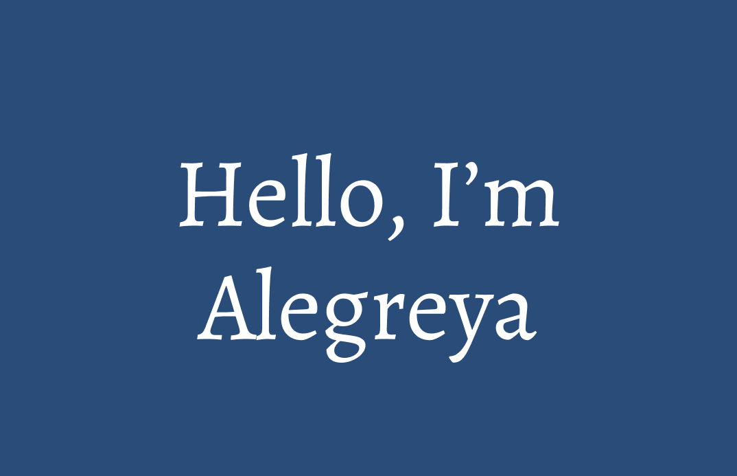
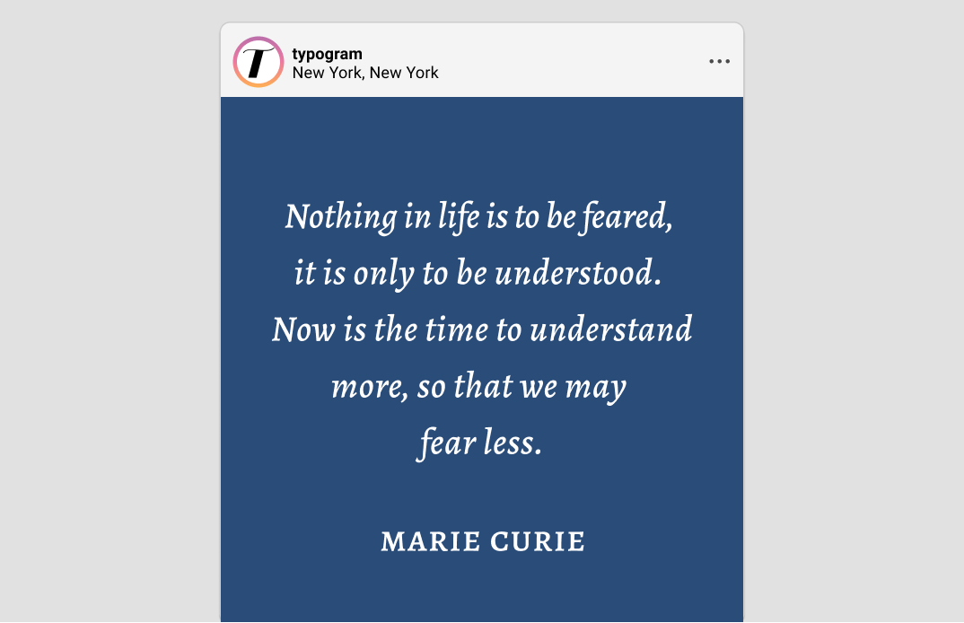
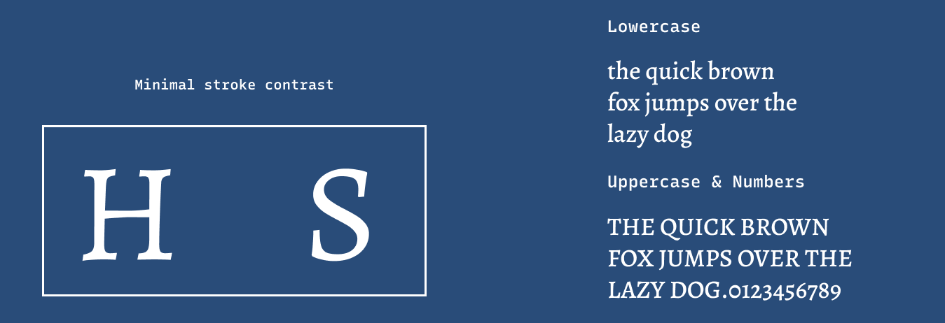
Alegreya is a super font family with several styles. My favorite is the Alegreya Serif, a classic-looking old-style serif with a friendly vibe, perfect for books or blogs. It also has an eye-catching italic with letterforms that looks distinct and complementary to the regular version, which is excellent for emphasizing text. Compared to Cormorant, Alegreya Serif has less overall stroke contrast and is more screen-friendly.
Font Details
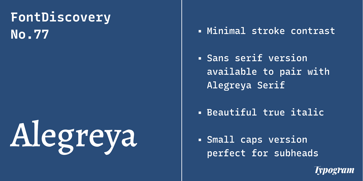
- Minimal stroke contrast
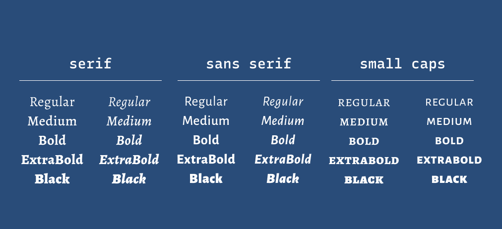
- Sans serif version available to pair with Alegreya Serif
- Beautiful true italic
- Small caps version perfect for subheads
How to use Alegreya serif for logo?
Alegreya is perfect for publishing and editorial projects like blogs, newsletters, books, and publishing. The medium and bold weights are perfect for logos.
How to use Alegreya serif for Branding and Marketing?
Alegreya has serif and sans versions perfect for pairing with each other for marketing graphics, website copies, and presentations. It has enough weights and style to carry a complex typography system by itself.
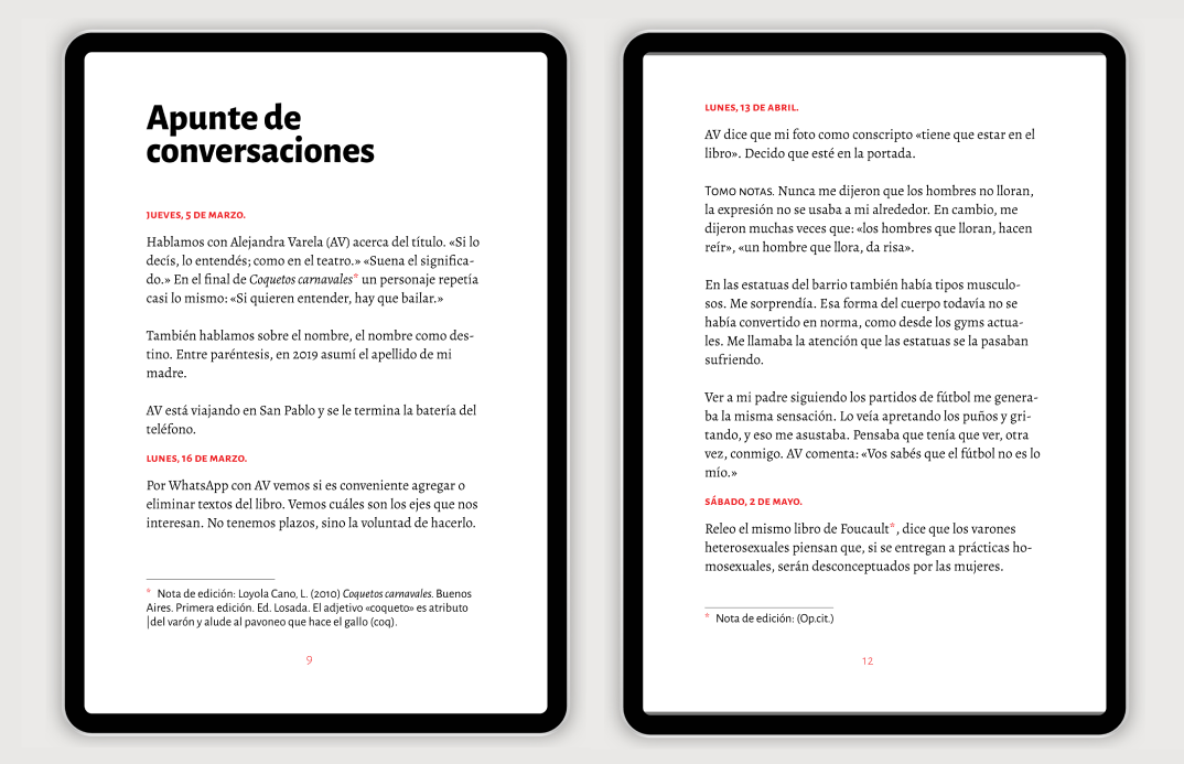
Alegreya being used in an ebook FontsInUse
Design Idea of the Week
Best and Worst Headshots
This week, enjoy this humorous article about fortune 500 CEOs with the best and worst headshots.
Color Inspiration of the Week
July Fireworks
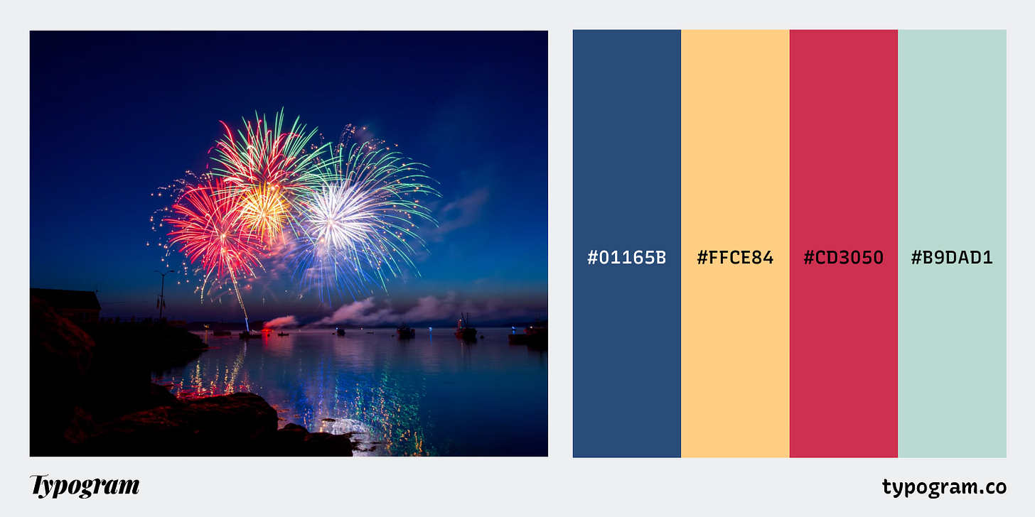
This week, enjoy this summer fireworks color palette.
Navy #01165B | Butter #FFCE84 | Cherry #CD3050 | Mint #B9DAD1
Creative Prompt
Create something with Alegreya.
Thank you
…for reading and hanging out here this week! Alegreya is available here.
