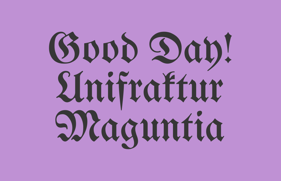
Reviewing UnifrakturMaguntia: Trendy Blackletter Font Speaking Tradition
In this issue...
How to Use Blackletter UnifrakturMaguntia for Logo and Branding
Font of the Week
Way Back When We Blackletter
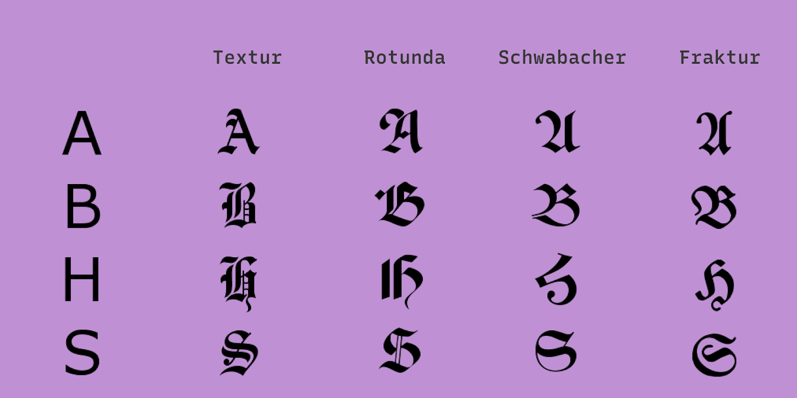
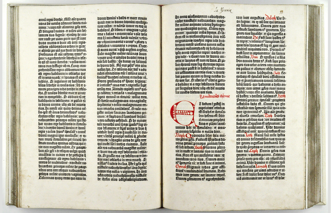
You might have seen a font like this on medieval-themed merchandise. Fonts of this genre are called Blackletter. It is a font style that originated from Western Europe in the 11th Century. There are several “styles” of Blackletter—all of them share common characteristics of sharp angular lines with significant contrasts.
Blackletter is enjoying a resurgence in contemporary visual branding. Brands are putting a modern spin on the traditional Blackletter. Nowadays, we often find it outside of its original, historical context.
As a Blackletter font, UnifrakturMaguntia has a traditional design that brings a specific historic feel. Before using, think about whether it is appropriate for your brand. If you decide to use UnifrakturMaguntia and worry about looking dated, you can combine this font with trendy color combinations and font pairings.
Font Details
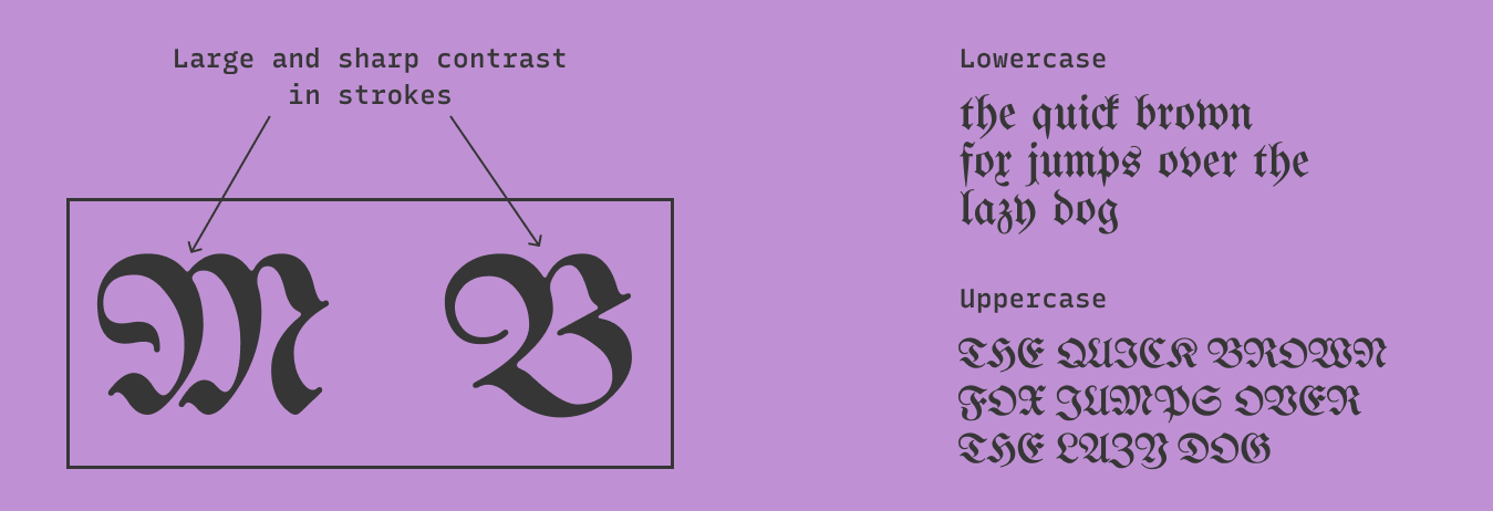
- Large and sharp contrast in strokes
- Uppercase letters are slightly round
General Usage Tips
- More suitable for logo
- Has only one weight
- Avoid using excessively. It is hard to read for marketing copy
How do I use it for logo?
- Communicates history and traditions (from Europe)
- Perfect for brands wanting to emphasize historic, traditional, or artisanal themes
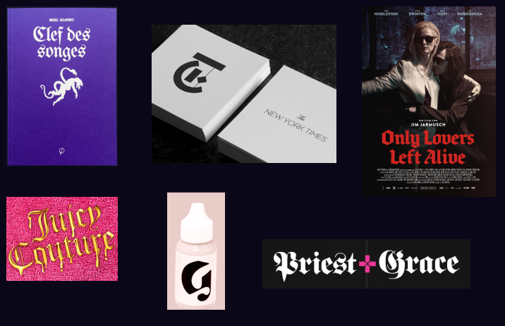
- Some brands used Blackletter for purely aesthetic purpose; for example, Glossier “G.”
How do I use it for marketing and branding?
- It is more suitable for display purposes to wow the audience
- Perfect for Instagram, wrapping paper, t-shirt, showpieces
Design Idea of the Week
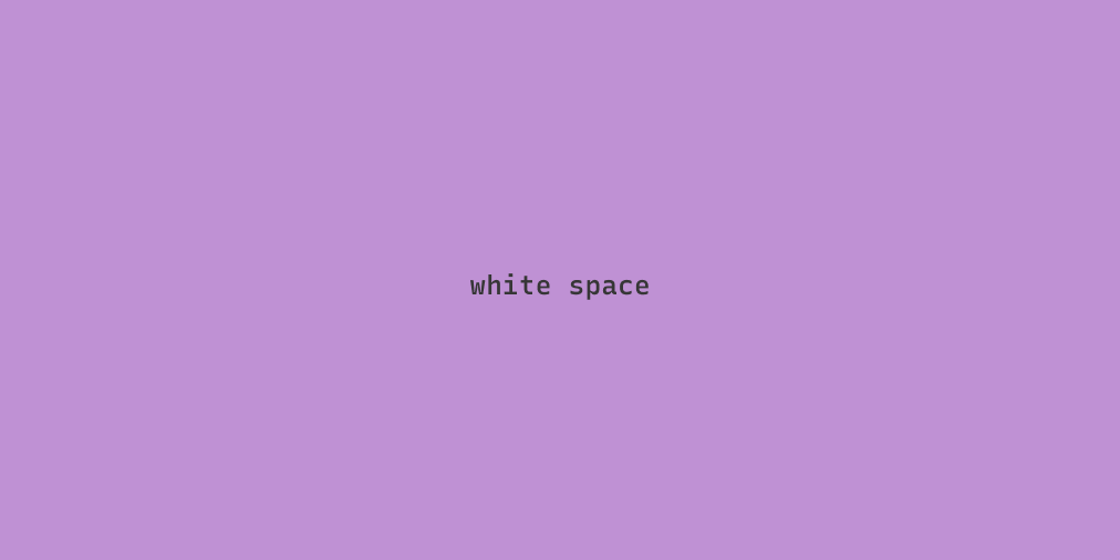
White Space
Renowned design writer Steven Heller once said, “in art as in life, white space is the ultimate luxury.” Inside an art gallery, we see many white walls. This is also true for design. Inside coffee table books, we see layouts with minimal content per page. In many luxury brand websites, we see spacious pages with simple typography. Products are often displayed on a muted gray background to give the illusion of more space. White space is the ultimate signifier of an upscale attitude. It shows that there is plenty of room to spare. It communicates luxury. Can this idea play into your design project?
Color Inspiration of the Week
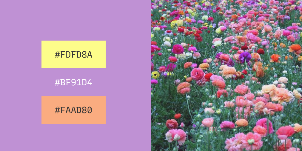
This issue uses colors inspired by Spring.
Creative Prompt
Can you use UnifrakturMaguntia, white space, or this week’s color palette to create a Twitter or Instagram visual for your project?
Thank you
UnifrakturMaguntia is available here.
