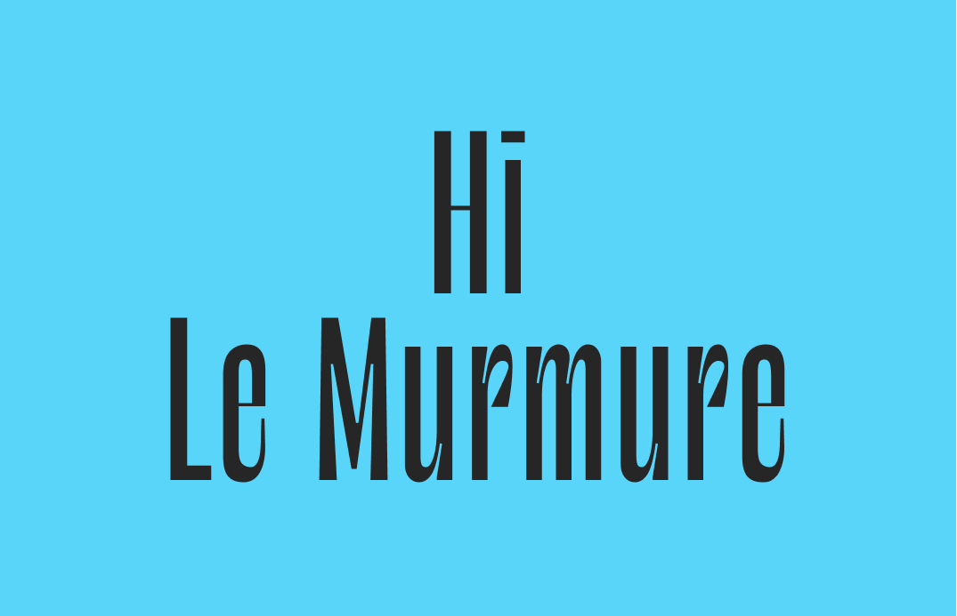
How to Use Le Murmure: A Trendy Editorial Font Perfect for Fashion

In This Issue…
How to Use Le Murmure for Logo, Branding & More
- Font of the Week: Le Murmure
- Design Idea: Now in 3D
- Color Inspirations: Internet art

Font of the Week: Le Murmure
The Power of Modern Serifs
A few posts ago, we talked about Bodoni. Bodoni is a font designed in the late eighteenth century by Giambattista Bodoni, an influential typographer, printer, and publisher. The fame of Bodoni back then was comparable to a pop star nowadays. People flocked down to his studio to watch him design and typeset.
Benjamin Franklin, who was a founding father of US and a printer, wrote Bodoni a fan letter in 1788, praising Bodoni’s work as “one of the most beautiful that Art had hitherto produc’d[produced].” and “should be glad to see a Specimen of your other Fonts besides this Italic and Roman…” (source)
Bodoni’s high contrast characteristics were so popular that they have since then become their own category, called “Modern” (or “Didone”) serifs. Modern serif fonts are darlings of fashion editorial and branding. Fonts like Playfair Display are “Modern” serifs. Magazines brands, luxury publishing houses like Rizzoli, and even blogging platforms like Medium love to use Modern serifs as part of their brands.
Today, our font, Le Murmure, a sharp and sleek font with high contrast, is similar to Bodoni. Rules can always be broken when it comes to creativity. Even though Le Murmure has no serifs, it borrows many characteristics from Modern serif fonts, for example, high stroke contrast.
Font Details
Le Murmure has a high stroke contrast with thin cuts (known as ink traps) and sharp angles in its letters. This unique combo gives this font a clean crispness. Its condensed width, along with the lack of serif, communicates luxury with a trendy vibe. All of these details make Le Murmure a stylish choice when used in larger sizes.
As I am painting my kitchen cabinets lately, I start to re-appreciate the geniuses of ink traps. The small corners always trap ink, be it cabinet or letterform. Ink trap was designed for this, it precuts and leaves extra room for ink to be trapped there, and after ink is trapped, it forms the ideal letter shape, instead of having an ugly puddle of extra ink. I wish cabinets would have ink traps too! Now in digital design, ink trap's practicality may disappear; however, it has become a really nice and unique visual detail.

How do I use Le Murmure for logos?
Le Murmure was originally designed for a design agency’s rebranding. It is now open source for everyone to use. You don’t have to worry about this font associating with its original brand. Since it had gone open-sourced, many brands have used Le Murmure for branding purposes. Le Murmure is perfect for fashion, creative, and editorial brands. It communicates style and luxury.
How do I use Le Murmure for marketing?
Le Murmure is best used for header and subheader sizes, and it is not friendly for body copy. Le murmur can pair with sans serif fonts like Dosis (both condensed) and IBM Plex Sans.

Design Idea of the Week
Now in 3D
If you study trendy illustrations nowadays, you’ll notice many of them are in 3D. Creating things in 3D usually requires knowledge of modeling software, but the availability of 3D illustration packs has made 3D easier to experiment with. If you want to experiment, I found this neat little free 3d pack.
If you still want to explore further, you can use software like Blender (open sourced). If you know javascript, Three.js is a fun 3D library you can explore. These can be a great way to play with 3D, and think about how you can incorporate it into your next project!

Color Inspiration of the Week
Internet Art
Long before Non-Fungible Token (NFT), there was internet art. Internet art was artwork inspired by code, and the “aesthetics of the internet.” Rafaël Rozendaal is a well-known artist in this movement. Most of his works are created with code, and viewers can interact with his artwork through the browser.
Creative Prompt
Can you make a visualization using a 3D heart element?
Thank you
Le Murmure is available here. It is created by Velvetyne foundry, designed by Raphael Bastide and Jérémy Landes.


