Reviewing PicNic: A Striking Visual Display Font Inspired by Water
Update on Typogram!
Recently, we have been working on editable icon for our favorite logo design tool! Having editable icons allow you to quickly manipulate icon through various style axis. Check the mountain icon we have been working on!

In This Issue…
How to Use PicNic for Logo, Branding & More
- Font of the Week: PicNic!
- Design idea of the Week: 4 Emotional Benefits of a Consistent Creative Habit
- Color Inspiration of the Week: Fall in Switzerland

Font of the Week
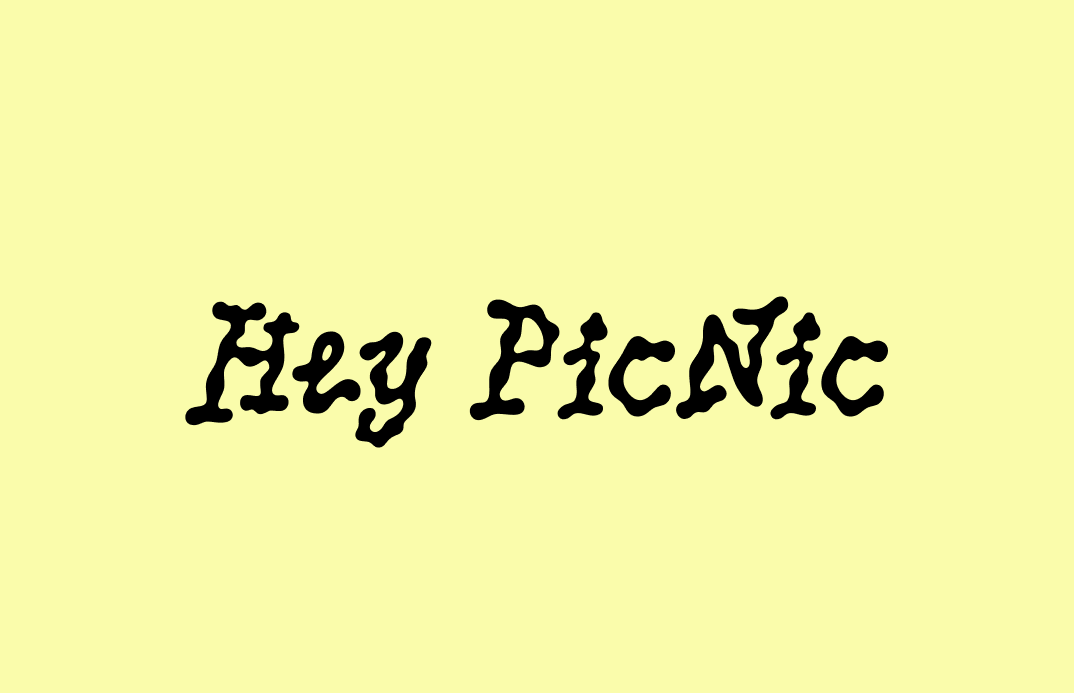
About PicNic
If you need a visual display font, look no further than PicNic, an extremely graphic font creating interesting particle-like visual movements. PicNic is inspired by the way water droplets move on an oilcloth. A similarly styled font we have introduced past is Pilowlava. Like Pilowlava, PicNic has a similar fluid visual rhythm but is much more readable.
 is more readable than Pilowlava")
Font Details
- Swirl, particle-like visual effect
- Slanted, bouncy letters
- One weight
How to use PicNic for logo?
PicNic is perfect for creating funky logos for creative projects. Most of its letters are eye-catching and legible in small sizes.
How to use PicNic for marketing and branding?
PicNic is perfect for creative or artistic projects. The movement created by the letters’ droplet shapes communicates a super eye-catching funkiness. Due to its unique visual texture, it is best used sparingly as a display font in large font sizes.


Design Idea of the Week
4 Emotional Benefits of a Consistent Creative Habit
What if chronic anxiety is our brain signaling to us we are not spending our energy the way we should? This week, learn more about the benefits of having consistent creative habits and the Ikea effect: lasting excitement tends to come from things we proactively and creatively invest in.
Color Inspiration of the Week
Fall in Switzerland
This week, enjoy this fall color palette from Horgenberg, Horgen, Switzerland.
Carrot #F05805|Pumpkin #D58F28 | Moss #73743C | Limeade #C7BF6D
Typography Jargon Buster!
Font Weight
Font weight is the overall thickness of the character relative to their height. Font weight can come in Thin, Light, Regular, Roman, Medium, Semi-Bold, Bold, Black, and Ultra Black. Thin is usually the lightest weight, while Ultra Black is the heaviest.

Creative Prompt
Create something with PicNic!
Thank you
…for reading and hanging out here this week! PicNic is available here.
