How to Use Langar: a Kooky Script Font to Catch Attention
In This Issue…
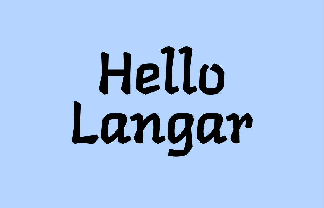
How to Use Langar for Logo and Branding
Font of the Week: Langar- Design idea: Variable Icons
- Color Inspiration: Spring Sakura
Font of the Week
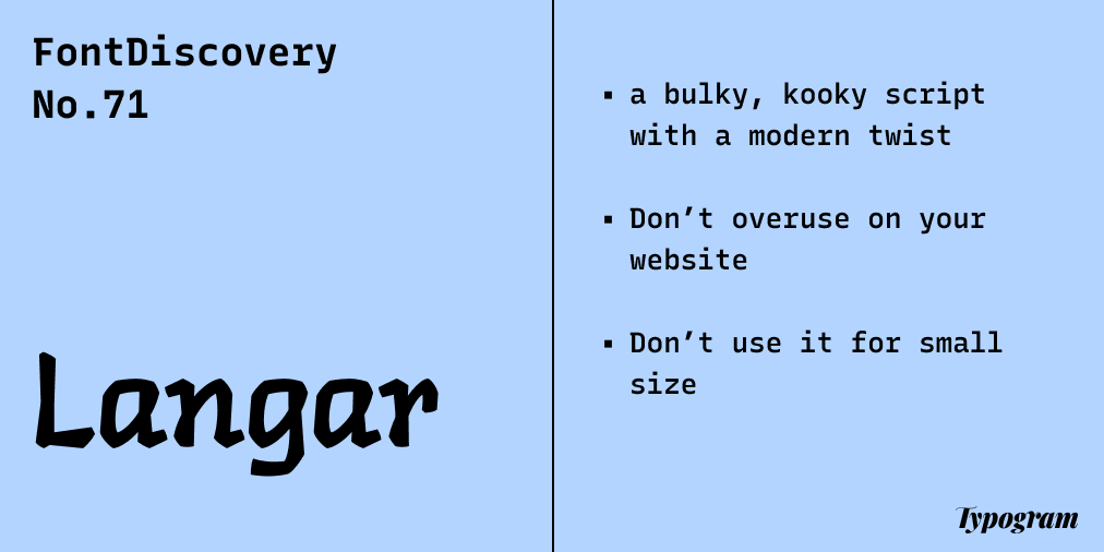
About Langar
Langar is a script font and carries on a modern, kooky tone. In general, script fonts are deeply personal. They are digitized versions of handwriting and bring a personal touch. In the olden days, people wrote calligraphy with a nibbed pen, so most of the scripts were thin and elongated. Some are elegant. Some are crisp and sharp, and some are vintage and decorative.
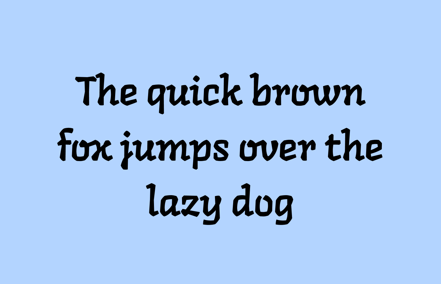
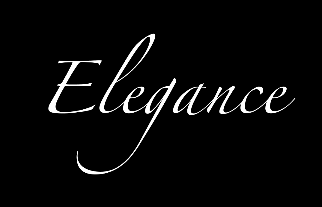
However, Langar looks as if it's written with a thick marker (It takes inspiration from Gurmukhi), which is uncommon compared to the more traditional scripts. All of this tells you Langar is a little bit of contemporary hodge-podge. It's kooky and bold (notice how thick Langar's strokes are, compared to Zapfino, a popular elegant script).
Font Detail
- Casual script with calligraphic and modern influences
- One weight
How to Use Langar for logos?
Use cautiously. Casual, bold, and kooky means this speaks to an alternative, younger, and bold audience. Is this your target audience?
How to Use Langar for marketing and branding?
It is ok to use Langar for header-level information. But remember, Langar will always add a tone of bold and kooky. The strokes are also very thick, so best to be used in large sizes. Langer is not something that should be used everywhere on your site. When everything is bold and kooky, it can get overwhelming for a user. Please don't use this font for body or UI text -- it is not suited for small sizes.
Design Idea of the Week
Variable Icons

Color Inspiration
Spring Sakura
This week, enjoy this color palette from late bloom cherry blossoms.
Navy #0D1D3E | Steel #D9BFE2 | Cornflower #F5C387 | Granny Smith #A3D19F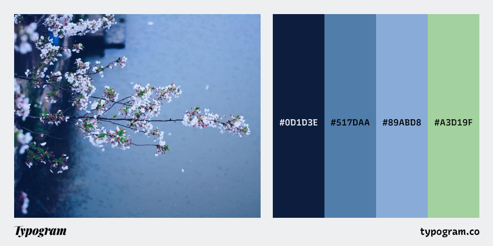
Thank you