How to Use Press Start 2P: A Great Bitmap Font for Your Gaming Projects

In This Issue…
How to Use Press Start 2P for Logo and Branding
- Font of the Week: Press Start 2P
- Design idea of the Week: Good Time Planning
- Color Inspiration of the Week: Night Time in Amazon Forest
Font of the Week
About Press Start 2P
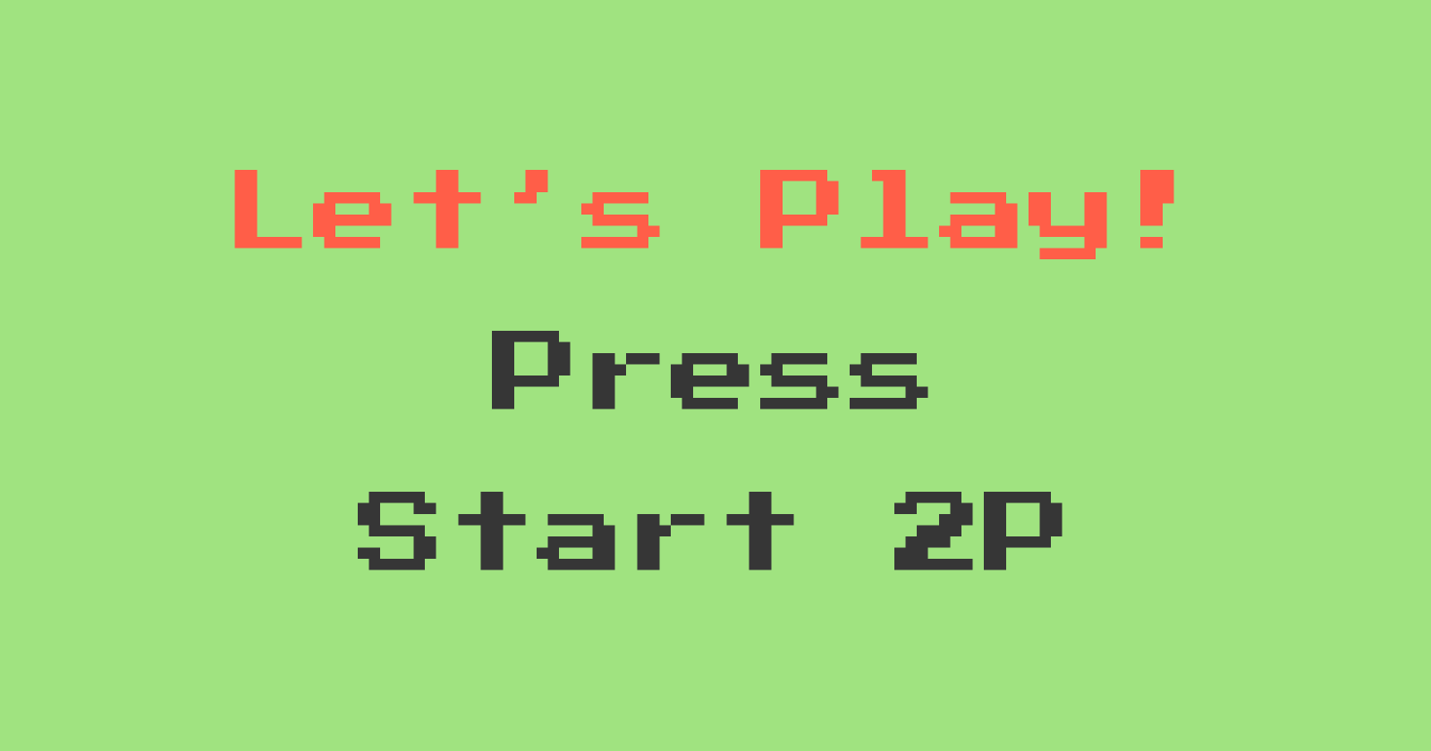
Press Start 2P is perfect for projects that have game themes. This font mimics bitmap fonts found in early Namco arcade games; Specifically, Return of the Ishtar, created in 1986. Return of the Ishtar was one of the first games to include lowercase and uppercase letters in its game screen font. Previously, most gaming user interface fonts had uppercase letters only.
These earlier gaming fonts have an iconic, identifiable look because they are bitmapped. The limited screen resolution back then restricted how fonts were designed and rendered. This resulted in an iconic look and vibe that is still much used in the design and branding of games today (We also covered a crazy fun spin of bitmap fonts and blackletter in issue no.30 ).
A revival and significant improvement of the original, Press Start 2P includes a variety of characters and multilingual support for Greek and Cyrillic.
Font Detail
- Bitmap look
- One weight
Specific Usage Tips
How to Use Press Start 2P for logo?
When most people glance at this font, they will think of gaming and cultures around gaming, like streaming, tech, fandom, digital/pop culture. Press Start 2P is perfect for projects with these themes. It is relatively legible as a logo and communicates a playful gaming vibe.
How to Use Press Start 2P for marketing and branding?
Press Start 2P is perfect for visuals communicating fun, tech culture, and gaming. Though Press Start 2P is readable, it is not most pleasing to read because it looks bitmapped. It works better as a display font and pairs well with sans serif like Montserrat.
Design Idea of the Week
Good Time Planning
I am always looking for tools that will help me be more mindful. During my break, I discovered something called Good Time Journal.
Good Time Journal is an activity log that tracks your activity to help you be more mindful of the task you are doing and discover things you take, enabling you to find the things you enjoy. It is one of the tools created by Burnett and Dave Evans, two design professors at Stanford, in their book, Designing Your Life (which I heard is fantastic! ). You can check out the free tool here. Let me know what you think.
Color Inspirations of the Week
Night Time in Amazon Forest
This week, enjoy this beautiful color palette from nature during the nighttime in the Amazon rainforest.
Indigo #0457B9 | Salsa #E9570A | Burnt Amber #F09C23 | Light Grass #ADBA81
Jargon Buster
Bowl
Bowl is a closed curved stroke that connects to either a vertical stroke or itself.
Creative Prompt
Create something with Press Start 2P!
Thank you
…for reading and hanging out here this week! Press Start 2P is available here.


