Reviewing Prompt: A Wide Font Perfect For Fashion & Editorial Brands
In This Issue…
How to Use Prompt for Logo and Branding
- Font of the Week: Prompt
- Design idea of the Week: AI for Interior Design?
- Color Inspiration of the Week: Horgen, Switzerland
Font of the Week
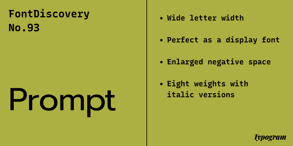
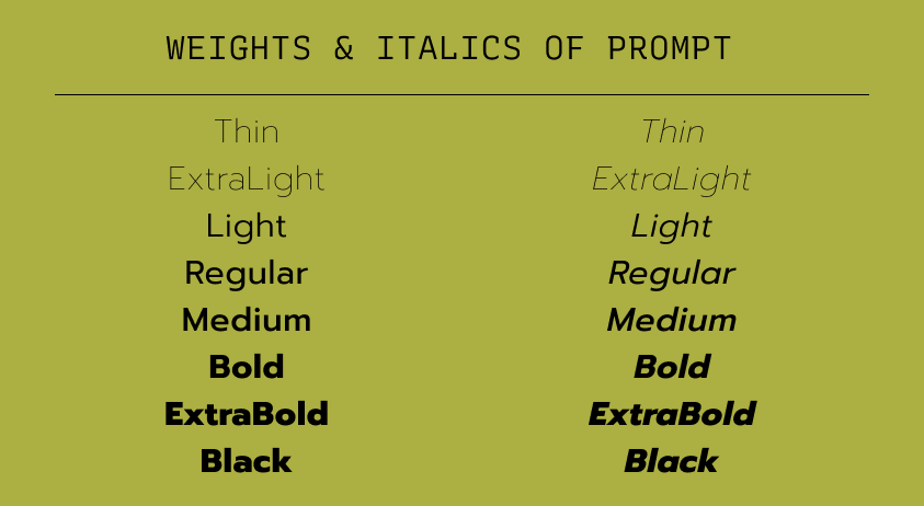
About Prompt
This week, I discovered a great sans serif, Prompt. Prompt, consisting of Latin and Non-Latin characters, was initially designed to work with Non-Latin, loopless Thai Alphabets –– a more modernized, simplified version of traditional Thai alphabets.

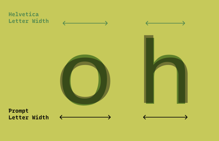
With this consideration in mind, Prompt is designed with wider letter width and enlarged negative spaces in its counter shapes to balance its Thai alphabet counterparts. These design features also make the font look modern and stylish. Wider sans serifs have been popular with fashion blogs and editorial lookbooks.
Font Details
Wide letter width
Enlarged negative space
Eight weights with italic versions
How to use Prompt for logo?
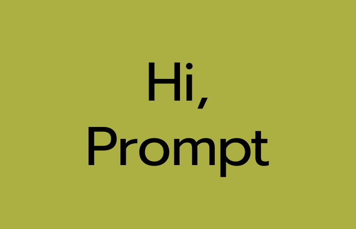
Prompt is perfect for creative projects, editorials, and fashion blogs. The wide sans-serif letters feel stylish and contemporary. The bolder weights, like Medium, Bold, and Extra Bold, are perfect for logos.
How to use Prompt for marketing and branding?
Because of Prompt’s wide letter width, it is perfect to use as a display font for headers and subheads. Because the letters are wider and take more horizontal space, Prompt is great for graphics with short pullout quotes or display copies. It can also be used for reading text. Pairing with a similar, but less wide font, like Roboto could work better for a reading font.

AI for Interior Design?
While AI is still far from completely taking over human creativity, here is a fun little tool that uses AI to generate interior design ideas for your room.
Color Inspiration of the Week
Horgen, Switzerland
This week, check out amazing colors from Horgen, Switzerland.
Dark Orange #E04C12|Coral #F79E05 |Celery #ADAF41 | Olive #4A4C2D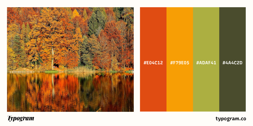
Typography Jargon Buster!
Serif
Serifs are letterforms with small lines or strokes, or “serifs,” attached at the end of larger strokes. Serifs originated from inscriptional lettering: Words were first painted with a brush, then carved into stones in Roman antiquity. Serifs are classified into several smaller categories: Old Style, Transitional, Modern, and Slab Serif.

Want more typography jargon buster? Check out this post!
Creative Prompt
Create something with Prompt.
Thank you
…for reading and hanging out here this week! Prompt is available here.