How to Use Rubik: A Versatile Font for Blog or Marketing
In This Issue…
How to Use Rubik for Logo, Branding & More
- Font of the Week: Rubik
- Design idea: Instagram's Immersive Feed…Verdict?
- Color Inspiration: Summer Nights

Font of the Week
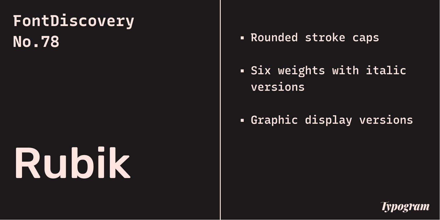
About Rubik
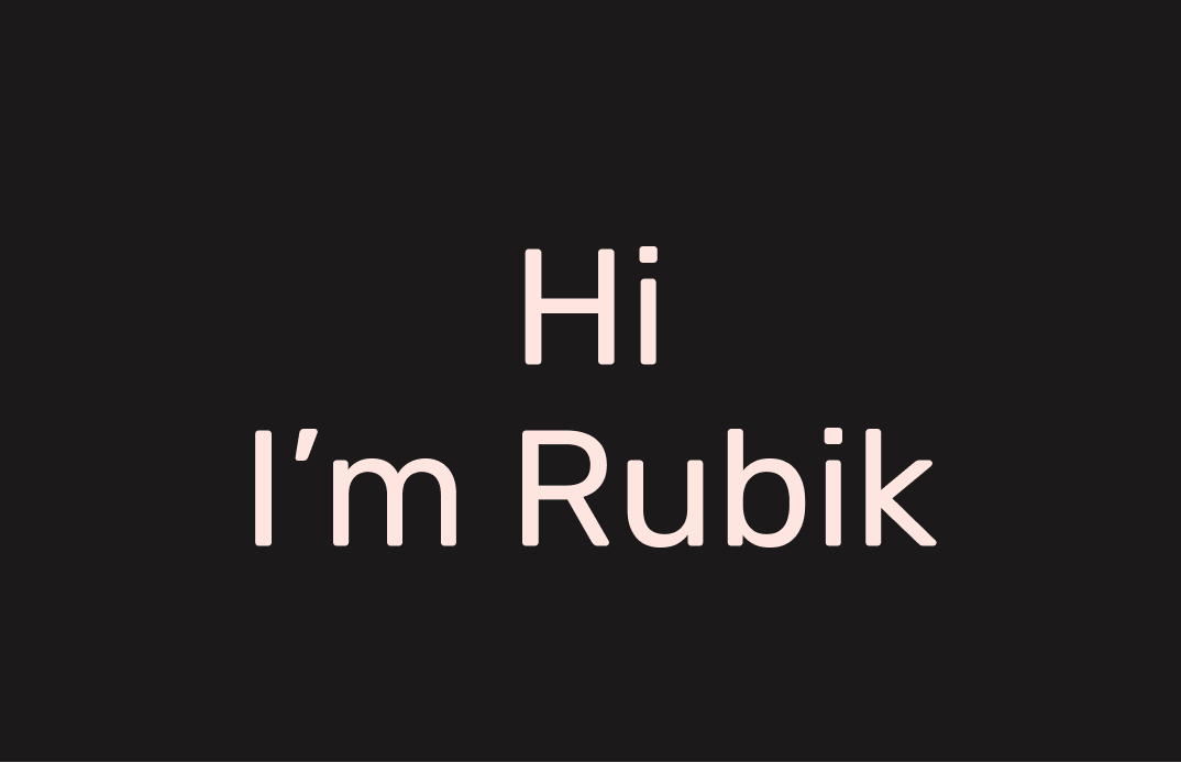
Rubik is a humanist sans serif with a neutral tone and minimal calligraphic details. Its slightly rounded corners make it inviting to read, but it is minimal enough to blend into the background. Compared to Nunito, a similar font we covered previously, Rubik is much more neutral and toned down.
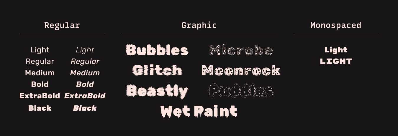
Designers have loved how Rubik looks and created additional graphic variations for display purposes. This means you have options with Rubik: you can use the more neutral sans serif for text and more graphic variations for marketing design.
My favorite one is the Rubik Glitch, which is Rubik designed with a glitch motion. I think Rubik Glitch is an exciting option for videos or animated gifs. Rubik Paddles and Rubik Microbe are attention-catching with their illustrative details.
Font Details
- Rounded corners
- Six weights with italic versions
- Graphic display versions

How to use Rubik for logos?
How to use Rubik for Branding and Marketing?
Rubik has six weights with italic versions, making it perfect for blogs and projects requiring a robust typography system. Graphic versions of Rubik are excellent for marketing graphics and display purposes because of their dashing and fun visual details.
Design Idea of the Week
Instagram's Immersive Feed…Verdict?
Remember we previously talked about Instagram? A significant part of the rebrand focused on “community-centric” layouts (cue: vertical formats). Instagram expressed interest in reworking its feed and has been pushing out a prototype similar to Tiktok to users. This weekend, I finally came across an article with insights and reactions from these test users. The title was pretty telling. Check it out here.
Color Inspiration of the Week
Summer Nights
This week, enjoy this summer night color palette!

Creative Prompt of the Week
Create something with Rubik!
Thank you
…for reading and hanging out here this week! Rubik is available here.