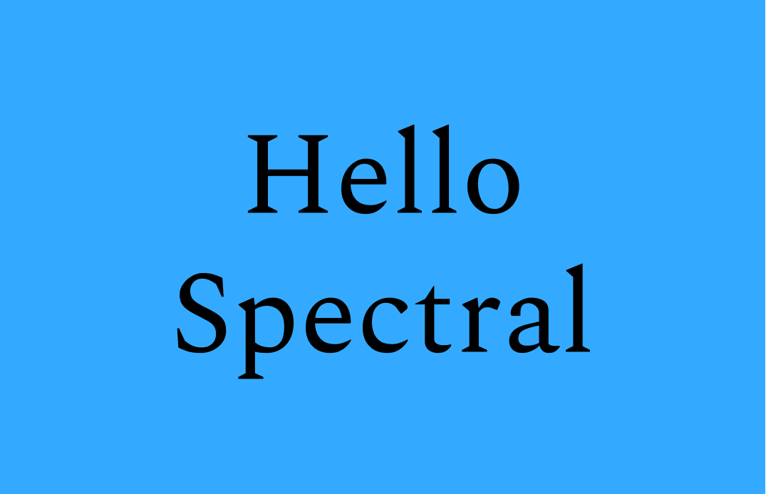
Reviewing Spectral: A Great Serif to Optimize Reading
The past week has been crazy for me. As I have told you previously, my co-founder and I are working towards a launch for our app. We are inching closer every day and I’m really proud of the progress we are making. Here is a little sneak peek 🙈.
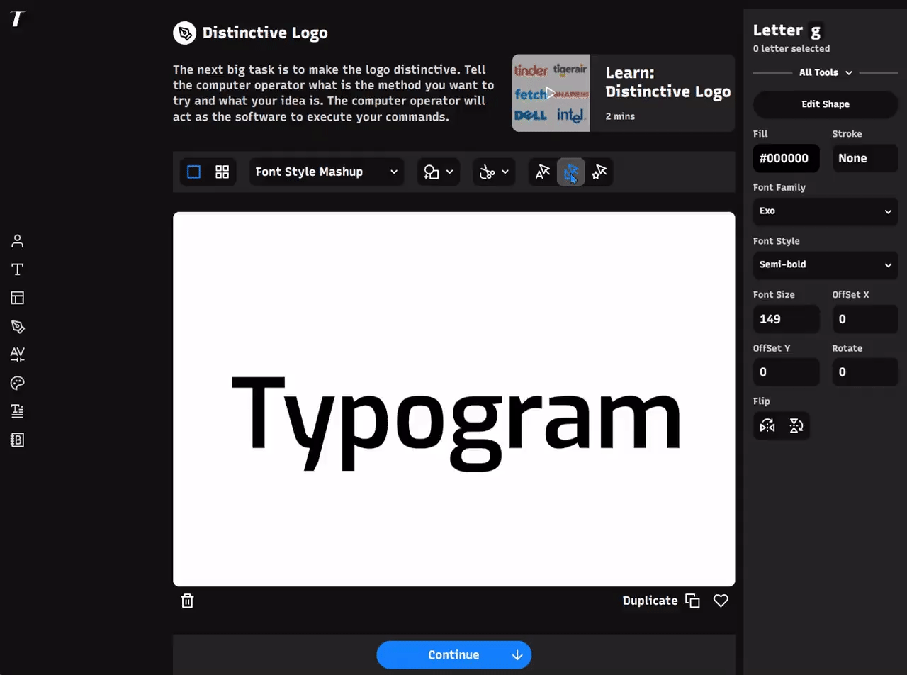
We have been working hard on Typogram's icon swap feature for logo design. Here is a sneak peek - user can select a part of logo and swap with an icon. The icon can be modified with a slider for easy editing.
In This Issue…
Reviewing Spectral: A Great Serif to Optimize Digital Reading Experience
- Fonts: Spectral
- Design idea: Cognitive Bias Directory
- Color Inspiration: One More Snow

Font of the Week
About Spectral
Spectral is one of my favorite serif fonts on Google Fonts. It is calligraphic and natural, and it has a slightly more “brushy” look than the serifs we have featured, like EB Garamond and Comourant Garamond. This modern look results from less stroke contrast, which also makes Spectral more favorable for screen reading.
Font Detail
Nine weights in regular and italic styles
Variable version
Large, triangle-like serifs without bracketing


Specific Usage Tips
How to use Spectral for logo?
Due to less contrast in strokes, Spectral has a human touch and a modern tone. Its visual details around the serif (no bracketing) give it an inviting feel without sacrificing the typical elegance and class that come with serifs. Spectral is perfect for a traditional theme project but appears modernized and updated.
How to use Spectral for marketing and branding?
Spectral is great for text-rich screen-based projects such as blogs and ebooks. It can pair with a Slab serif like Zilla Slab or a sans serif like Noto.
Design Idea of the Week
Cognitive Bias Directory
This week I stumbled upon this Wikipedia page about cognitive bias. This page list 188 Wikipedia pages about cognitive biases, grouped into categories, and rendered as a radial diagram. Each list item also links to their corresponding Wikipedia page.

Color Inspiration
One More Snow
Check out this cool-color color theme for your creative projects!
Lake #33AAFF | Steel #738BA3 | Silver Lining #CED8E5 | Noir #383639
Typography Jargon Buster
Line-Height
The space between two baselines of text.

Want more? check out the jargon buster glossary page.
Creative Prompt
Create something with Spectral!
Thank you
…for reading and hanging out here this week! Spectral is available here.
