How to Use Zen Dots: A Futuristic Scientific Font Perfect for Tech Brands
In This Issue…
How to Use Zen Dot for Logo and Branding
- Font of the Week: Zen Dots
- Design idea of the Week: ChatGPT - What’s the Big Deal?
- Color Inspiration of the Week: Glacier National Park, Montana, USA
Font of the Week
About Zen Dots
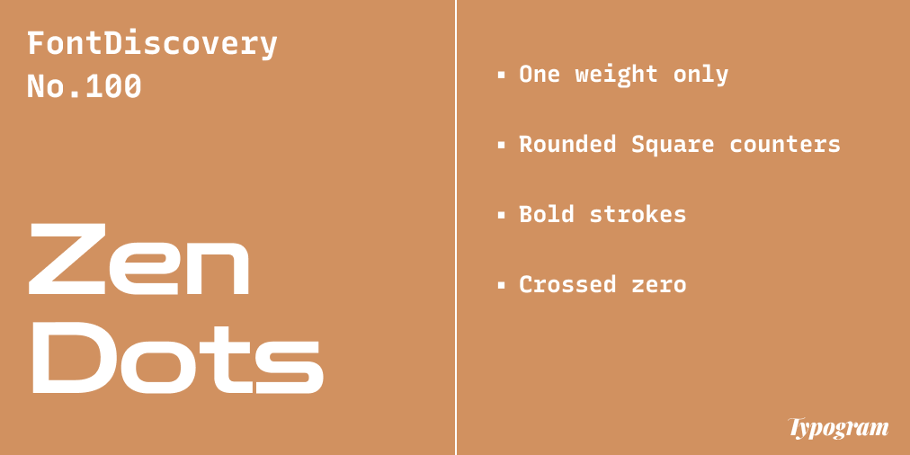
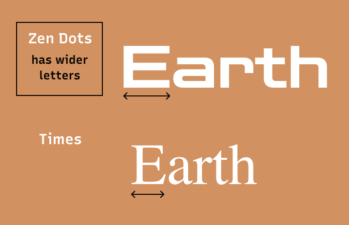
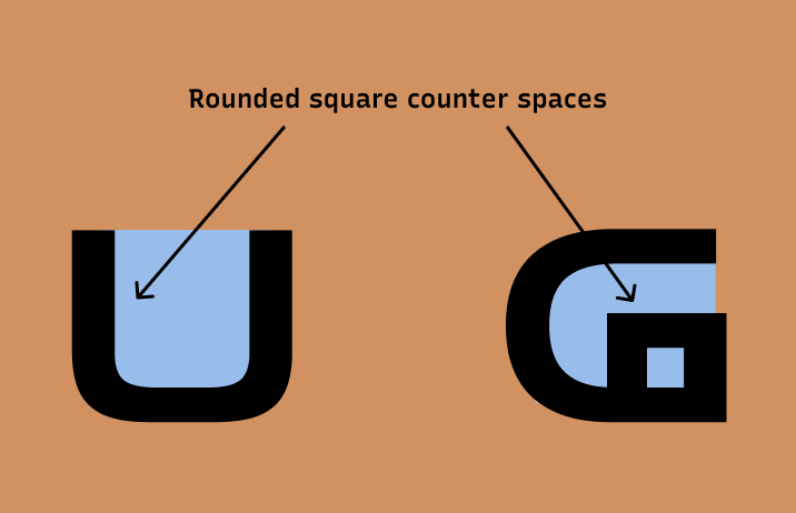
If you are looking for a futuristic scientific font, look no further than Zen Dots. Zen Dots is inspired by different eras in science fiction films and their aesthetic for the possible futures they envisioned. The letterforms are bold and wider, with strong, rounded square counter shapes communicating strength.
In the past, we have covered Obritron, another sci-fi-influenced font with more rigid counters. Compared to Orbitron, Zen Dots incorporates much more roundness in its letter designs. This makes Zen Dots more trendy and updated and matches our current taste for aesthetics about tech and the future.
Font Details
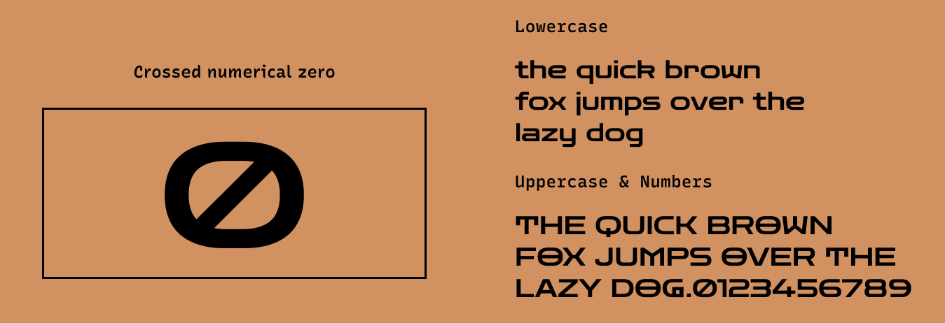
One weight only
Square counters
Wide letters with bold strokes
Crossed zero
How to use Zen Dots for logos?
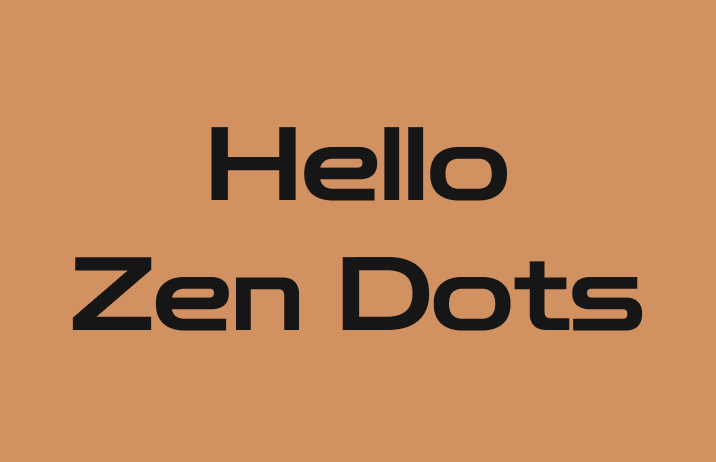
The strokes are bold and perfect for logos for a science-themed, future envisioning, or tech project. Zen Dots has a sci-fi vibe and communicates strength.
How to use Zen Dots for marketing and branding?
Due to the thickness of the letter strokes, Zen Dots is not suitable for smaller text-like paragraphs. Also, because this font is full of visual quirks, it is best used for a graphic piece and call-out copies to communicate the appropriate tone.
Design Idea of the Week
ChatGPT - What’s the Big Deal?
Recently a chatbot called ChatGPT has taken the internet by storm. Well, what is it? ChatGPT is a chatbot created by Open AI, the company that also developed Dall-E. You may say, so what?
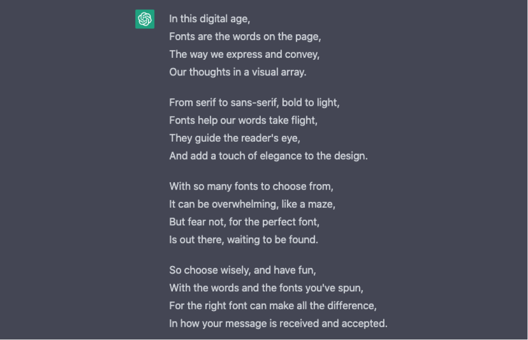
What’s interesting about ChatGPT is that it is more natural and “conversational.” it can recall information from an earlier conversation. Find out more here. Also, I made ChatGPT write a little paragraph about fonts. Not so bad, right?
Color Inspiration of the Week
Glacier National Park, Montana, USA
This week, enjoy colors from Glacier National Park in Montana, USA.

Typography Jargon Buster!
Display Fonts
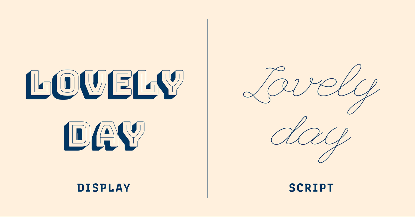
Display fonts are often fonts with unrestrained, decorative details. They look more visually stimulating than restrained, simple fonts used for paragraph text. Display fonts are used at header sizes, grabbing people’s attention right away. Many display fonts do not have good readability in small sizes because of their more ornate shapes. Their font details get lost in small sizes, thus decreasing their legibility.
Want more typography jargon buster? Check out this post!
Creative Prompt
Create something with Zen Dots.
Thank you
…for reading and hanging out here this week! Zen Dots is available here.
