Typogram Product Update: Color Selections

How is Typogram development going?
We have been busy building our favorite logo design tool. Here are the features we have been working for October. (Missed the previous updates? See September and our archive here)
Choosing Brand Colors
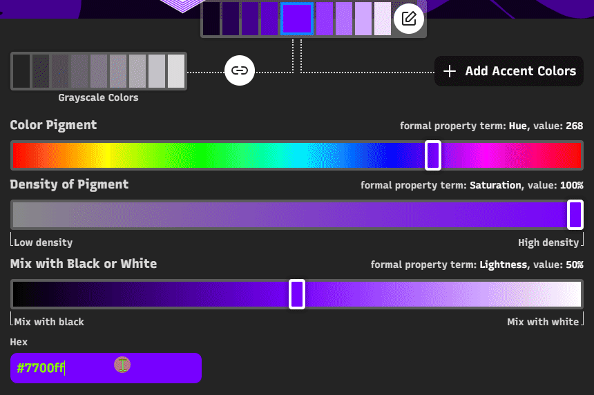
This month, we focused on a critical feature: Brand Colors. From chatting with our customers, we know many struggles with brand colors, so we focused on making this feature as visual and accessible as possible.
There are several things we have created in this feature to help you choose colors:
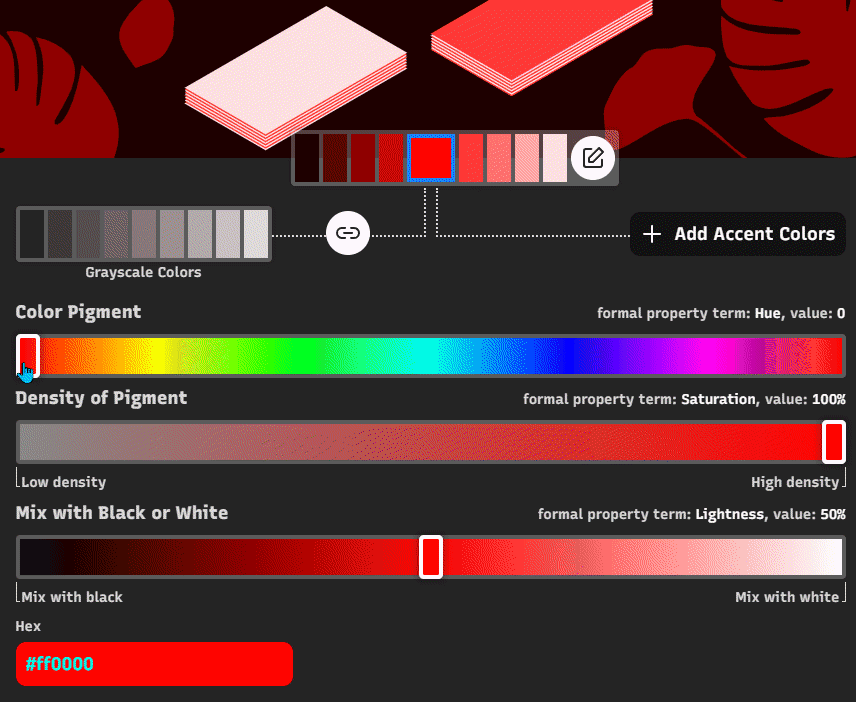
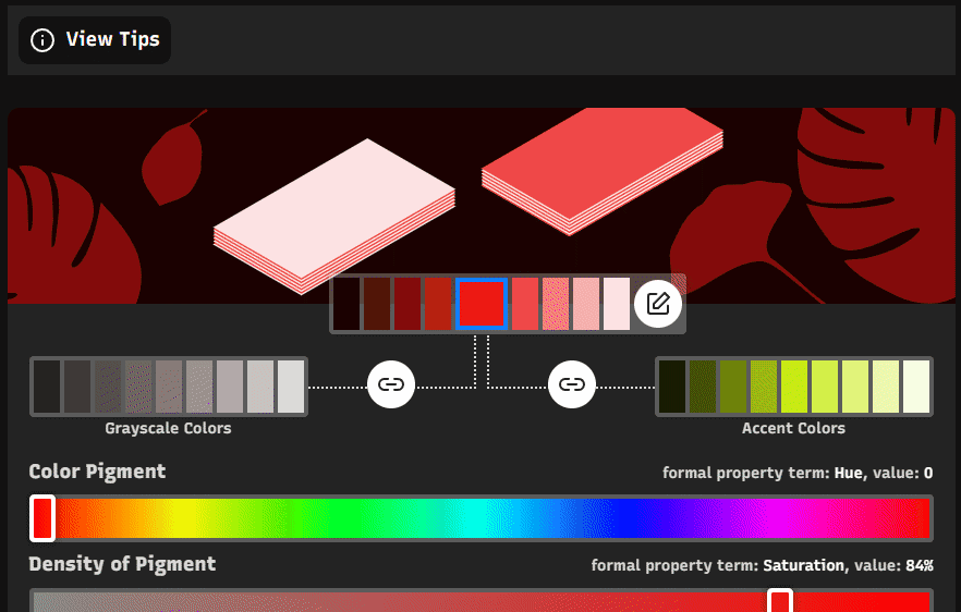
- Preview Primary Brand Color in Graphics
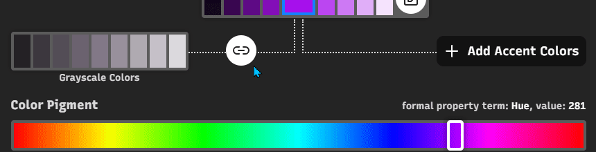
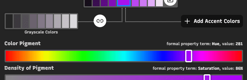
- Grayscale Colors
- Accent Colors
- View Color Tips
- Hex Input and More
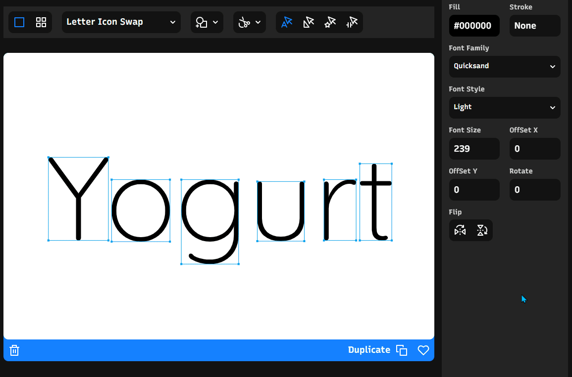
Detail 1: Preview Primary Brand Color in Graphics
A common misconception is that color value is absolute and can stand on its own. While it is true mathematically, it is false optically. Our eyes absolutely do fool us at times — a red color can look 100% blue once put next to a set of certain colors and shades. It is essential to build a color palette for your brand instead of a singular color. With Typogram, you can preview the primary brand color palettes in a graphic in real time as you are making changes.
Detail 2: Grayscale Colors
A common pitfall of branding is over-using brand color everywhere. A booklet full of bright blue text is not a good idea — when used excessively, the brand color disappears instead of standing out. Brand colors are meant to be used somewhat scarcely and stand out amid more neutral tones — that is where the grayscale color palette comes in. Grayscale colors have very low saturation, which you can adjust between 0% to 16%. It is also a good idea to make the “neutral” gray not entirely neutral. Inject the hue of the primary brand color into the grayscale colors to hint at your brand color subtly. Even when your logo is not present, users can still feel your brand’s presence because the dark gray text radiates your brand color in small doses.
Detail 3: Accent Colors
Unlike grayscale colors, which are a must-have, accent colors are optional and up to you to decide. Similar to grayscale colors’ “binding” to the primary brand color in hue values, accent colors bind with the primary color in saturation values to create harmony.
Detail 4: View Color Tips
Choosing brand colors is not an instinct thing. Instinct will draw me to colors that appeal to me personally, but my favorite color will not be the most suitable for my company and its audience. We should ditch our instinct for a little bit and choose values in hue, saturation, and lightness, respectively, based on rationales. “View Tips” provide rationales to you in real-time while you drag the values up and down. What does hue 19 mean in brand color psychology? The tips section gives a direct, timely answer to help you decide.
Detail 5: Hex Input and More
While HSL (hue, saturation, and lightness) is Typogram’s chosen way to define a color, you may already have a color that you want to bring in. Simply input the hex value with or without “#” or the color names and hit enter; if it is a valid color code or name, Typogram will recognize it and set HSL values accordingly. If it is not a valid color, the app will revert to the last valid color you selected.
Save & Access Brand Color Swatches
Once the brand colors are chosen, they are saved and can be accessed via the color swatch panel. We think this will make it easy to select, design and test once you are in the logo editor.
And that’s it for this month! Have a fantastic November and see you in the next update!