Commanding Attention with Anton: A Bold Sans Serif Typeface for Impactful Design Projects
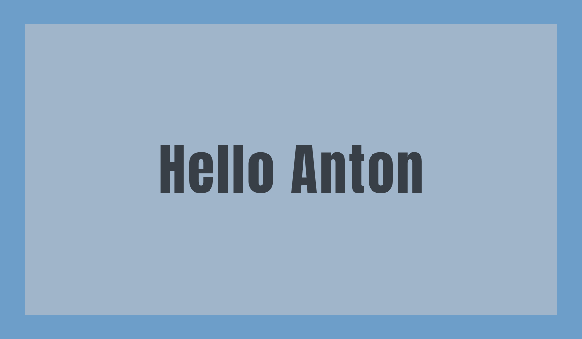
Font of the Week
About Anton
Anton is a bold sans serif typeface known for its commanding presence and readability. Inspired by traditional advertising fonts, Anton embodies strength and clarity, ideal for designs needing maximum impact. As a reimagined sans serif typography, it brings modernity while preserving the classic essence of bold fonts.
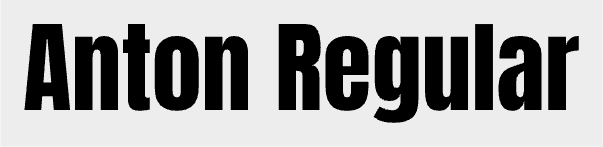
Anton Type Details
Anton features strong vertical lines and emphatic cuts at the terminals, designed for impactful design. Its optimized curves and simplified forms make it perfect for headlines and display purposes. Anton is best suited for large displays, including posters, banners, and impactful headings in graphic design projects.
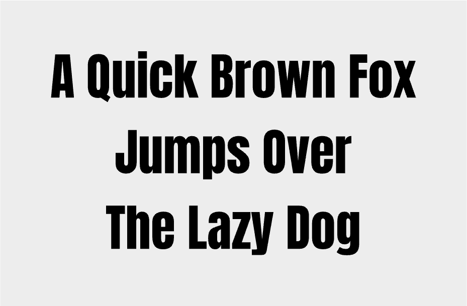
How to use Anton for Logo
Using Anton for logo design can dramatically increase brand visibility. Its bold weight ensures legibility even from a distance, exuding confidence and stability. For logos, pairing Anton with minimalist graphic elements can create a powerful branding identity that stands out in competitive markets.
How to use Anton for Branding & Marketing
In branding and marketing, Anton excels at creating strong visual hierarchies. Its boldness captures attention, making it suitable for promotional materials such as flyers and advertisements. When crafting a brand message, Anton can convey authority and clarity, ensuring the message is not just seen, but also remembered.
Anton Font Pairings
- Open Sans - A versatile sans serif that complements Anton's boldness with its clean and neutral style, perfect for body text accompanying Anton headlines.
- Lato - Features semi-rounded details that harmonize well with Anton's rigid and strong appearance, bringing a bit of softness to brand collateral.
- Roboto - Provides a modern feel with its geometric forms, balancing Anton's boldness, making it ideal for user interfaces and digital product design.