Reviewing Fruktur: Bold Script Catching Attention
In This Issue…
How to Use Fruktur for Logo and Branding
- Font of the Week: Fruktur
- Design idea of the Week: Did Apple Vision Pro Get it Right?
- Color Inspiration of the Week: Summer Monstera

Font of the Week
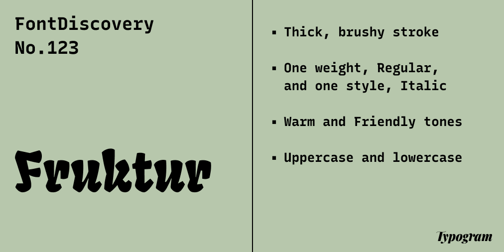
About Fruktur
This week we are featuring a unique marketing font, Fruktur. Fruktur is a playful display font with a warm feeling. Fruktur takes inspiration from the construction of Blackletters. As we have mentioned in the UnifrakturMaguntia issue, Blackletter is a font style that originated from Western Europe in the 11th Century.
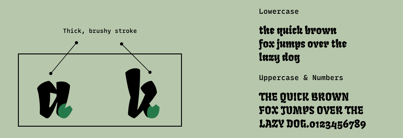
Blackletter has several styles—all share common characteristics of sharp angular lines with significant contrasts. This is where Fruktur differs and takes a more friendly, modern, and legible route - the strokes are thick and pleasant to the eye, with a luscious and brushy vibe.
Font Details
Thick, brushy stroke
One weight, Regular, and one style, Italic
How to use Fruktur for logo?
A unique and eye-catching font, Fruktur’s thick, brushy strokes have a distinctive warm tone that feels more casual and urban. Its strokes are thick and legible, perfect for logos.
How to use Fruktur for marketing and branding?
Fruktur’s thick strokes are fantastic visual textures for swag, packaging, social posts, and animations. Since it has more “color” and black shapes by having thick strokes, it should not be used in paragraphs and should be used in large display sizes for posters and graphics.

Design Idea of the Week
Did Apple Vision Pro Get it Right?
This week, apple unrevealed its new AR/VR headset, Apple Vision Pro. Due to be out next year, it comes with a heavy price tag, $3,500.
Like many others, I have heard rumors about Apple jumping into the AR/VR market, and it was satisfying to finally see this speculation confirmed. Well, how is it? Read more here to learn more.

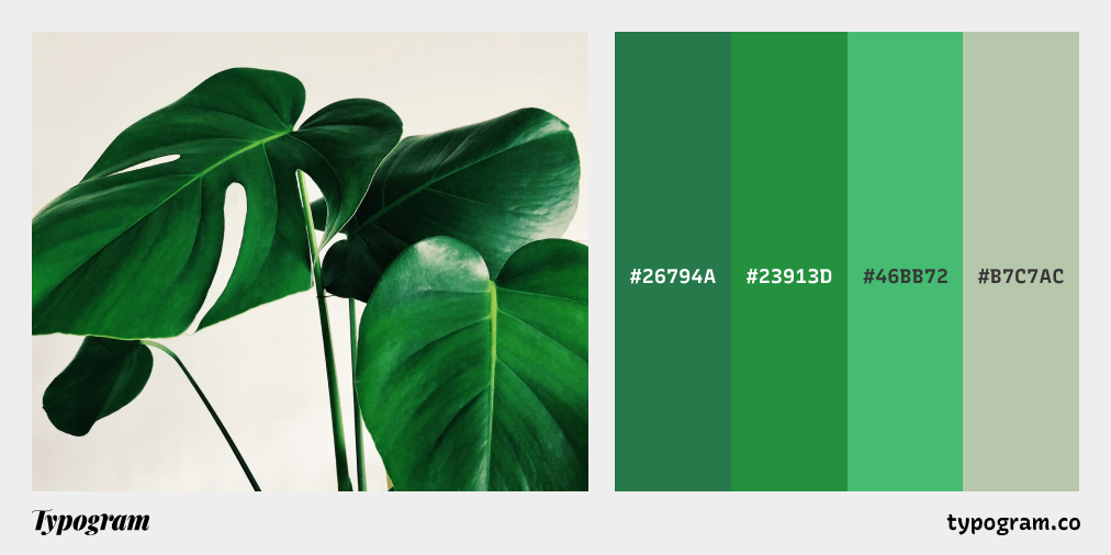
Color Inspiration of the Week
Summer Monstera
This week, enjoy lovely shades of green from our favorite tropical plants.
Typography Jargon Buster!
Ligature
Ligatures are unique characters created from multiple letters of common letter combinations to improve readability in a font. or example, the letter “f” has a high frequency of occurring with “i” and “l”, as in words like “figure” and “flower.” To improve the readability in these specific cases, “fi” and “fl”, would be combined to create a unique character that would replace the two letters when typed together.

Want more typography jargon buster? Check out this post!
Creative Prompt
Create something with Fruktur.
Thank you
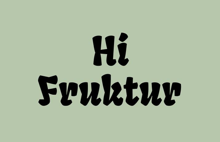
…for reading and hanging out here this week! Here is Fruktur.