Reviewing Lustria: A Fantastic Old Style Serif with a Modern Twist
In This Issue…
How to Use Lustria for Logo and Branding
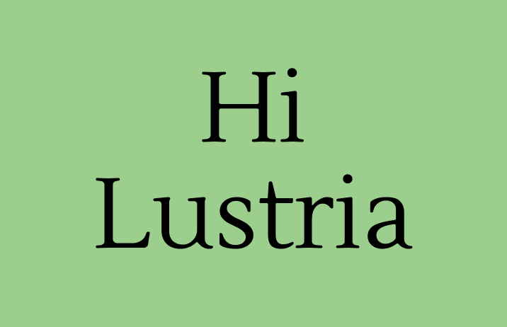
Font of the Week: Lustria
Design idea of the Week: Typogram's Fontkit Documentation
Color Inspiration: Calming Green
Font of the Week
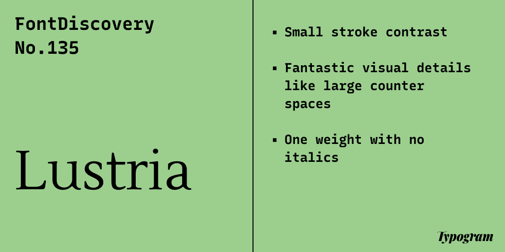
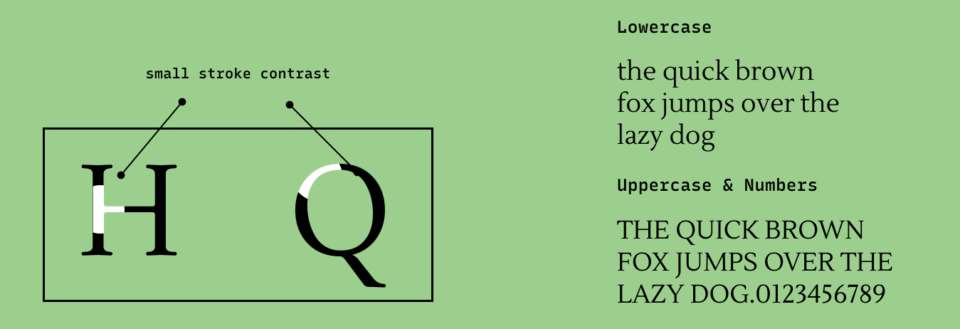
About Lustria
Since 1999, the designer of Lustria has been chipping away at it, designing this font to perfection. We can infer the tone of a font from its visual elements – with visual elements prioritizing negative spaces, Lustria appears more modern than other old-style serifs. It has plenty of negative spaces in the font through its large counters, short ascenders, and descenders, creating a memorable presence without overpowering. It feels natural and balanced.
Font Details
Small stroke contrast
Large counters with short ascenders and descenders
One weight with no italics
How to use Lustria for logos?
A legible font, Lustria is perfect for logos. The large counter spaces in this font make a logo look open and inviting.
How to use Lustria for Marketing?
Since Lustria only has one weight, it is perfect to pair with a multi weight sans serif font like Roboto. It can work both for header and body text. Lustria has many charming font details, using it at display sizes can help you grab attention.
Design Idea of the Week
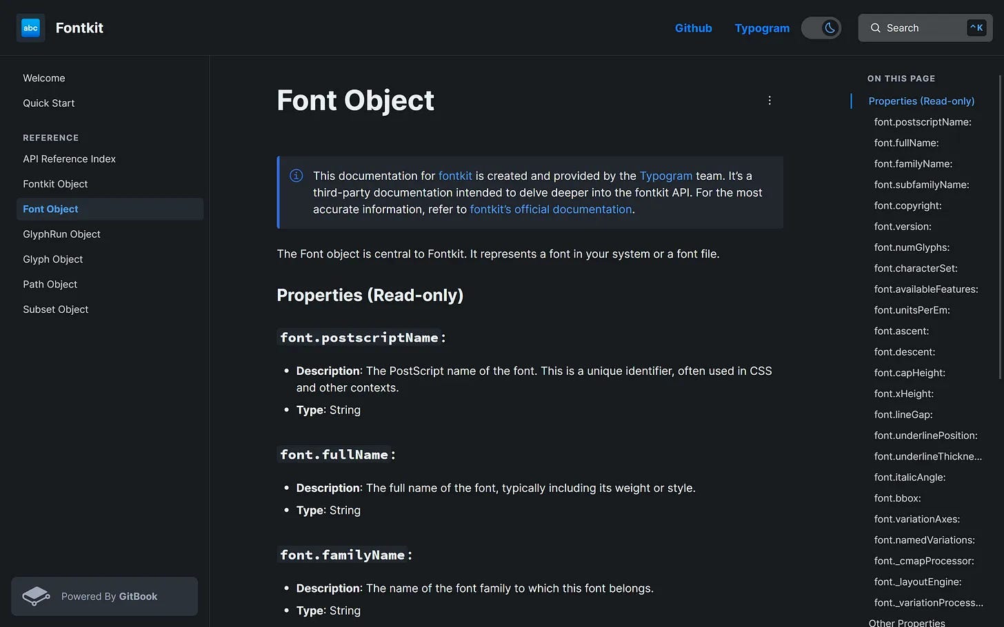
Contributing to Open Source
We made heavy use of Fontkit, an open-source font engine for the browser we use for Typogram. So to contribute to this wonderful project, we made a comprehensive documentation site featuring more in-depth information, searchable documentation, and ai-enhanced interactions like response fetching! See our documentation for Fontkit.
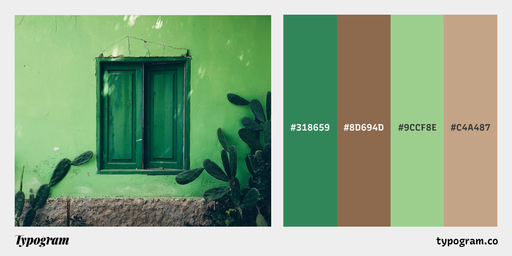
Color Inspiration of the Week
Calming Green
This week, check out green shades from the summer!
Typography Jargon Buster!
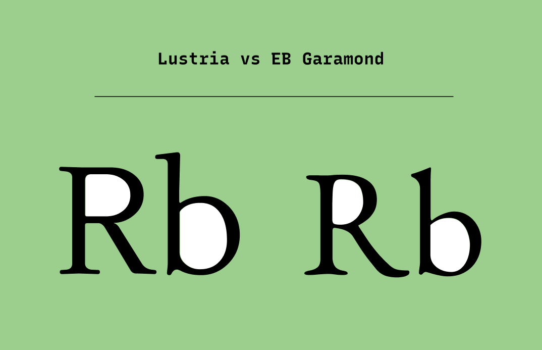
Counter
A Counter is an unfilled (white or negative) space partially or entirely closed by other parts of the letters. For example, lowercase “b” and uppercase “U” both have counters. The stroke creating a counter shape is known as a “bowl.” There are two types of counter spaces: open and closed. An open counter means the unfilled space is partially closed, like “U.” A closed counter happens when the unfilled space is completely sealed, like “b.”

Want more typography jargon buster?
Creative Prompt
Create something with Lustria.
Thank you
…for reading and hanging out here this week! Here is Lustria.