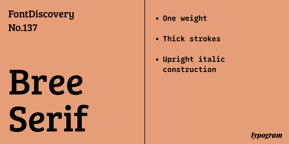
Reviewing Bree Serif: A Bulky, Friendly Serif for Your Blogs
In This Issue…
How to Use Lustria for Logo and Branding
Font of the Week: Bree Serif
Design idea of the Week: Brand New Google Fonts
Color Inspiration: Houseplant Fun

Font of the Week
About Bree
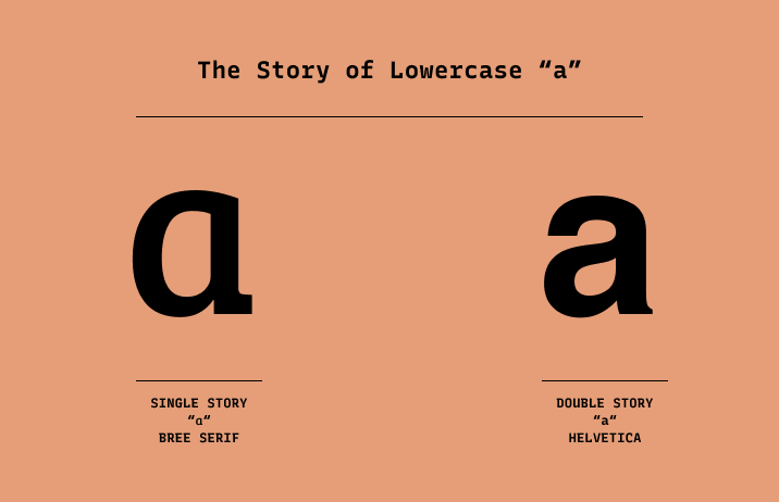
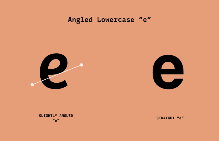
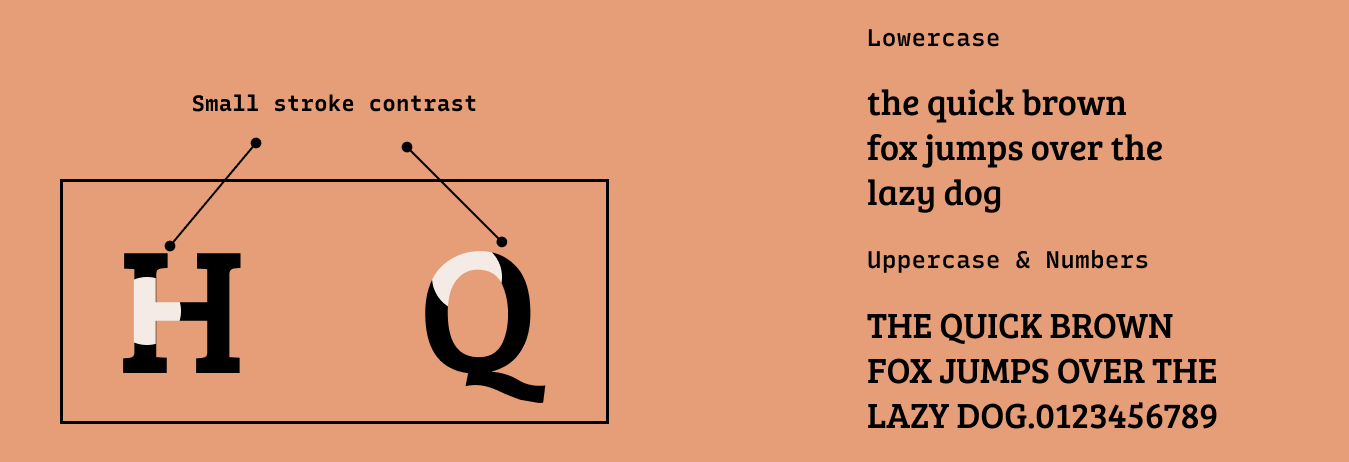
Recently, one of my favorite fonts recently has been Bree Serif, a bulky serif with a friendly flare. Comforting and inviting to the eye, Bree Serif has letter constructions of an italic without the overall slanted angles. The single story “a” and the angled, horizontal stroke of the “e” give this font an extra quirk that feels simple, genuine, and inviting.
Font Details
One weight
Thick strokes
Italic construction, but without slant
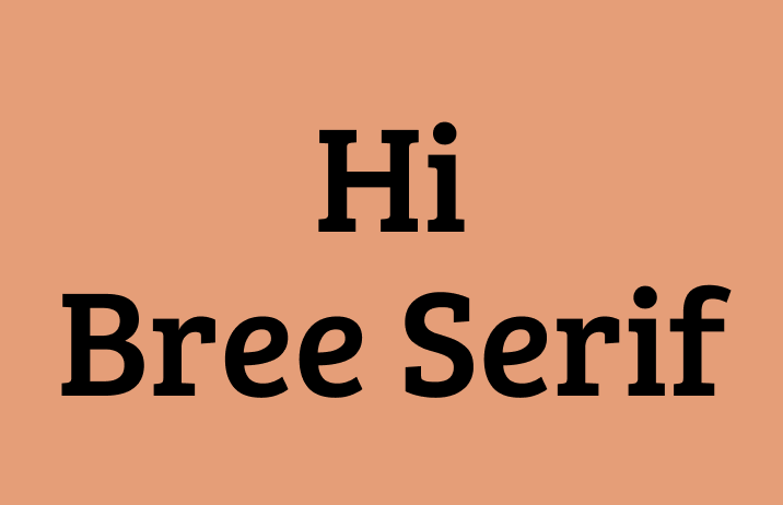
How to Use Bree Serif for Logo?
How to Use Bree Serif for Branding and Marketing?
Bree Serif is perfect for your blogs and social media graphics. Available in one weight only, its thick and earnest strokes are perfect as headers for blogs. It can pair with a multi-weight sans serif, like Noto Sans to create a more robust typography system for your brand.
Design Idea of the Week
Brand New Google Fonts
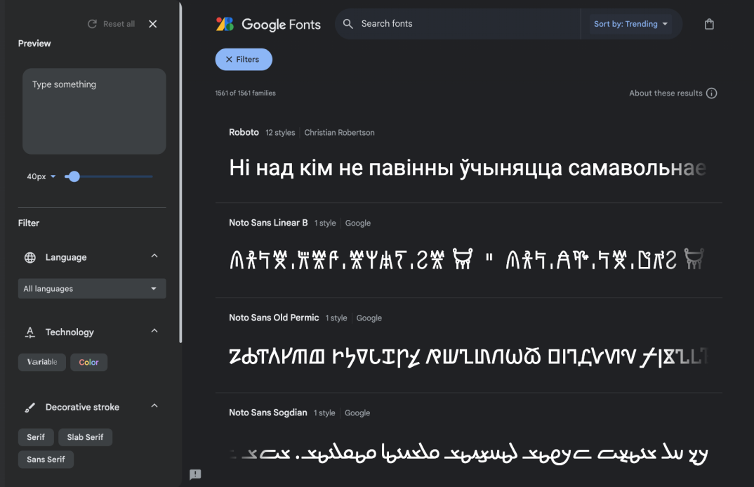
Last week, Google Fonts unveiled its new website, making a few major tweaks to its UI. Now, there is a left-hand side sidepanel makes it easier to research and preview fonts. You can also filter fonts by formats, like variable or color fonts. What do you think?
Color Inspiration of the Week
Houseplant Fun
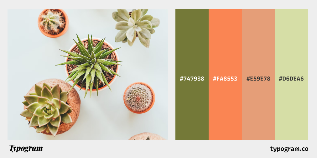
This week, enjoy the simple colors of small plants.
Typography Jargon Buster!
Counter
A counter is an unfilled (white or negative) space partially or entirely closed by other parts of the letters. For example, lowercase “b” and uppercase “U” both have counters. The stroke creating a counter shape is known as a “bowl.” There are two types of counter spaces: open and closed. An open counter means the unfilled space is partially closed, like “U.” A closed counter happens when the unfilled space is completely sealed, like “b.”

Want more typography jargon buster? Check out this post!
Creative Prompt
Create something with Bree Serif
Thank you
…for reading and hanging out here this week! here is Bree Serif.
