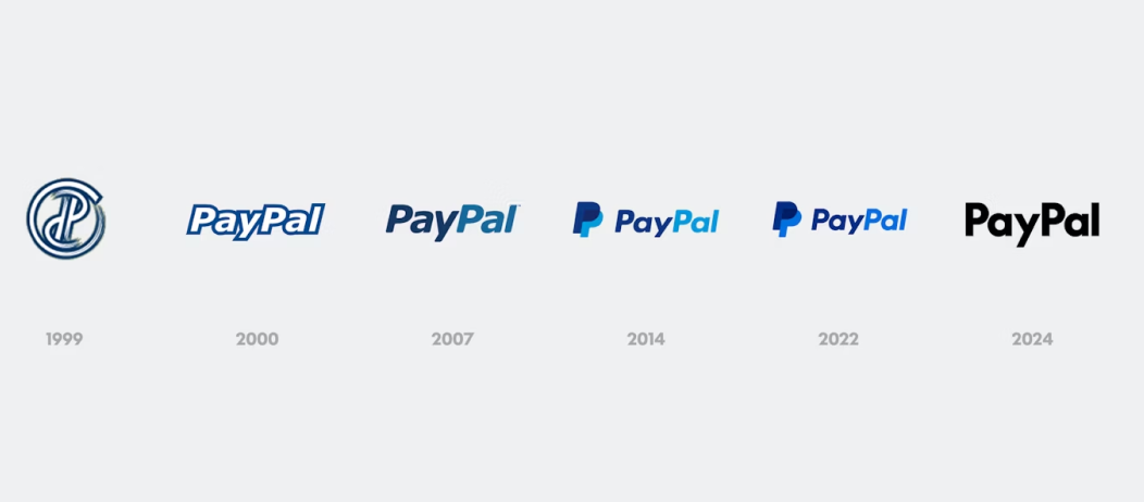
Paypal needs no introduction - it is one of the most popular payment platforms in the world. Recently, PayPal unveiled a bold rebranding initiative to redefine its image as a versatile and modern payment platform. Emphasizing inclusivity and innovation, the new branding features a sleek, sans-serif logo and a vibrant color palette designed to resonate with a younger, tech-savvy audience.
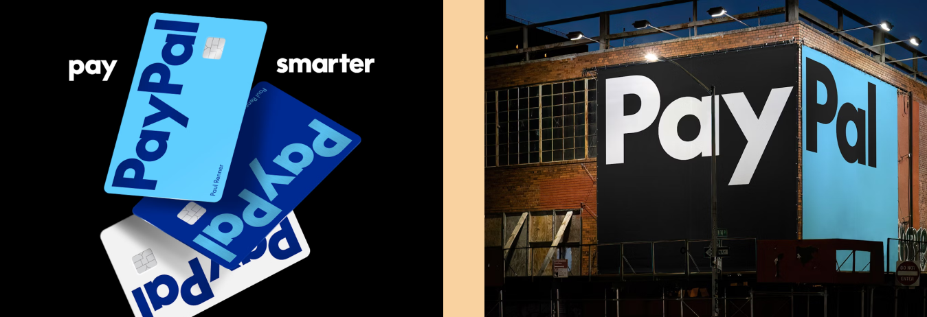
My favorite part about the new logo is the updated neutral black and white palette, giving it an updated modern look that could work anywhere. If you miss Paypal’s iconic fintech blues, do not worry - the blues are still being used, but now as an intentional accent. In my opinion, this more optimistically makes the brand colors more memorable.
Evolution of Paypal's logo. Source: PentagramPaypal's new logo. source: Pentagram
Font of the Week
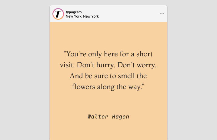
All About Montaga
Montaga is a contemporary old-style serif typeface that elegantly blends traditional and modern design elements. Its structure features clean lines and subtle curves, creating a sense of neutrality, readability, and quirk. Inspired by Venetian calligraphy, the serifs are airy and slightly rounded, giving Montaga an inviting feel without losing formality. The overall proportions lend Montaga a classic touch suitable for print and digital media.
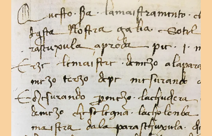
Venetian calligraphy. source: Reddit
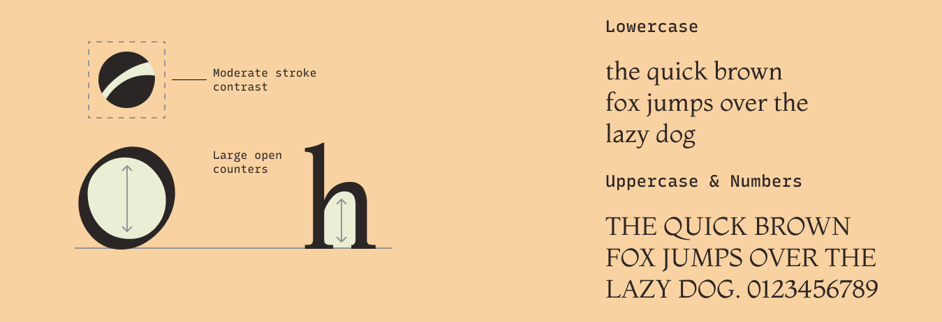
Montaga Font Details
Relatively high x-height, which improves readability, especially at smaller sizes. This design choice makes it suitable for both display and body text.
Legibility is maintained with moderate contrast between thick and thin strokes.
Large open counters give the font plenty of white space and improve readability
How to Use Montaga for Logo?
Using Montaga for a logo can create a sophisticated and timeless look.
How to Use Montaga for Branding and Marketing?
Montaga stands out without overpowering the content it accompanies. Its well-balanced letterforms contribute to a harmonious visual experience, making it a popular choice among designers seeking a refined yet accessible typeface. Montaga’s versatility makes it ideal for various applications, from editorial layouts to branding.
Watch-outs for Montaga
Montaga only has one font weight. It is best used for a header or logo, and paired with another, multi-weight font like Roboto to do the heavy lifting for the typography system and information hierarchy.