How to Use Nunito: A Simple Sans Serif with a Friendly Flare
In This Issue...
How to Use Nunito for Logo and Branding
- Theme: Simplicity
- Font of the Week: Nunito
- Design idea: Big Bold Type
- Color Inspiration: Black & White
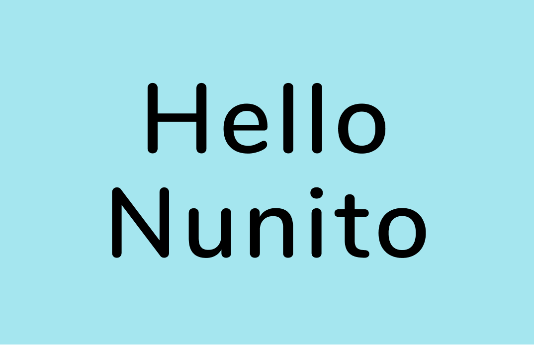
Font of the Week: Nunito
The Simple Sans Serif
We talked a lot about sans serif in this newsletter. Sans serifs are the favorites of digital screens. They are aesthetically pleasing and UX-friendly.
There are four basic classifications of sans-serif typefaces:
- Grotesque: the first generation of sans serifs, with a lot of (wonky) visual character
- Neo-Grotesque: rework the design of Grotesque and make shapes and curves of letters less awkward.
- Humanist: focus on the calligraphic influence
- Geometric: focus on the geometry of letters
About Nunito
Nunito is a neo-grotesque sans serif. Many sans serifs we use every day, like Helvetica and Arial, are in this category. They are super popular to use because they communicate simplicity and straightforwardness.

Font Details
If you want something that looks simple, open, and approachable, Nunito has your back. Nunito Family has two stylistic variations: rounded and normal:
Nunito: The “rounded” version has round cap strokes and communicates a heightened sense of warmth. It lacks the crispness of the regular sans serif.
Nunito Sans: The “normal” version gives you the straightforward, simple tone offered by the Neo-Grotesque types.

How to use it for logos?
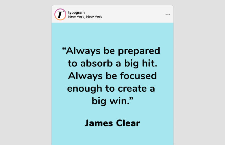
Nunito communicates simplicity, openness. The “rounded” cap adds an extra sense of warmth. Bold, semi-bold are fantastic for logos. The Extra Light and Black weights might not work for logos because the graphics could become illegible under small scales
How to use it for marketing?
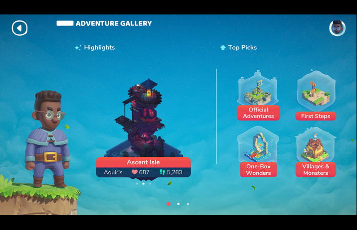
A significant benefit about Nunito is that it has seven weights. Nunito is excellent for more complex projects like app interfaces, where you need more information structures. Wenting used Nunito as the UI and logo typeface for Font Playground because it is versatile with many different weights, and its rounded stroke caps give warmth to her app. However, don’t use the thinner weights like Light, Extra Light, for body copy, as they will break down.
Design Idea of the Week
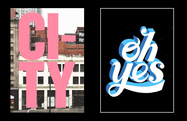
Big Bold Type
Are there any simple hacks that will make anything look good? Sometimes, you just run out of creative ideas and that’s totally ok. Designing with big, bold types is for those times. If you run out of creative ideas, an interesting experiment you can try is blowing up the copy so that the words become the central part of the graphic. It’s simple, bold, and grabs the attention of your audience right away.
Jargon Buster
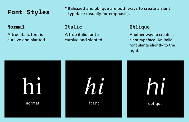
Font Style
Normal, italicized, oblique styles of the font.
Color Inspirations of the Week
Black & White
In fonts, simplicity can mean without decorations, like sans serif. How does the idea of simplicity translates to other areas, like colors?
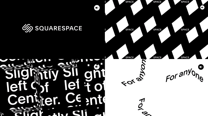
A black and white palette can be the answer. Using an extremely limited palette, like black and white, helps people focus on the core information and visuals. It prevents distraction and communicates a message of simplicity and modernity. Brands like MoMa, Uber, Squarespace all use only black and white exclusively.
Creative Prompt
Can you create a design with a big bold type design? I would love to see what you create via Twitter or Email.
Thank you!
Thanks for being here for another week. Nunito is available here. It is designed by Vernon Adams.
