How to Use Alatsi: A Geometric Sans with Calm Confidence and Contemporary Flair
Font of the Week
About Alatsi Font
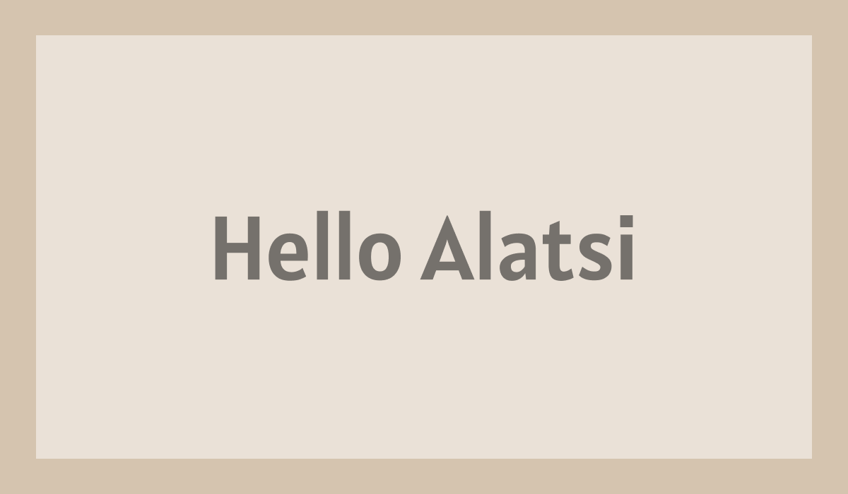
Alatsi is a modern geometric sans serif font characterized by its calm confidence and contemporary flair. This typeface is inspired by the sleek lines and balanced proportions typical of geometric designs. It embodies the precision and clarity that are hallmarks of geometric sans serifs, making it a reliable choice for contemporary typography. Alatsi’s design roots reach back to the early 20th-century Bauhaus movement, which emphasized functionality and simplified form: principles that resonate through Alatsi’s clean and fearless lines.
Alatsi Font Type Details
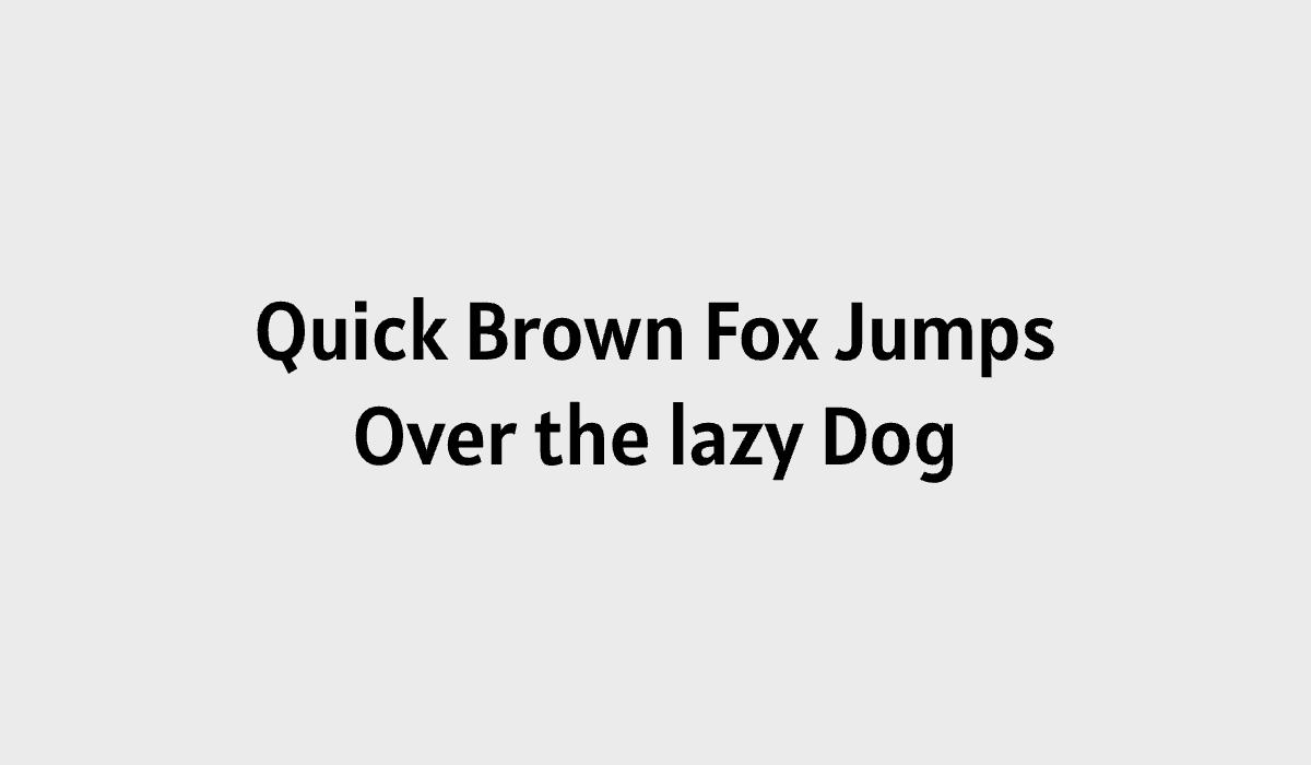
The Alatsi font shines with its distinctive geometric form, featuring wide apertures and a harmonious blend of rounded and angular elements. The even weight distribution among strokes and its modest x-height create a sense of tranquility.
Alatsi is ideally suited for projects requiring a nuanced blend of modernity and simplicity. Its readability and understated elegance make it an excellent choice for typography design where clarity is paramount.Though it only comes in a single regular weight, it's highly legible and works well at smaller display sizes.
How to use Alatsi for Logo
To use Alatsi for logo design, lean into its geometric quirks and clean lines to create a modern, distinctive brand mark. Its relatively bold strokes provide strong contrast for both print and digital applications. Alatsi’s structured tranquility can support a confident, contemporary identity for tech companies, design studios, or any brand seeking a look that feels both modern and warm.
How to use Alatsi for Branding & Marketing
In branding and marketing, Alatsi lends a contemporary yet quirky appeal to brand communications. Whether on a website, social media, or printed materials, Alatsi's confident letterforms enhance brand identity by delivering clear, compelling messages.
Alatsi Font Pairings
Combining Alatsi with complementary typefaces is easy with these font pairing options:
- Montserrat: Montserrat shares Alatsi’s geometric DNA, so the pairing feels cohesive, contemporary, and streamlined. Use it when you want a minimal, modern identity with less contrast and more visual continuity.
- Source Sans Pro: Source Sans Pro adds softness and readability without competing with Alatsi’s personality. It’s a useful pairing for longer text, UI copy, or brand systems that need a dependable supporting face. In addition, Source Sans pro has more font weights to support a larger typography system.
- IBM Plex Serif: IBM Plex Serif introduces a more sophisticated contrast while still feeling modern and system-oriented. This pairing works well for brands that want a smart, design-forward tone with a bit more character.