Aldrich: A Confident and Futuristic Sans Serif Typeface
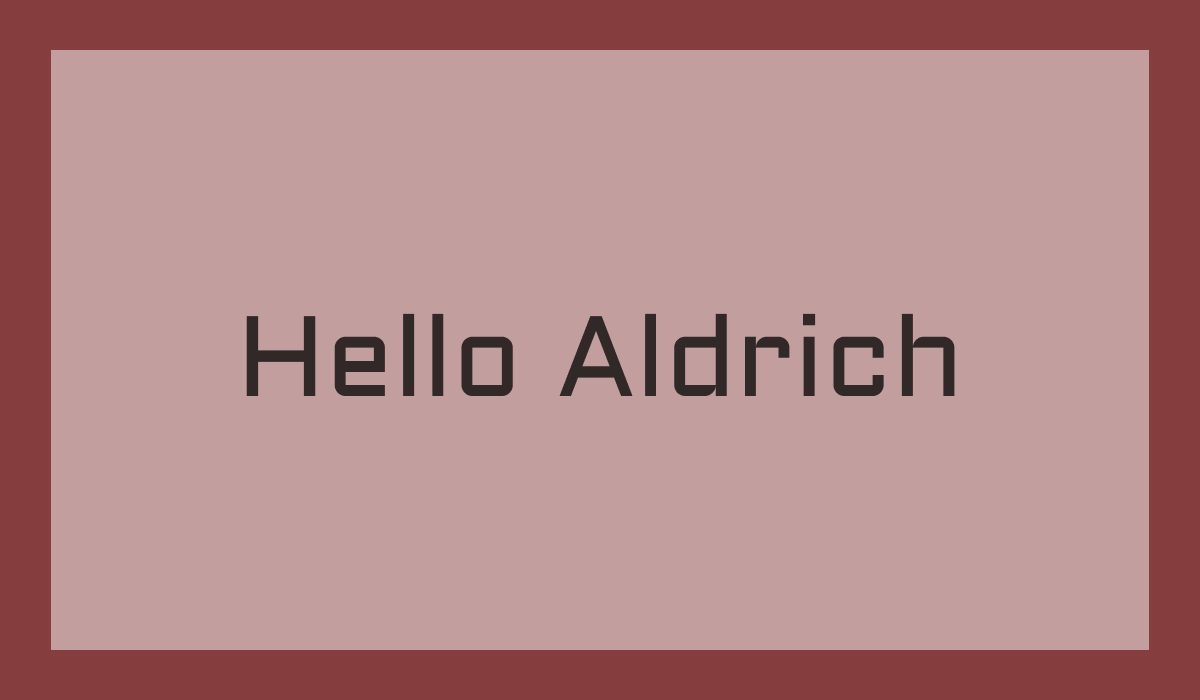
Font of the Week
About Aldrich Typeface
Aldrich is a modern sans serif font inspired by technological advancements and the future. Its clean lines and geometric form give it a confident and futuristic look that appeals to modern designers. This typeface perfectly embodies minimalist font design while adding a bold touch to any graphic project.
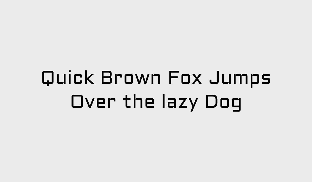
Aldrich Type Details
Aldrich is characterized by its strong, vertical strokes and precisely curved edges, creating an aesthetic that is both professional and approachable. The font’s design details were crafted to instill a sense of assurance and forward-thinking, making it a great fit for modern designs that require a futuristic typography approach. Aldrich is well-suited for projects needing a strong, confident typeface - from posters to digital interfaces.
How to Use Aldrich for Logo
With its minimalist yet assertive style, Aldrich is a fantastic choice for logos requiring a contemporary appeal. Use bolder weights of the font to ensure legibility at various sizes. The font’s geometric simplicity allows it to stand out, ensuring logos are memorable and impactful. Whether it’s a tech startup or a fashion brand, Aldrich can add that modern design touch necessary to make a brand shine.
How to Use Aldrich for Branding & Marketing
Aldrich is a reliable choice for branding and marketing when you want to project confidence and a distinct contemporary edge. It works well across both print and digital applications, helping maintain consistency across brand touchpoints.
Aldrich Font Pairings
- Inter: Inter balances Aldrich’s distinctive geometric letterforms with a highly readable, neutral sans serif. While Aldrich makes a bold statement in headlines, Inter stays understated in body copy, creating a clean hierarchy that works especially well for product websites, SaaS landing pages, and technology brands.
- IBM Plex Sans: IBM Plex Sans complements Aldrich with a technical yet approachable personality. Both typefaces share a modern aesthetic, but IBM Plex Sans introduces greater warmth and readability for longer passages of text. This pairing works particularly well for developer tools, documentation, and software interfaces.
- Space Grotesk: Space Grotesk amplifies Aldrich's futuristic character while adding a more expressive and contemporary touch. The combination feels innovative and energetic without sacrificing legibility, making it a strong choice for startups, creative technology companies, gaming, and digital products.