Amarante in Design: The Bridge Between Serif Sophistication and Sans Serif Simplicity
Font of the Week
About Amarante Font
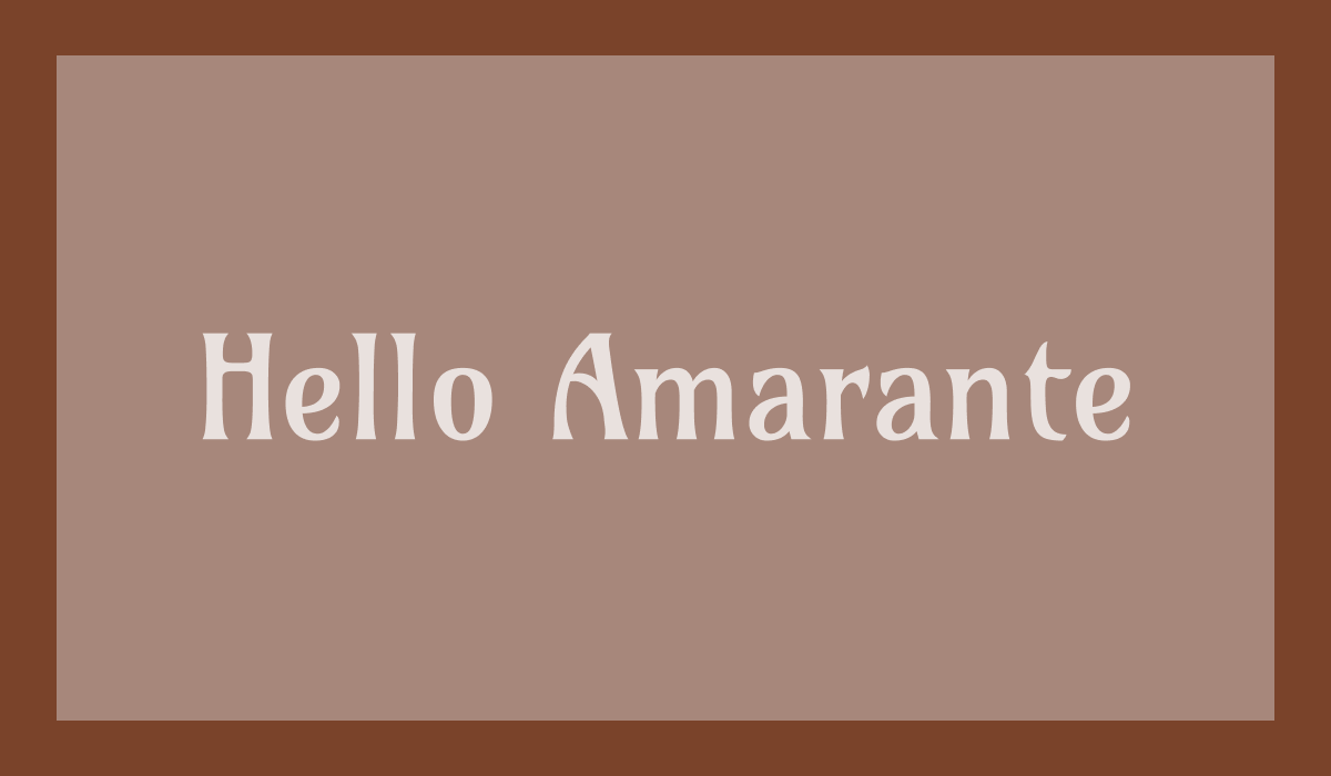
Amarante is a distinctive, medium-contrast condensed display typeface that sits between traditional serif and modern sans serif design. Drawing from the elegance of vintage serifs and the clarity of contemporary sans serifs, it incorporates unconventional, Art Nouveau–inspired forms that create a character both playful and refined. Though primarily designed as a display face, Amarante performs unexpectedly well across both headlines and short text settings.
Amarante Type Details
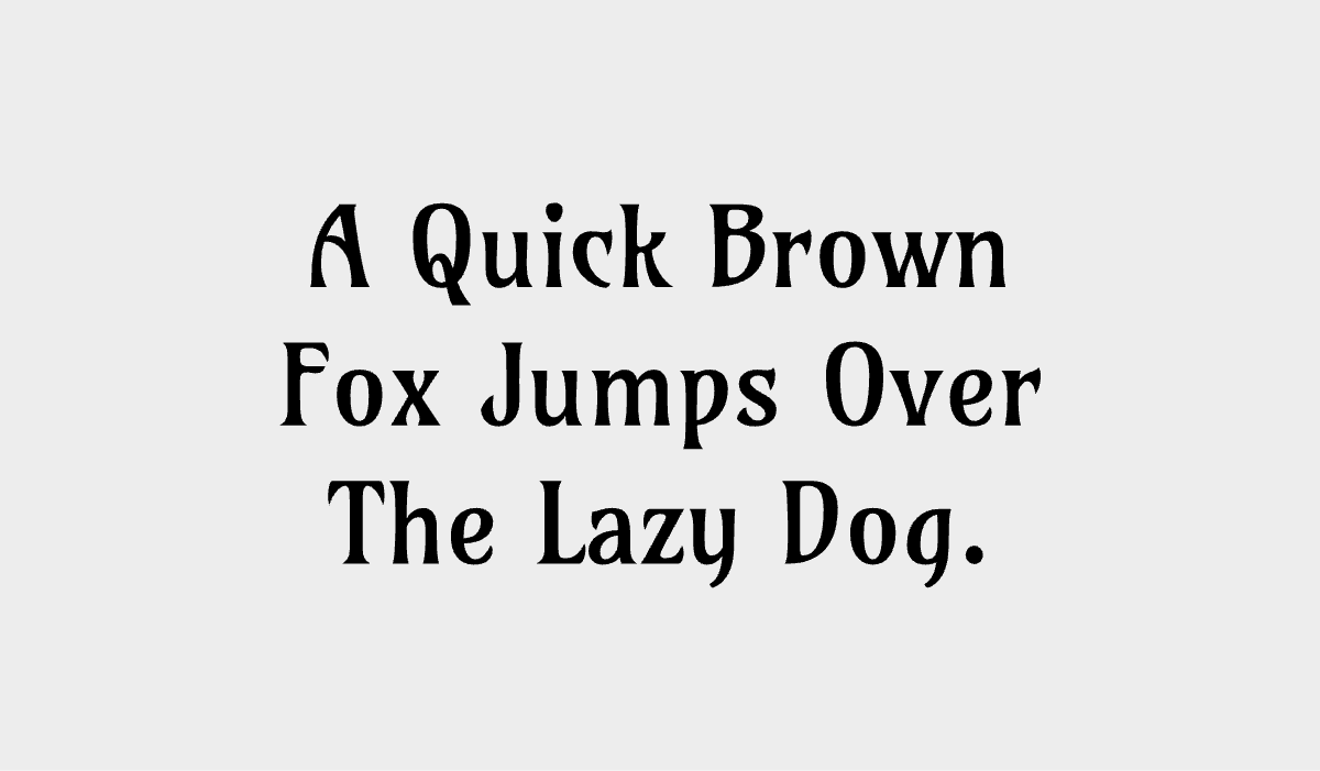
Defined by its condensed proportions, medium contrast, and expressive Art Nouveau influences, Amarante stands out for its decorative yet approachable style. Its fluid, low-contrast strokes lend a soft, vintage sensibility, while a tall x-height and relatively open spacing support readability. The result is a typeface that balances ornament with usability, making it well suited for display contexts that call for a subtle sense of intrigue.
How to Use Amarante for Logo
Amarante’s distinctive personality makes it particularly effective in logo design. Its vintage character and unconventional forms help create memorable marks, while its sturdy, low-contrast strokes maintain clarity even at smaller sizes. It works best for brands looking to convey individuality with a hint of nostalgia.
How to Use Amarante for Branding & Marketing
In branding and marketing applications, Amarante brings a unique blend of charm and sophistication. Its expressive forms can anchor visual identity systems, especially for projects that aim to evoke a vintage or slightly mysterious tone. It performs well across packaging, editorial layouts, and promotional materials where character and distinctiveness are key.
Amarante Font Pairings
Finding the right companion for Amarante is about balancing its expressive, Art Nouveau–leaning forms with something that either grounds or complements its personality. Here are three strong pairing directions:
- Inter: Pairing Amarante with Inter creates a clean, contemporary contrast. Inter’s highly readable, neutral design tempers Amarante’s decorative qualities, making the combination ideal for digital products, editorial layouts, or brand systems that need both personality and clarity.
- Libre Franklin: Libre Franklin brings a slightly humanist warmth that complements Amarante without competing with it. This pairing feels more relaxed and approachable than a purely geometric sans, making it well suited for lifestyle branding, packaging, or storytelling-driven web design.
- Playfair Display: For a more expressive, editorial direction, Playfair Display amplifies Amarante’s vintage sensibility. The contrast between Playfair’s high-contrast elegance and Amarante’s softer, more fluid forms creates a rich typographic palette, ideal for fashion, luxury branding, or magazine-style layouts.