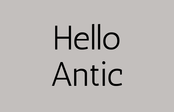
Reviewing Antic: A Fantastic Font with Neutral Tone
In This Issue...
How to Use Antic for Logo and Branding
- Font of the Week: Antic
- Design idea of the Week: Celebrating Pride | Colors of Rainbow in Branding
- Color Inspiration of the Week: Hokkaido Crane

Font of the Week
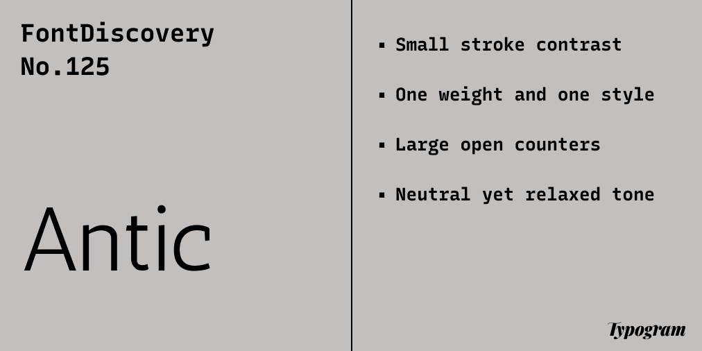
About Antic
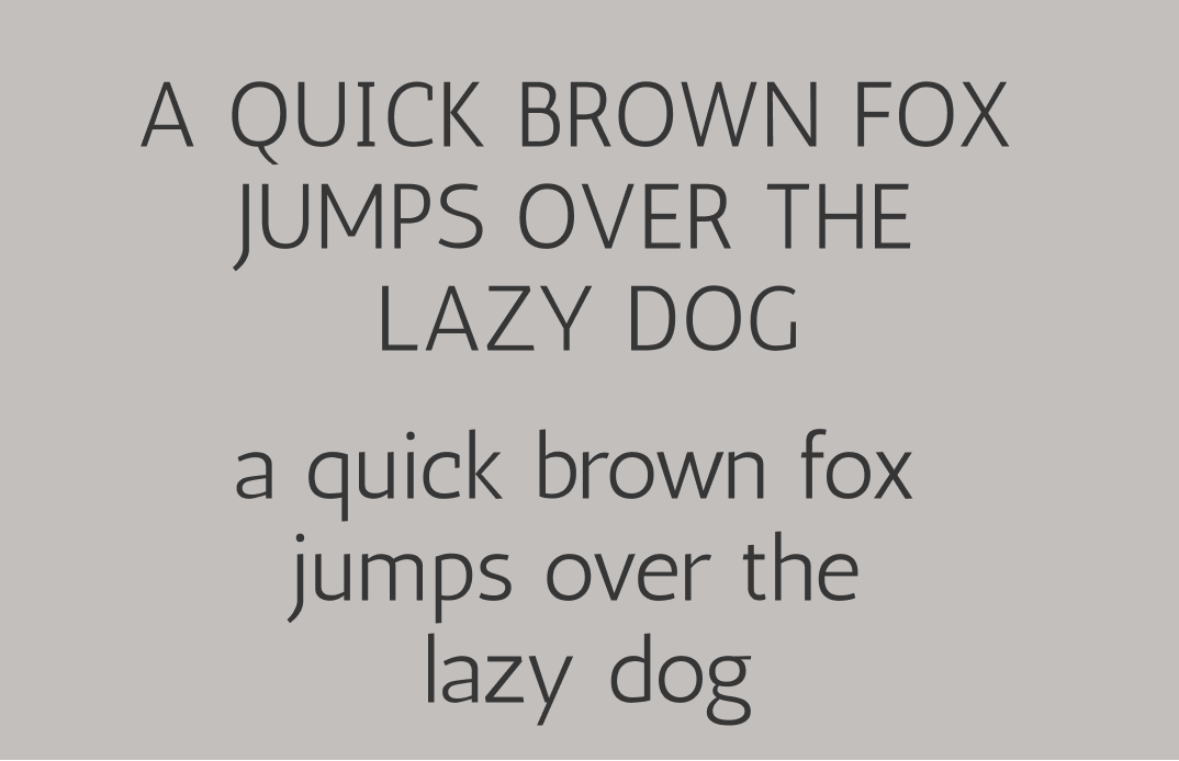
If you are looking for a beautiful sans-serif, look no further than Antic. Antic is inspired by calligraphy, and the strokes contrast between thick and thin are small. Overall, Antic gives off an organic and relaxed tone.
Font Details
Small stroke contrast
One weight and one style
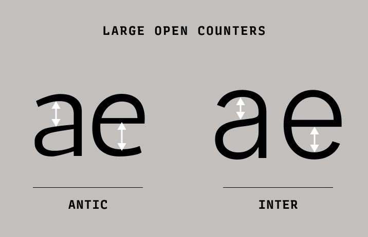
Large open counters
How to use Antic for Logo?
Antic is perfect for a logo. Its large open counters create a neutral but relaxed tone. Though Antics only has one weight, the strokes are thick enough to create a legible and memorable logo.
How to use Antic for Branding and Marketing?
Antics is designed to be a reading font and looks beautiful in paragraphs, comforting to the eye. The counter (explained in our Typography Jargon Buster section this week ) in letters are large, making the shapes of letters very apparent and legible and easy to read. It is a great reading font for your blog posts and newsletters. Antic pairs well with serif typefaces, like Bitter.
Design Idea of the Week
Celebrating Pride: Colors of Rainbow in Branding
June is pride month, and rainbow brandings are everywhere, but what does each color mean in branding? In this post, we find out.

Color Inspiration of the Week
Hokkaido Crane
This week, enjoy this beautiful crane found in Hokkaido, Japan.

Typography Jargon Buster!
Counter
A counter is an unfilled (white or negative) space partially or entirely closed by other parts of the letters. For example, lowercase “b” and uppercase “U” both have counters. The stroke creating a counter shape is known as a “bowl.” There are two types of counter spaces: open and closed. An open counter means the unfilled space is partially closed, like “U.” A closed counter happens when the unfilled space is completely sealed, like “b.”

Want more typography jargon buster? Check out this post!
Creative Prompt
Create something with Antic!
Thank you
…for reading and hanging out here this week! Here is Antic.