Antic Didone: A Bold Modern Serif That Transforms Your Branding Design
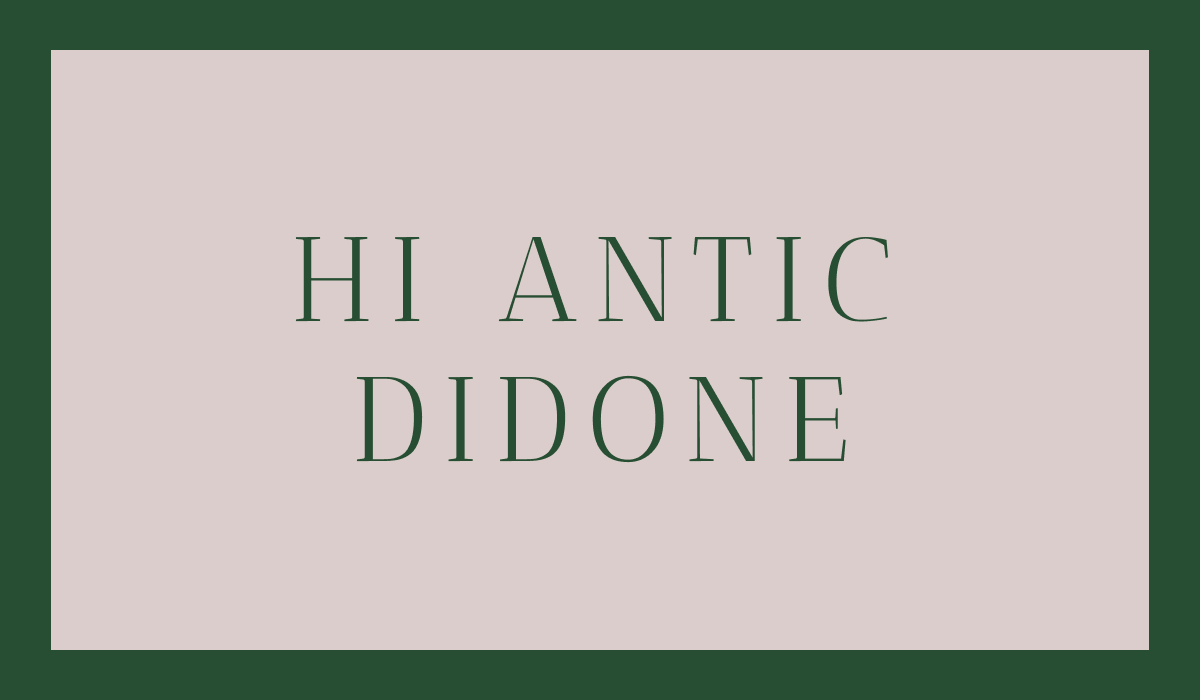
Looking for a font that blends timeless elegance with bold modern flair? Meet Antic Didone, a modern serif that draws inspiration from classic 18th-century typography while offering a clean, contemporary twist. Whether you’re designing for fashion, editorial, or luxury branding, Antic Didone brings a refined sense of sophistication to any project.
About Antic Didone
Antic Didone is a high-contrast serif font from the Didone classification, known for its sharp, delicate serifs and striking vertical stress. Based on the original Antic font structure, Antic Didone has "Didone" influence and takes stylistic cues from the renowned Didot family of type designers, like Firmin Didot who is credited for establishing use of "Didone" or high contrast modern serifs. Its elegant structure makes it a favorite for projects where drama and style are front and center.
Why Designers Love Antic Didone
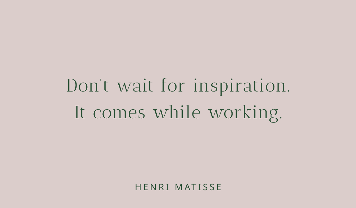
Antic Didone stands out for its bold contrast between thick and thin strokes, giving text a dramatic, eye-catching quality. Its refined serifs and tall letterforms enhance readability in larger sizes, making it ideal for headlines, posters, packaging, and editorial layouts.
Use Antic Didone when you want your typography to feel premium, elegant, and unmistakably stylish. You can also pair it with Antic Regular and Antic Slab.
Antic Didone Font Details: Style, Features, and Best Uses
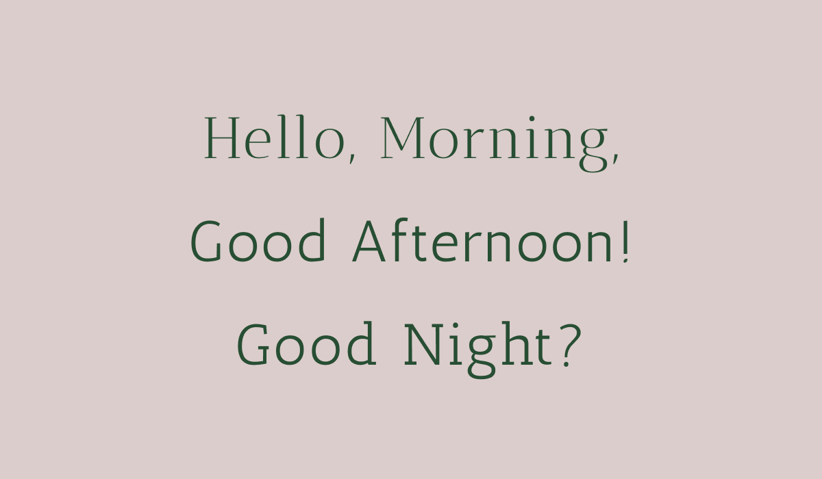
Antic Didone is a modern serif font that blends bold contrast with elegant detailing, making it a standout choice for eye-catching typography. With its thin horizontal strokes, strong vertical lines, and delicate hairline serifs, it perfectly captures the refined aesthetic of classic Didone-style typefaces—ideal for making a statement.
While its fine details add sophistication, they also make it less suitable for body text or small-scale logos, where legibility can suffer. Where Antic Didone truly shines is in headlines, large titles, and display settings—anywhere you want to convey style and elegance. It’s especially well-suited for editorial design, fashion branding, luxury packaging, and high-end marketing that demands a polished, upscale feel.
For best results:
Use it at larger sizes
Consider adding a subtle stroke or outline to maintain legibility
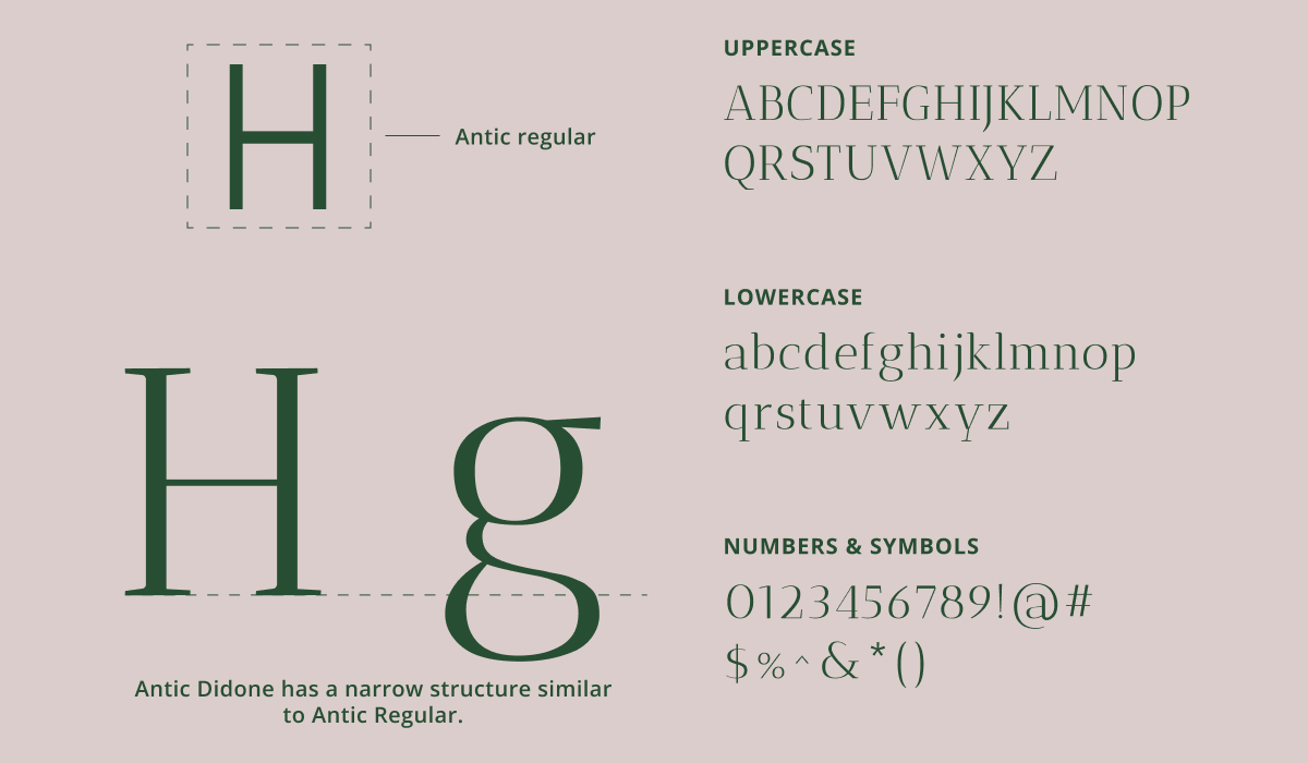
Key Features of Antic Didone:
Font style: Modern Serif / Didone
Design traits: High contrast, unbracketed hairline serifs, vertical stress
Best for: Fashion, editorial, luxury branding, high-end marketing
Avoid using for: Small text or dense paragraphs
Using Antic Didone for Logo Design
Antic Didone can work well in logo design—but with a few important considerations. Its thin strokes and high contrast create a luxurious look at large sizes. However, these delicate details can break down or appear too light in small-scale applications.
Tips for logo use:
Stick to larger sizes for clarity
Consider adding a stroke or outline to preserve detail
Best used for logos in fashion, cosmetics, or premium lifestyle brands
Branding & Marketing with Antic Didone
Antic Didone adds instant polish to branding materials. From business cards to packaging and social media graphics, its upscale feel helps communicate professionalism and prestige.
Pair it with muted colors, minimalist layouts, and generous white space to really let the typography shine. It's especially effective for luxury marketing campaigns, high-end product launches, or elegant editorial spreads.
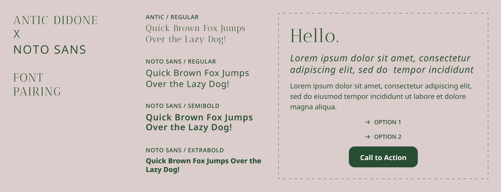
Font Pairings for Antic Didone
Since Antic Didone only has one weight, you should pair it with another multi weight font to create more robust typography system for your design. Pairing fonts can make or break your design. Here are some Google Fonts that pair beautifully with Antic Didone:
Merriweather – A readable, classic serif that complements Antic Didone in editorial or long-form text
Open Sans – A clean sans-serif that balances Antic Didone’s drama with a more neutral, modern tone
Noto Sans – A multi family humanist sans serif font that works great for subheadings, quotes, or UI elements
Each of these fonts helps highlight Antic Didone’s strengths without competing for attention.
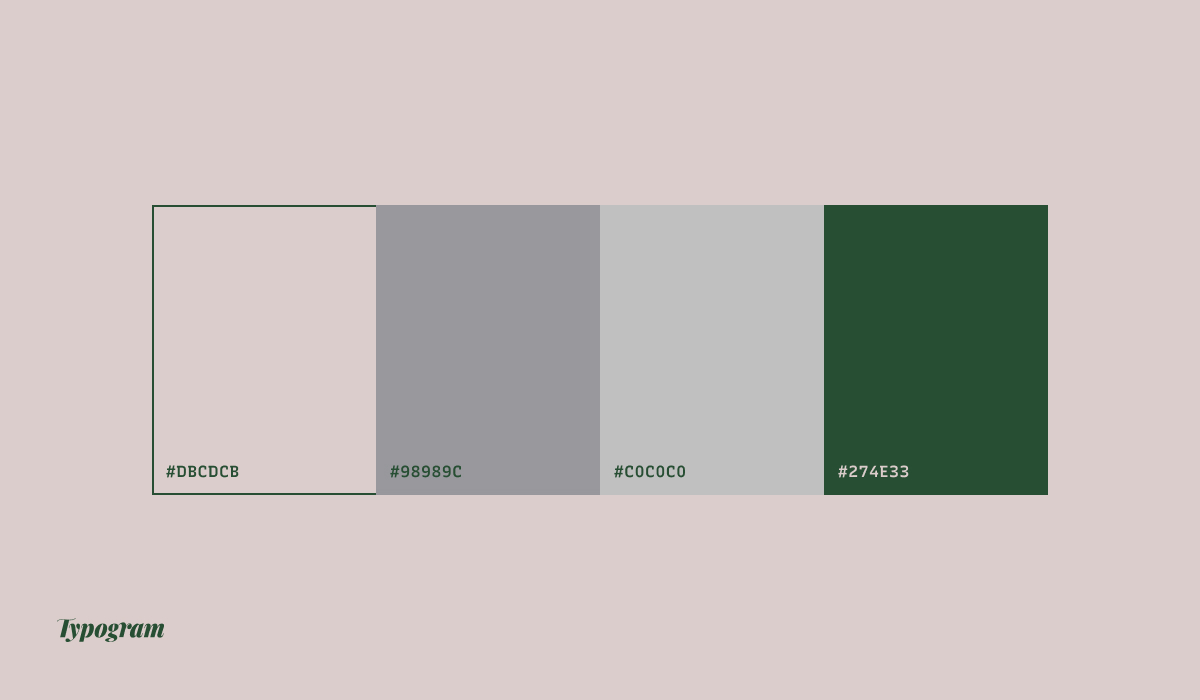
Color Inspiration
Enjoy this modern spring color palette combining green, pink and neutrals.
Final Thoughts
Antic Didone is more than just a beautiful typeface—it’s a powerful tool for designers who want to create elegant, high-impact visuals. With its roots in historical type and its modern sensibility, it’s perfect for bold branding, standout headlines, and stylish marketing materials.
Give Antic Didone a try in your next project and see how it transforms your typography!