How to Use Abril Fatface: The Perfect Font for Fashion and Editorial
In This Issue…
How to Use Abril Fatface for Logo and Branding
Font of the Week: Abril Fatface
Design Idea of the Week: Revamping the Design Section
Color Inspiration of the Week: Fall Leaves
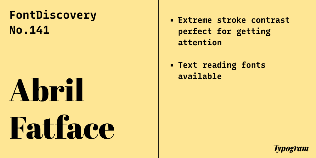
Font of the Week
Abril Fatface
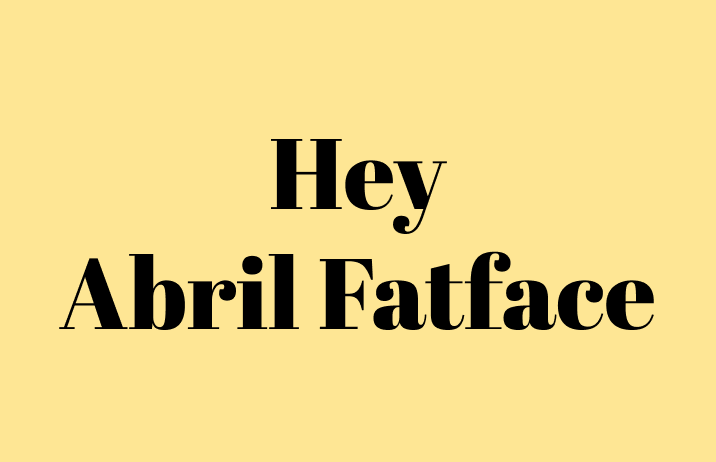
If you want to incorporate elegance and drama, consider using Abril Fatface for your next project.
What is a fat face letterform?
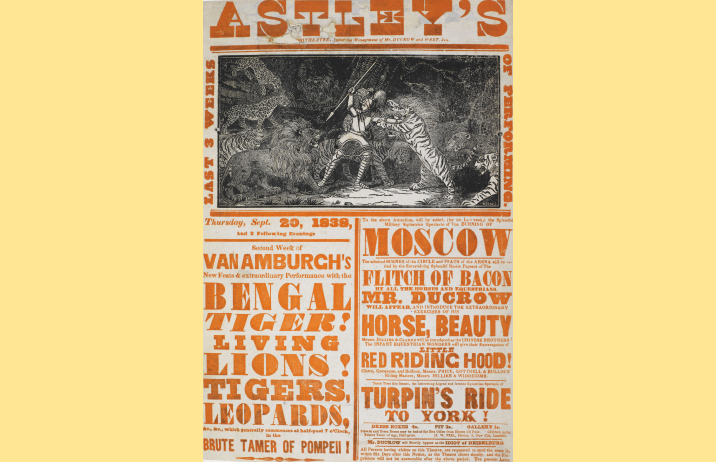
A funny name, a fat face is a modern serif (large stroke contrast) with a bold design (very thick strokes) that usually consists of extreme stroke contrast. These were popular for advertising posters, becoming the “first real display typeface” to sell products and attract attention.
Abril Fatface, in particular, is inspired by posters found in 19th-century Britain and France. However, it is a much more contemporary interpretation with updates, making it a fantastic font for display on your blog and graphic projects. It is part of the Abril font family, with more reading-friendly versions.
Font Details
Extreme stroke contrast perfect for display and getting attention
More text reading fonts available in the Abril family

How to use Abril Fatface for logo?
When you use Abril Fatface for logos, watch out for its stroke contrast. Its significant stroke contrast could break down when used in smaller sizes, lowering readability. Make sure your logo is legible.
How to use Abril Fatface for marketing?
Abril Fatface is perfect for blog headers, landing pages, and graphics. It’s extreme, visually stimulating stroke contrast is loud and demands attention.
Color Inspiration of the Week
This week, enjoy warm colors from fall leaves.

Design Idea of the Week
Revamping the Design Section
Recently, I have been interested in making guides and infographics based on the design and typography knowledge we share here. I want these graphics to be fun, easy to understand, and informative for beginners.
I am kicking off this revamp with this funny graphic I made recently on what is a sans serif. Let me know if you have any thoughts or suggestions!

Typography Jargon Buster
Stem? Arm? Leg?
Sometimes we hear terms specific to font details of a letterform. In this post, we go over some of the font details you encounter.

Creative Prompt
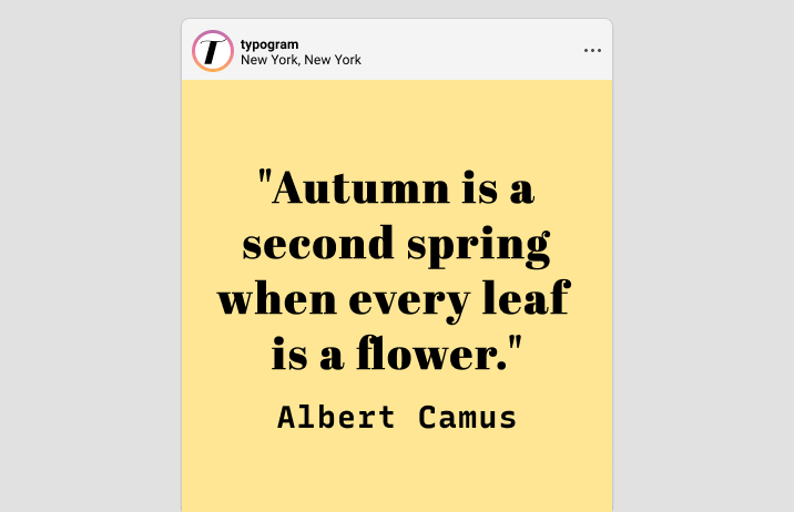
Create something with Abril Fatface.
Thank you
…for reading and hanging out here this week! Abril Fatface is available here.