How to Use Libre Franklin: A Friendly Sans Serif Font for Your Tech Brands
In This Issue…
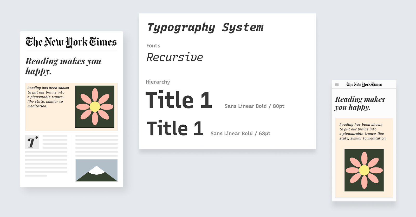
How to Use Libre Franklin for Logo, Branding & More
Font of the Week: Libre FranklinDesign idea: Symbols to Copy- Color Inspiration: Start of Summer
Font of the Week
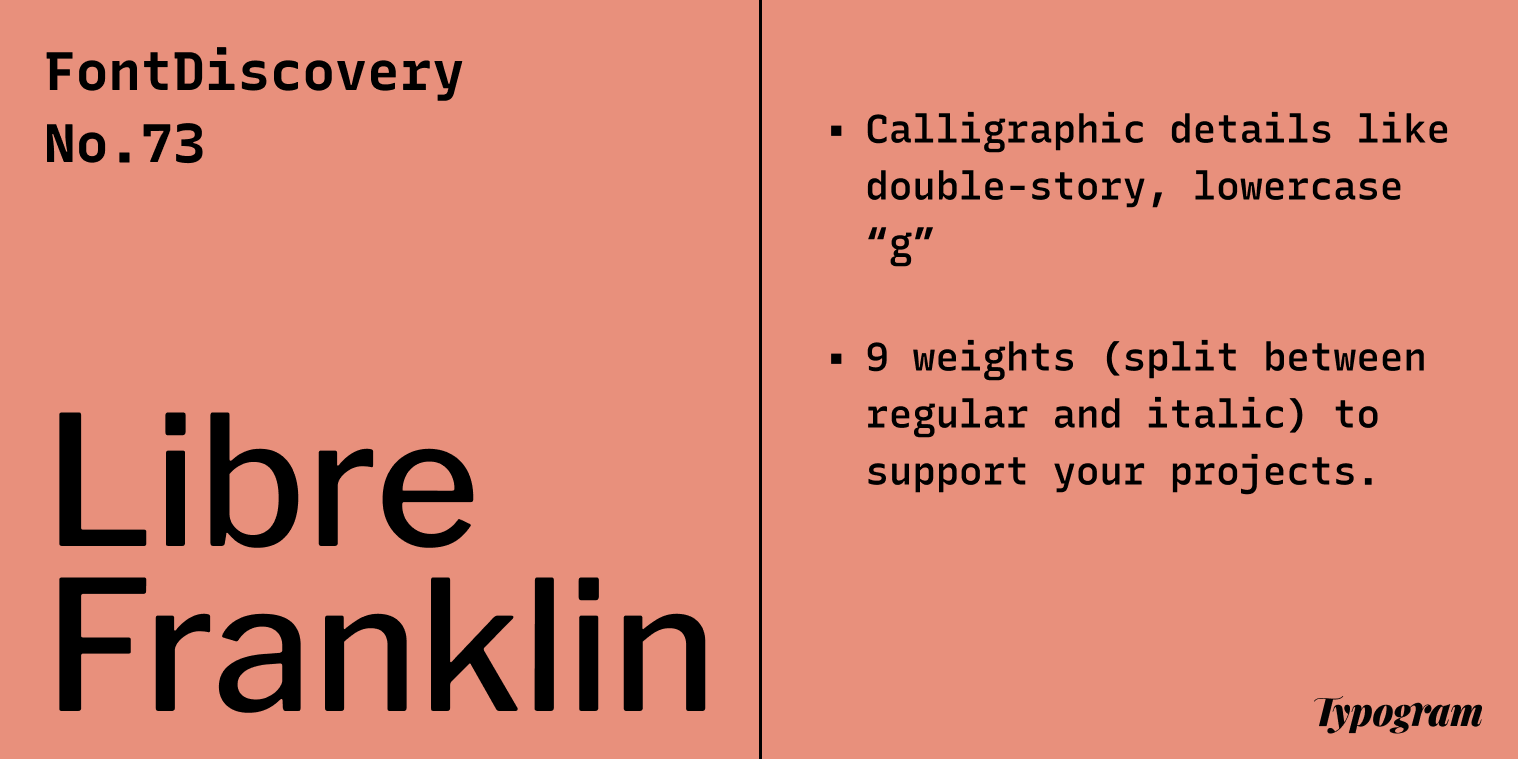
About Libre Franklin
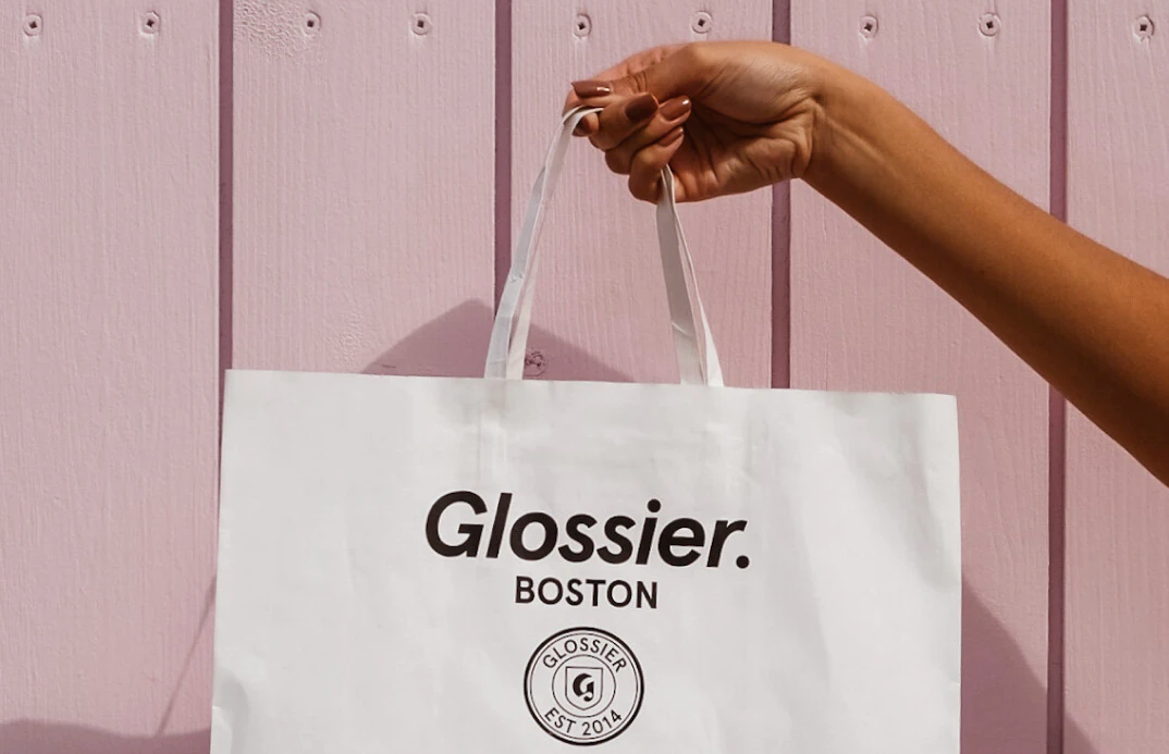
Libre Franklin belongs to a category of sans serif called humanist sans serif, which takes inspiration from traditional calligraphy. Look closely, and you will find that Libre Franklin has a very slight variance in its strokes, reminding us of a soft calligraphic touch. Because it reminds us of calligraphy, humanist sans serif is often perceived as less edgy, and more friendly than other sans serif types. Many brands, such as Glossier, love these sans serif due to the warmth they offer.
Font Details
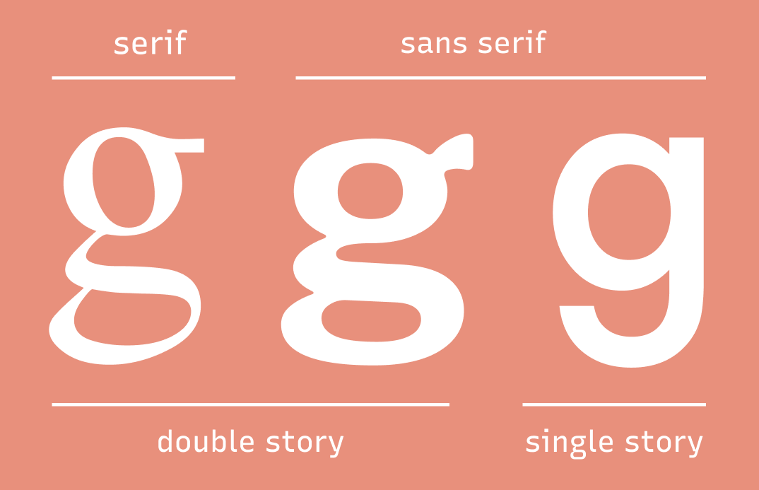
- Calligraphic details like double-story, lowercase “g”
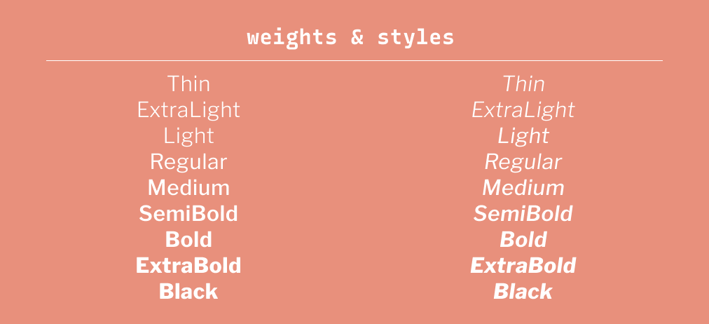
- Nine weights with regular and italic
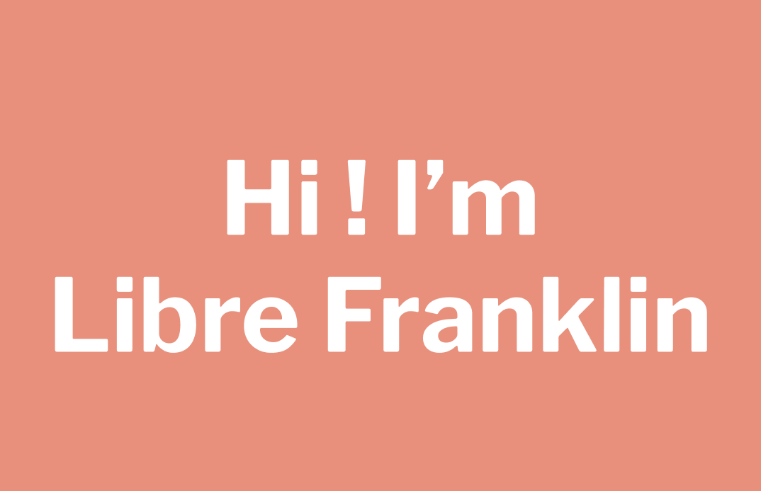
How to use Libre Franklin for Logo?
Libre Franklin comes across as friendly. If your brand is looking for a warm and inviting tone, give Libre Franklin a try. However, don't use thin, extra light, or light for small size texts. It can be tough to see.
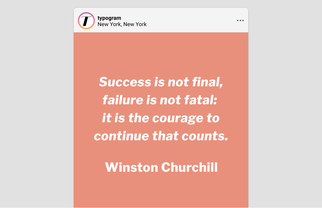
How to use Libre Franklin for Marketing and Branding?
Design Idea of the Week
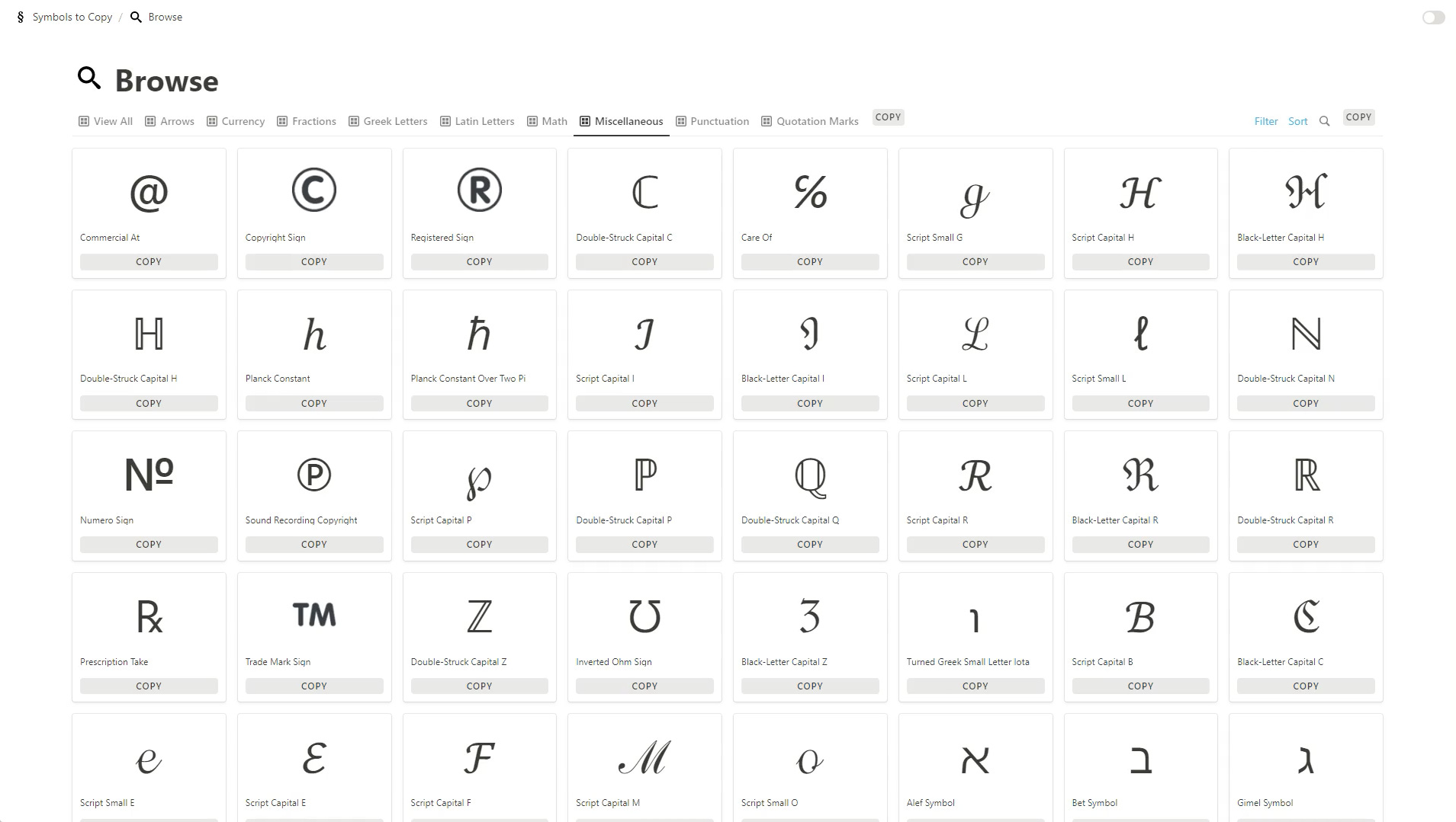
Symbols to Copy
Color Inspiration of the Week
Start of Summer
This week, enjoy this wonderful summer color palette from the paint Skiffs, by Gustave Caillebotte.
Sky #C5D7EB | Sage #A8B4A4 | Laguna #EFD18E | Coral #E8907C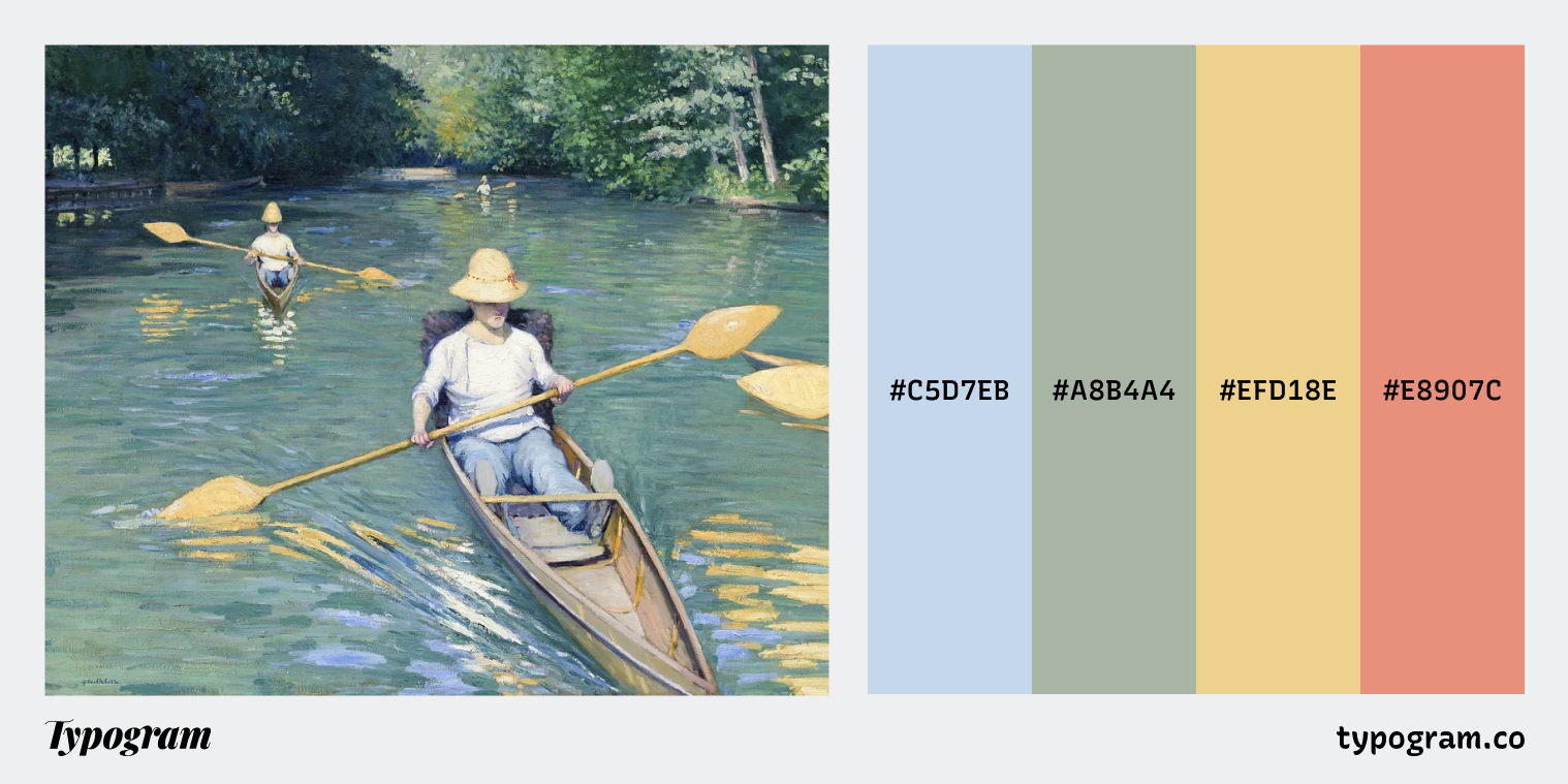
Jargon Buster
Typography
Typography is the art of arranging pieces of text via typefaces to make information legible, readable, and pleasing to the eye. Typography is more important than ever because information today is more readily available. Typography shapes language and helps us communicate a clear message.
Creative Prompt
Create something with Libre Franklin
Thank you