How to Use Autour One: Perfect Hand-drawn Font for Posters

In This Issue…
How to Use Autur One for Logo and Branding
- Font of the Week: Autour One
- Design idea: Models of Ambition
- Color Inspiration: Oregon Maples
Font of the Week
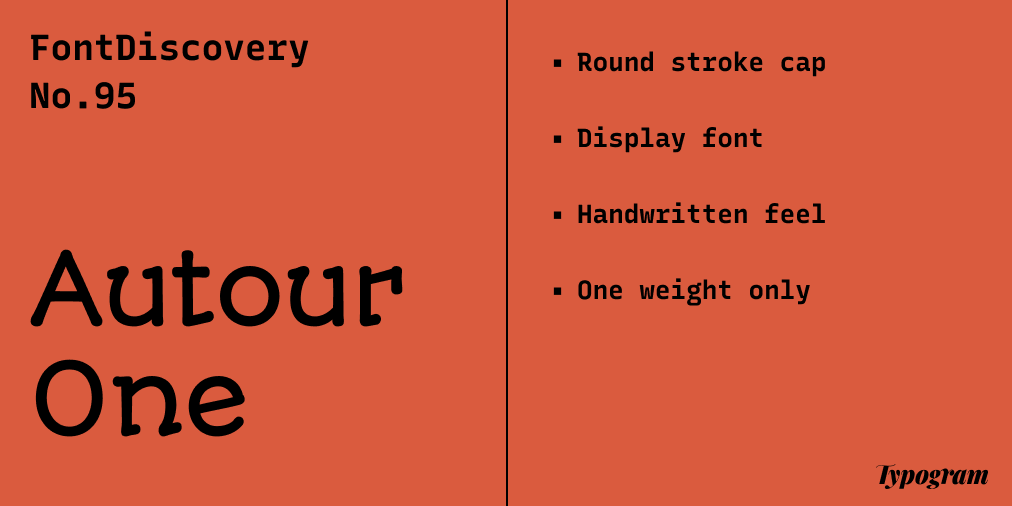
About Autour One
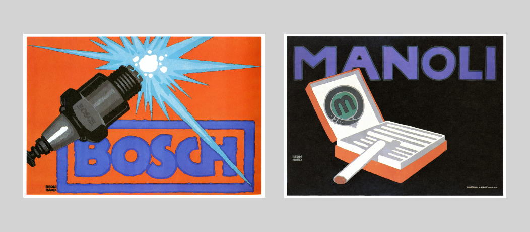
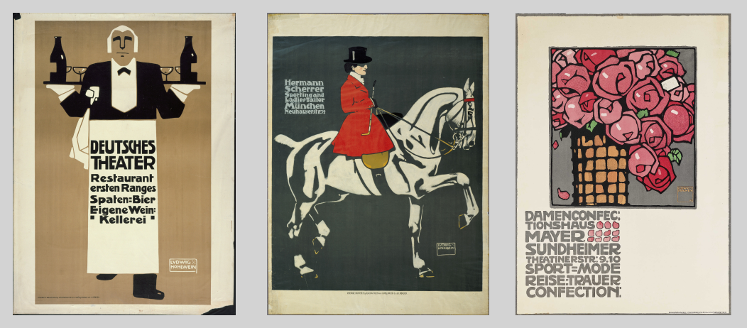
One of my favorite fonts right now, Autour One is an excellent display font inspired by handwritten letters found on the poster art of Ludwig Hohlwein, a pioneer of the Sachplakat poster style. Sachplatkat was a popular poster style that originated in Berlin in the 1900s. Usually, Sachplatkat-style posters featured a single central object in the posters’ compositions, with large text placed across in bold letterforms. Autour One is inspired by the simplicity and bold, graphic nature of the letters found on Hohlwein’s Sachplakat posters.
Font Details
- Round stroke cap with round feel
- Display font
- Handwritten fee with friendly quirks
- One weight only
How to Use Autour One for Logos?
Autour One has a warm and friendly tone. This comes from its handwritten feel and round shape created by the letterforms and stroke caps. Its strokes are thick enough to remain clear and readable in small sizes. It is perfect for a logo looking to appear friendly.
How to Use Autour One for Marketing and Branding?
Autour One’s warm and friendly tones make it perfect for marketing graphics. Because of its friendly tone, it may not be appropriate for content looking for serious and objective. Though only having one weight, Autour One can be paired with sans serif like Space Grotesque.

Design Idea of the Week
Models of Ambition
I have always thought of myself as an ambitious person but never thought of different types and models of ambitions until I read this theory by the computer scientist Cal Newport.
Color Inspiration of the Week
Oregon Maples
This week, enjoy colors from Portland, Oregon.
Bordeaux #3D0A05 | Coral #CE3324 | Contessa #C1826F| Cloudy Gray #D9DEE1
Typography Jargon Buster!
Sans Serif
Sans means “without.” Sans Serifs do not have serifs extending at the end of strokes. Sans Serifs were invented long after Serifs. In 1816, William Caslon IV created the first official sans serif typeface, Caslon, for commercial use. Though Caslon didn’t become popular right away, Sans Serif boomed in popularity decades later. Sans Serifs are also further broken down into smaller style categories: Grotesque, Neo Grotesque, Humanist, and Geometric.

Creative Prompt
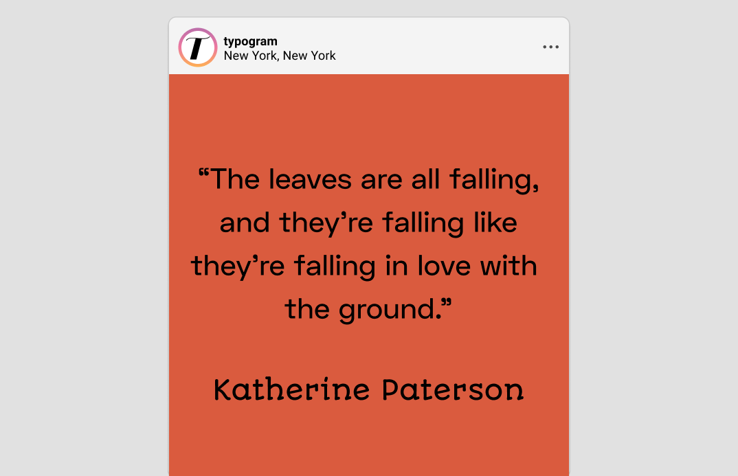
Create something with Autour One.
Thank you
…for reading and hanging out here this week! Autour One is available here.